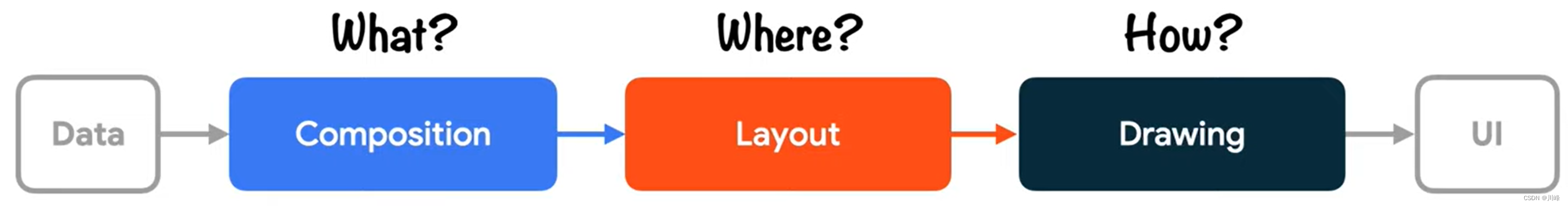
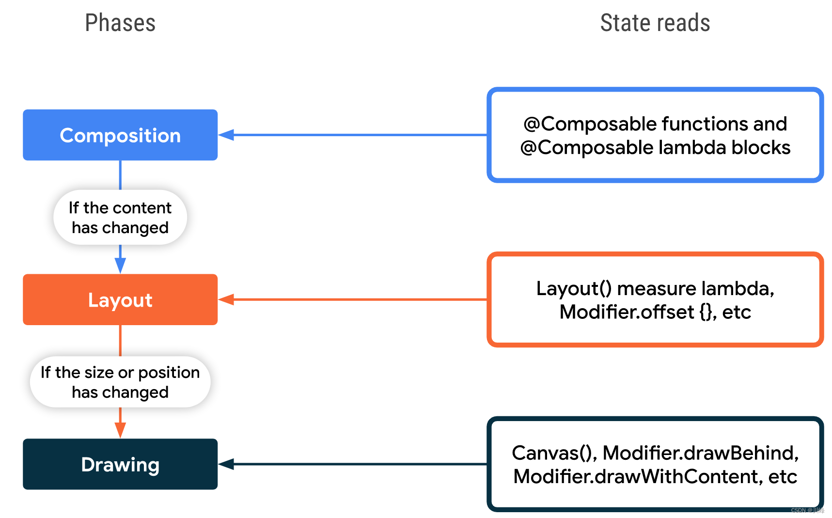
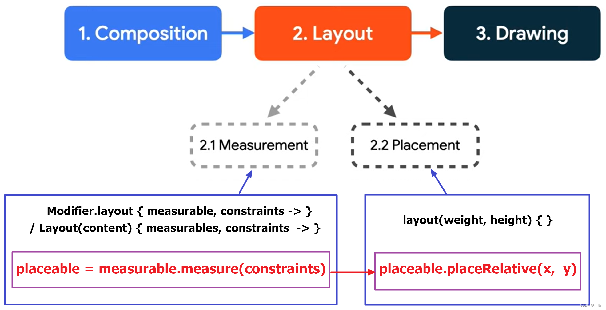
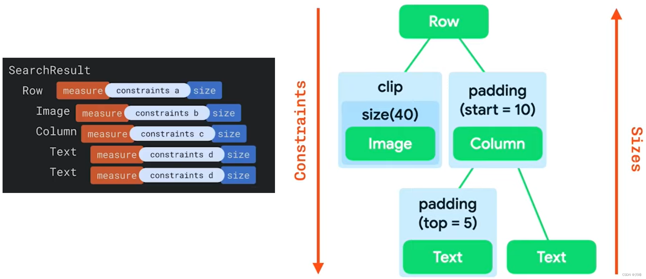
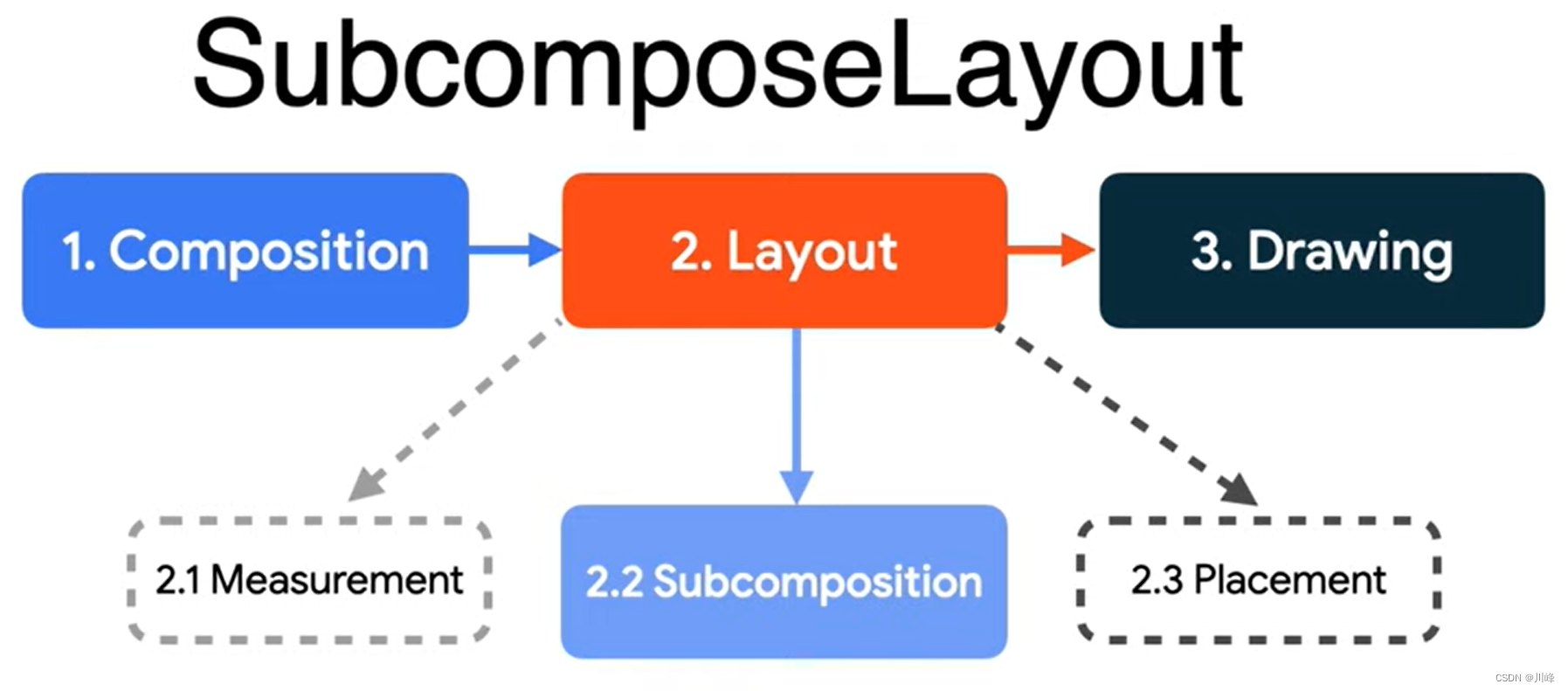
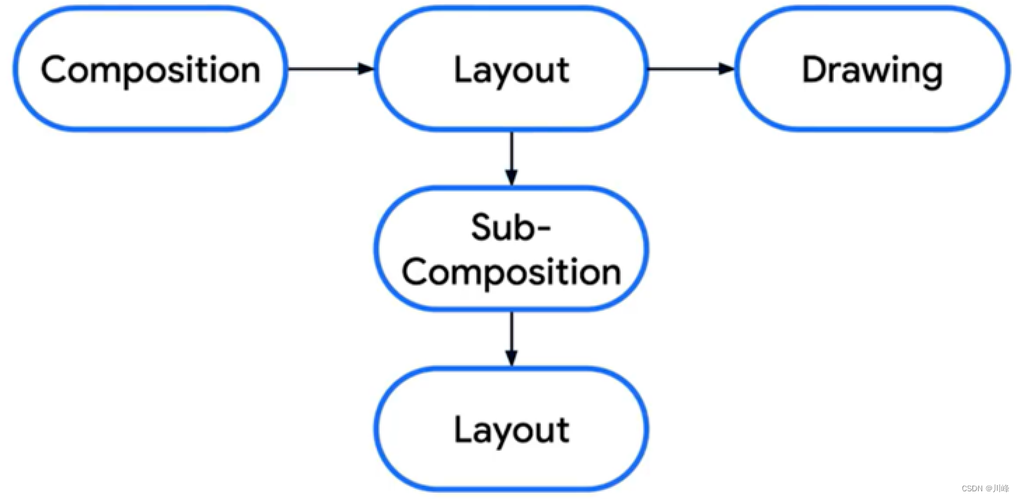
Jetpack Compose中绘制流程的三个阶段 与大多数其他界面工具包一样,Compose 会通过几个不同的“阶段”来渲染帧。如果我们观察一下 Android View 系统,就会发现它有 3 个主要阶段:测量、布局和绘制 。Compose 和它非常相似,但开头多了一个叫做“组合 ”的重要阶段。
Compose 有 3 个主要的阶段:
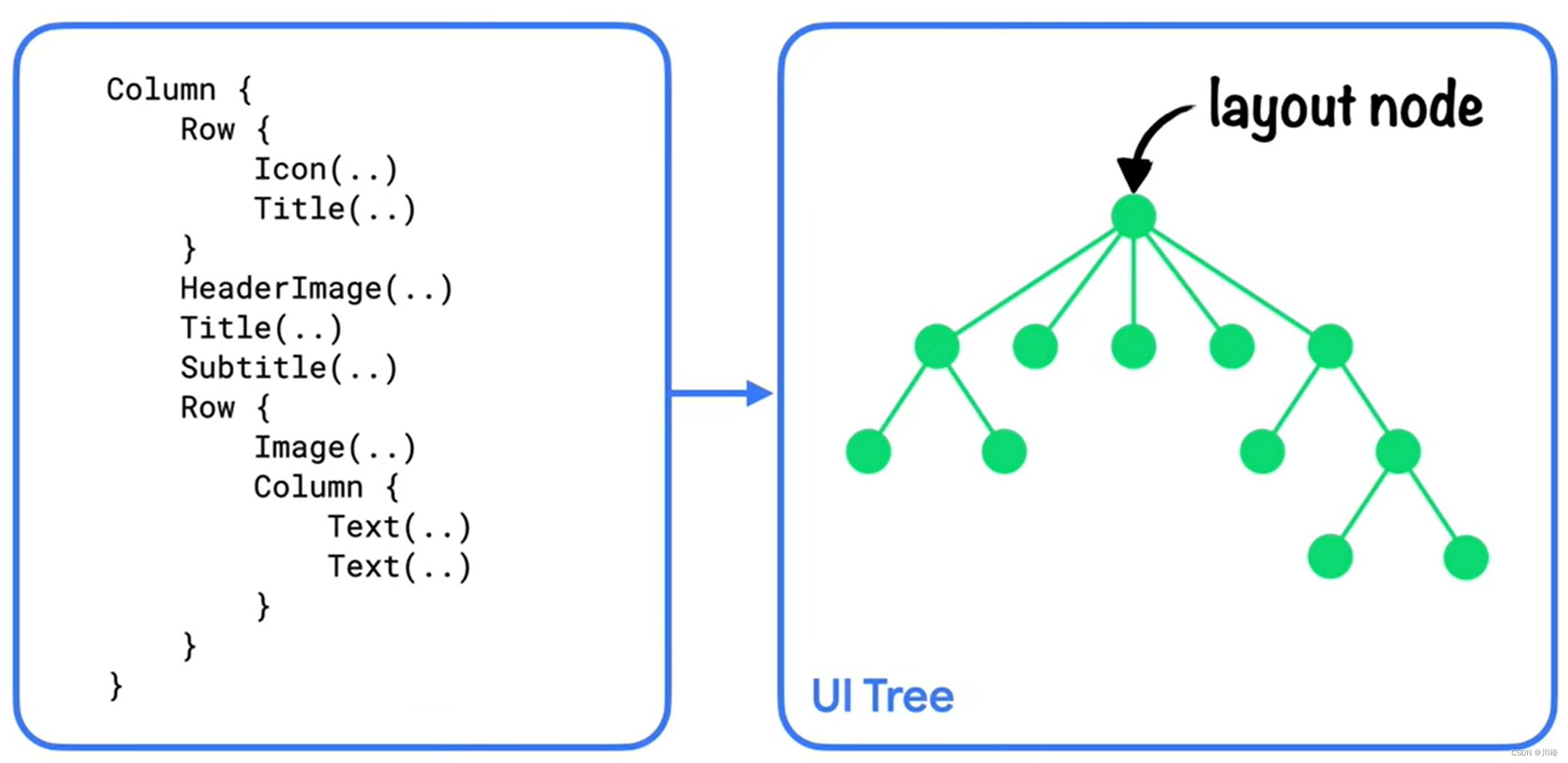
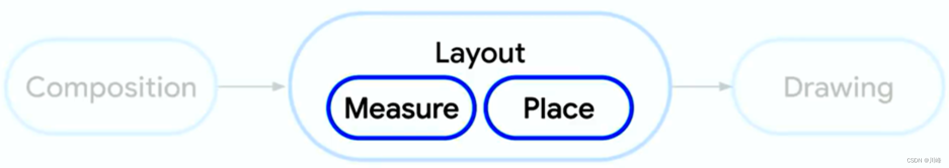
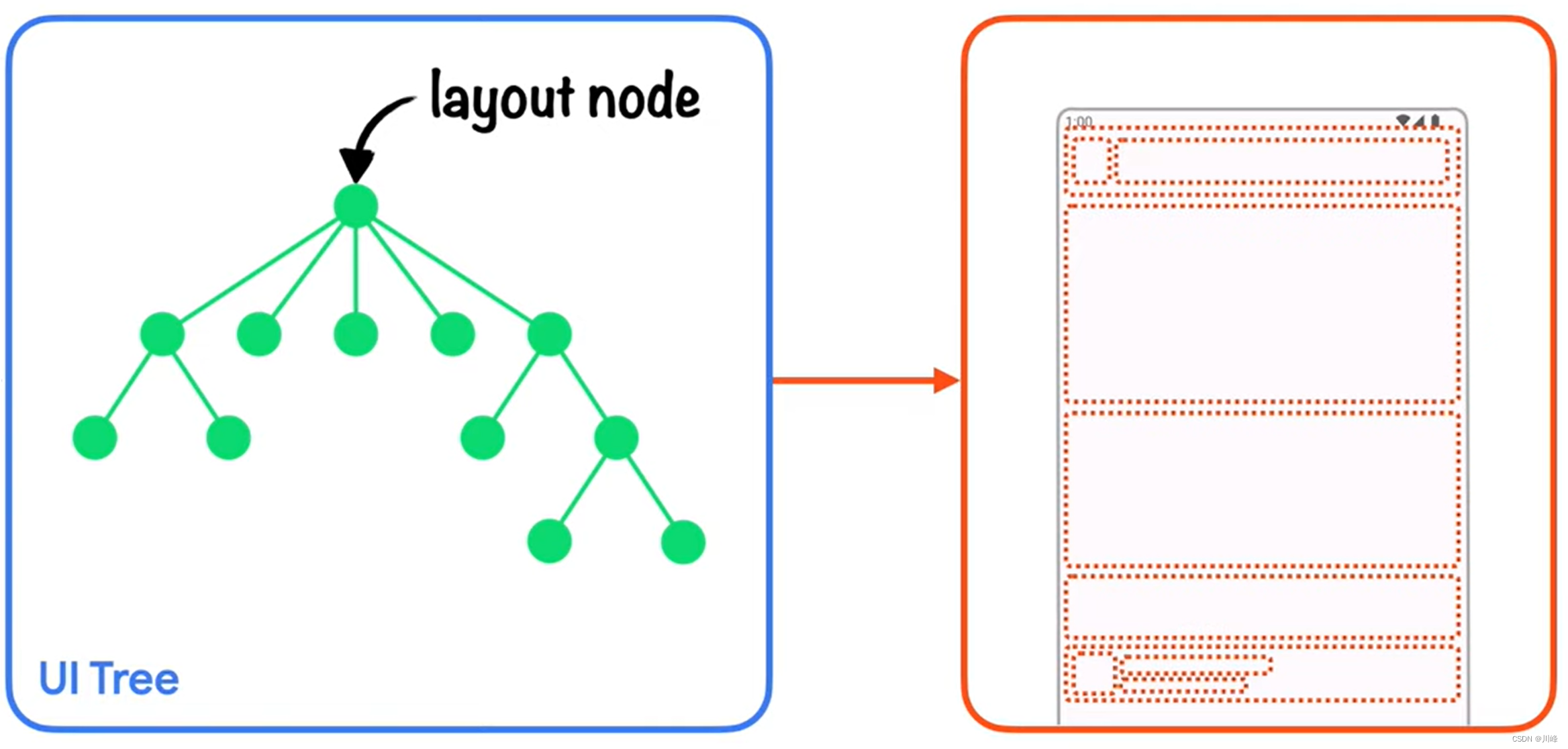
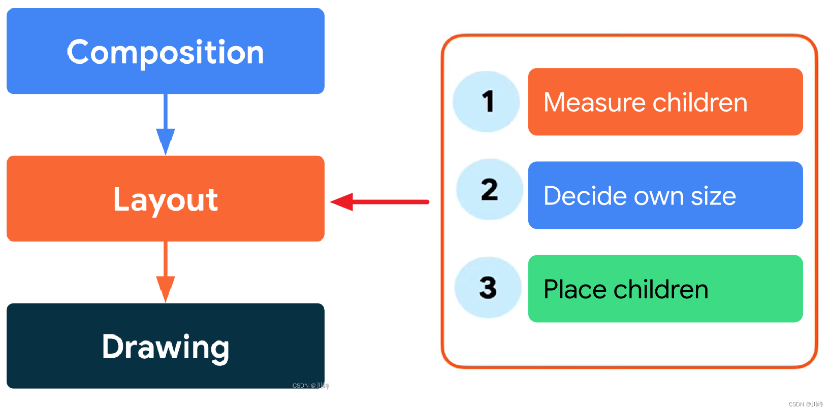
组合 :要显示什么样的界面。Compose 运行Composable可组合函数并创建LayoutNode视图树。布局 :要放置界面的位置。该阶段包含两个步骤:测量 和放置 。对于视图树中的每个LayoutNode节点进行宽高尺寸测量并完成位置摆放,布局元素都会根据 2D 坐标来测量并放置自己及其所有子元素。绘制 :渲染的方式。将所有LayoutNode界面元素会绘制到画布(通常是设备屏幕)之上。
这些阶段的顺序通常是相同的,从而让数据能够沿一个方向(从组合到布局,再到绘制)生成帧(也称为单向数据流 )。
您可以放心地假设每个帧都会以虚拟方式经历这 3 个阶段,但为了保障性能,Compose 会避免在所有这些阶段中重复执行根据相同输入计算出相同结果的工作。如果可以重复使用前面计算出的结果,Compose 会跳过对应的可组合函数;如果没有必要,Compose 界面不会对整个树进行重新布局或重新绘制。Compose 只会执行更新界面所需的最低限度的工作 。之所以能够实现这种优化,是因为 Compose 会跟踪不同阶段中的状态读取 。
所谓状态读取 就是通常使用 mutableStateOf() 创建的,然后通过以下两种方式之一进行访问:
val state = remember { mutableStateOf() }, 然后访问 state.value 属性值
1 2 3 4 5 6 val paddingState: MutableState<Dp> = remember { mutableStateOf(8. dp) }Text( text = "Hello" , modifier = Modifier.padding(paddingState.value) )
val state by remember { mutableStateOf() } 使用 Kotlin 属性委托 by 语法, 直接使用state值
1 2 3 4 5 6 var padding: Dp by remember { mutableStateOf(8. dp) }Text( text = "Hello" , modifier = Modifier.padding(padding) )
当您在上述任一阶段中读取快照状态值时,Compose 会自动跟踪在系统读取该值时正在执行的操作。通过这项跟踪,Compose 能够在状态值发生更改时重新执行读取程序;Compose 以这项跟踪为基础实现了对状态的观察。
第 1 阶段:组合
组合阶段的主要目标是生成并维护LayoutNode视图树,在Activity中执行setContent时,会开始首次组合,这会执行所有的Composable函数生成与之对应的LayoutNode视图树。而后当Composable依赖的状态值发生更改时,Recomposer 会安排重新运行所有要读取相应状态值的可组合函数,即所谓的重组。
当前组件发生重组时,子Composable被依次重新调用,被调用的子Composable 会将当前传入的参数和之前重组中的参数进行比较,若参数变化,则Composable发生重组,更新LayoutNode视图树上的节点,UI发生更新。若参数无变化,则跳过本次执行,即所谓的智能重组,LayoutNode视图树中对应的节点不变,UI无变化。
当前组件发生重组时,如果子Composable在重组中没有被调用到,其对应节点及其子节点会从LayoutNode视图树中被删除,UI会从屏幕移除。
根据组合结果,Compose 界面会运行布局和绘制阶段。请注意,如果输入未更改,运行时可能会决定跳过部分或全部可组合函数 。如果内容保持不变,并且大小和布局也未更改 ,界面可能会跳过这些阶段 。
1
2
3
4
5
6
7
8
var padding by remember { mutableStateOf(8. dp) }Text( text = "Hello" , modifier = Modifier.padding(padding) )
第 2 阶段:布局
布局阶段的主要目的是为了对视图树中的每个 LayoutNode 节点进行测量和摆放。
布局阶段包含两个步骤:测量 和放置 。测量步骤 会运行传递给 Layout 可组合项的测量 lambda 、LayoutModifier 接口的 MeasureScope.measure 方法放置步骤 会运行 layoutModifier.offset { … } 的 lambda 块,等等。
每个步骤的状态读取都会影响布局阶段,并且可能会影响绘制阶段。当状态值 发生更改时,Compose 界面会安排布局阶段 。如果大小 或位置 发生更改,界面还会运行绘制阶段 。
更确切地说,测量步骤和放置步骤分别具有单独的重启作用域 ,这意味着,放置步骤中的状态读取不会在此之前重新调用测量步骤 。不过,这两个步骤通常是交织 在一起的,因此在放置步骤中读取的状态可能会影响属于测量步骤的其他重启作用域 。
1
2
3
4
5
6
7
8
9
10
var offsetX by remember { mutableStateOf(8. dp) }Text( text = "Hello" , modifier = Modifier.offset { IntOffset(offsetX.roundToPx(), 0 ) } )
布局阶段用来对视图树中每个LayoutNode节点进行宽高尺寸测量并完成位置摆放。在Compose中,父节点会向子节点传递布局约束,布局约束中包含了父节点允许子节点的 最大宽高 和 最小宽高,当父节点希望子节点测量的宽高为某个具体的值时,约束中的最大宽高和最小宽高就是相同的。子节点根据父节点传给自己的布局约束进行自我测量。
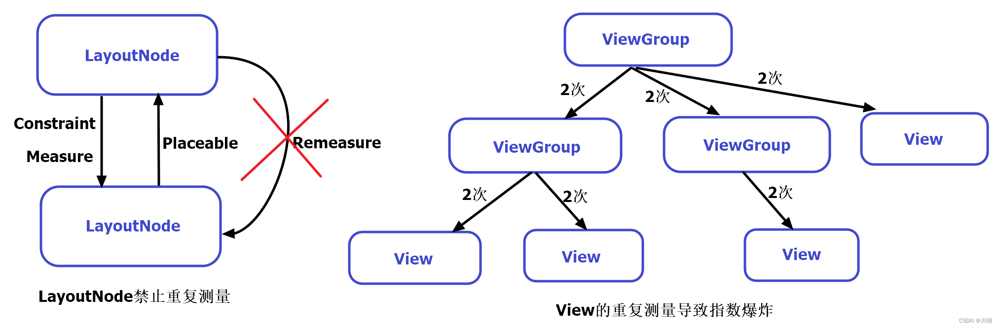
在Compose框架中,LayoutNode不允许被多次测量 ,换句话说就是每个子元素只允许被测量一次 。这意味着,你不能为了尝试不同的测量配置而多次测量任何子元素。在 Compose 的世界中,这个规则是强制性的,如果你不小心对某个子元素进行了多次测量,那么Compose会直接抛出异常 导致应用崩溃。但在传统View中,每个父View可以对子View进行一次或多次测量,因此很容易导致测量次数发生指数级爆炸。所以传统View的性能优化 点之一就是减少xml中布局的嵌套层级,而在Compose中组件的多级嵌套也不会导致此问题。这也是为什么Compose比传统View性能高的原因之一。
(x, y) 位置;也都有一个尺寸,指定为 width 和 height。
在界面树中每个节点的布局过程分为三个步骤:
测量所有子项
确定自己的尺寸
放置其子项
在测量完所有子元素的尺寸后,父元素才会对子元素进行摆放。在摆放时,系统会遍历视图树,执行所有的place命令。
第 3 阶段:绘制
绘制代码期间的状态读取会影响绘制阶段。常见示例包括 Canvas()、Modifier.drawBehind 和 Modifier.drawWithContent。当状态值 发生更改时,Compose 界面只会运行绘制阶段 。
1
2
3
4
5
6
7
var color by remember { mutableStateOf(Color.Red) }Canvas(modifier = modifier) { drawRect(color) }
使用 Modifier.layout() 自定义布局 当我们需要进行自定义布局时,首选推荐的就是Modifier.layout()修饰符,通过使用 Modifier.layout() 可以手动控制元素的测量和布局。
1
2
3
Modifier.layout { measurable, constraints -> ... }
当使用 Modifier.layout() 修饰符时,传入的回调 lambda 需要包含两个参数:measurable、constraints
measurablemeasure() 方法完成LayoutNode的测量。constraints
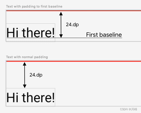
Modifier.layout() 使用示例 使用 Compose 的 Text 组件时,有时希望指定 Text 顶部到文本基线的高度,让文本看的更自然一些,使用内置的 padding 修饰符是无法满足需求的,因为padding 修饰符只能指定 Text 顶部到文本顶部的高度。虽然 Compose 已经提供了 paddingFromBaseline 修饰符来解决这个问题,不妨用 layout 修饰符来自己实现一个试试。
paddingBaselineToTop 的自定义修饰符,实现代码如下:
1
2
3
4
5
6
7
8
9
10
fun Modifier.paddingBaselineToTop (padding : Dp = 0. dp) val placeable = measurable.measure(constraints) check(placeable[FirstBaseline] != AlignmentLine.Unspecified) val firstBaseline = placeable[FirstBaseline] val paddingTop = padding.roundToPx() - firstBaseline layout(placeable.width, placeable.height + paddingTop) { placeable.placeRelative(0 , paddingTop) } }
接下来说明一下在上面代码中发生了什么:
正如前面布局阶段中所提到的,每个LayoutNode只允许被测量一次 ,这里使用了measurable.measure(constraints) 方法来完成子元素的测量,这里将父节点的 constraints 约束参数直接传入了子节点的 measure 方法中进行测量,这意味着:你将父节点的布局约束限制直接提供给了当前的子元素,自身没有增加任何额外的限制。
子元素测量的结果被包装在一个 Placeable 实例中,稍后即可通过该Placeable 实例来获取到刚刚子元素测量结果。
完成测量流程后,接下来就是布局过程,这需要调用 layout(width, height) 方法对当前元素的宽度与高度进行指定,这里将高度增加了paddingTop距离。
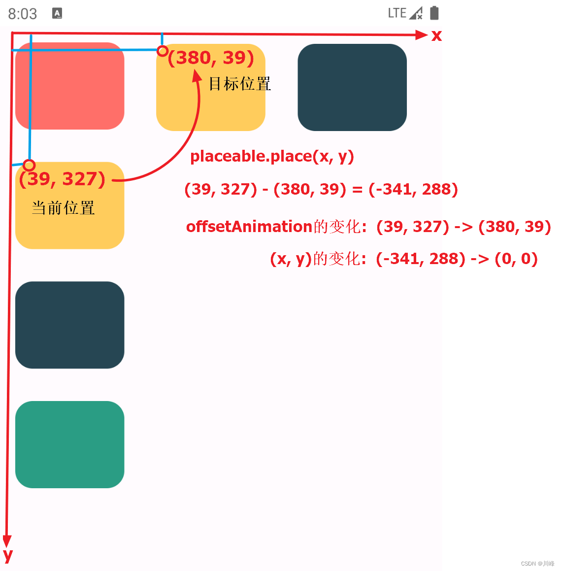
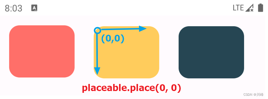
最后在 layout(){ } 的 lambda 中调用 placeable.place(x, y) 或 placeable.placeRelative(x, y) (支持RTL)进行位置摆放。
另外需要说明的一点是:作用域的使用决定了您可以衡量和放置子项的时机。即只能在测量和布局传递期间(即 MeasureScope 作用域中)测量布局 ,并且只能在布局传递期间(即 PlacementScope 作用域中)才能放置子项(且要在已进行测量之后) 。此操作在编译时强制执行,所以不用担心你的代码放错了地方,编译器会提醒你。
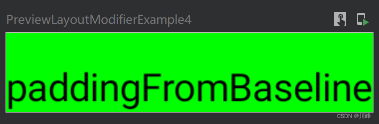
接下来预览一下效果:
1
2
3
4
5
6
7
8
@Preview @Composable fun LayoutModifierExample () Box(Modifier.background(Color.Green)){ Text(text = "paddingFromBaseline" , Modifier.paddingBaselineToTop(25. dp)) } }
在熟悉了layout修饰符的使用流程之后,就可以根据业务需求自己定义更多的自定义修饰符来使用。
例如,下面是实现自定义类似系统内置的offset修饰符的功能:
1
2
3
4
5
6
7
8
9
10
11
12
13
@Composable fun LayoutModifierExample () Box(Modifier.background(Color.Red)) { Text(text = "Offset" , Modifier.myOffset(5. dp)) } } fun Modifier.myOffset (x : Dp = 0. dp, y : Dp = 0. dp) val placeable = measurable.measure(constraints) layout(placeable.width, placeable.height) { placeable.placeRelative(x.roundToPx(), y.roundToPx()) } }
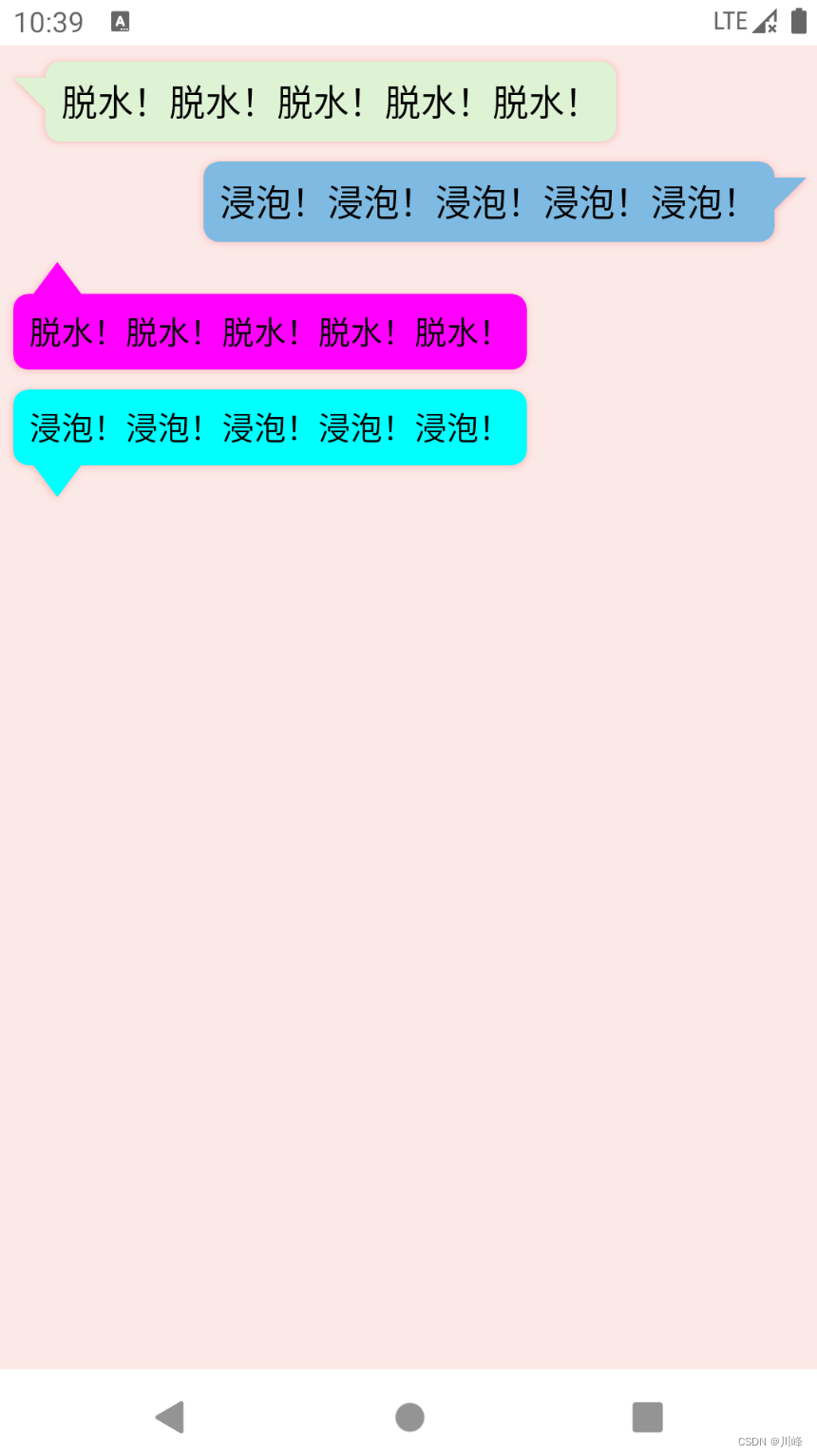
下面的例子实现了一个聊天对话框中消息气泡的效果:
1
2
3
4
5
6
7
8
9
10
11
12
13
14
15
16
17
18
19
20
21
22
23
24
25
26
27
28
29
30
31
32
33
34
35
36
37
38
39
40
41
42
43
44
45
46
47
48
49
50
51
52
53
54
55
56
57
58
59
60
61
62
63
64
65
66
67
68
69
70
71
72
73
74
75
76
77
78
79
80
81
82
83
84
85
86
87
88
89
90
91
92
93
94
95
96
97
98
99
100
101
102
103
104
105
106
107
108
109
110
111
112
113
114
115
116
117
118
119
120
121
122
123
124
125
126
127
128
@Composable fun BubbleBox ( modifier : Modifier = Modifier, text: String = "" , fontSize : TextUnit = 18. sp, textColor : Color = Color.Black, arrowWidth: Dp = 16. dp, arrowHeight: Dp = 16. dp, arrowOffset: Dp = 8. dp, arrowDirection: ArrowDirection = ArrowDirection.Left, elevation: Dp = 2. dp, backgroundColor: Color = Color(0xffE7FFDB ) padding: Dp = 8. dp ) { Box( modifier.drawBubble( arrowWidth = arrowWidth, arrowHeight = arrowHeight, arrowOffset = arrowOffset, arrowDirection = arrowDirection, elevation = elevation, color = backgroundColor ) .padding(padding) ) { Text(text = text, fontSize = fontSize, color = textColor) } } fun Modifier.drawBubble ( arrowWidth: Dp , arrowHeight: Dp , arrowOffset: Dp , arrowDirection: ArrowDirection , elevation: Dp = 0. dp, color: Color = Color.Unspecified ) val arrowWidthPx: Float = arrowWidth.toPx() val arrowHeightPx: Float = arrowHeight.toPx() val arrowOffsetPx: Float = arrowOffset.toPx() val shape = remember(arrowWidth, arrowHeight, arrowOffset, arrowDirection) { createBubbleShape(arrowWidthPx, arrowHeightPx, arrowOffsetPx, arrowDirection) } val shadowShapeModifier = Modifier.shadow(elevation, shape, spotColor = Color.Red, ambientColor = Color.Black) val shapeModifier = if (elevation > 0. dp) shadowShapeModifier else Modifier.clip(shape) Modifier.then(shapeModifier) .background(color, shape) .layout { measurable, constraints -> val isHorizontalArrow = arrowDirection == ArrowDirection.Left || arrowDirection == ArrowDirection.Right val isVerticalArrow = arrowDirection == ArrowDirection.Top || arrowDirection == ArrowDirection.Bottom val offsetX = if (isHorizontalArrow) arrowWidthPx.toInt() else 0 val offsetY = if (isVerticalArrow) arrowHeightPx.toInt() else 0 val placeable = measurable.measure( constraints.offset(horizontal = -offsetX, vertical = -offsetY) ) val width = constraints.constrainWidth(placeable.width + offsetX) val height = constraints.constrainHeight(placeable.height + offsetY) val posX = when (arrowDirection) { ArrowDirection.Left -> arrowWidthPx.toInt() else -> 0 } val posY = when (arrowDirection) { ArrowDirection.Top -> arrowHeightPx.toInt() else -> 0 } layout(width, height) { placeable.placeRelative(posX, posY) } } } enum class ArrowDirection { Left, Right, Top, Bottom }fun createBubbleShape ( arrowWidth: Float , arrowHeight: Float , arrowOffset: Float , arrowDirection: ArrowDirection ) return GenericShape { size: Size, layoutDirection: LayoutDirection -> val width = size.width val height = size.height val rect = RoundRect( rect = Rect(0f , 0f , width, height), cornerRadius = CornerRadius(x = 20f , y = 20f ) ) when (arrowDirection) { ArrowDirection.Left -> { moveTo(arrowWidth, arrowOffset) lineTo(0f , arrowOffset) lineTo(arrowWidth, arrowHeight + arrowOffset) addRoundRect(rect.copy(left = arrowWidth)) } ArrowDirection.Right -> { moveTo(width - arrowWidth, arrowOffset) lineTo(width, arrowOffset) lineTo(width - arrowWidth, arrowHeight + arrowOffset) addRoundRect(rect.copy(right = width - arrowWidth)) } ArrowDirection.Top -> { moveTo(arrowOffset, arrowHeight) lineTo(arrowOffset + arrowWidth / 2 , 0f ) lineTo(arrowOffset + arrowWidth, arrowHeight) addRoundRect(rect.copy(top = arrowHeight)) } ArrowDirection.Bottom -> { moveTo(arrowOffset, height - arrowHeight) lineTo(arrowOffset + arrowWidth / 2 , height) lineTo(arrowOffset + arrowWidth, height - arrowHeight) addRoundRect(rect.copy(bottom = height - arrowHeight)) } } } }
使用:
1
2
3
4
5
6
7
8
9
10
11
12
13
14
15
16
17
18
19
20
21
22
23
24
25
26
27
28
29
30
31
32
33
34
35
36
37
38
39
40
41
42
43
44
45
46
47
48
49
@Composable fun BubbleBoxExample () Column( modifier = Modifier.background(Color(0xffFBE9E7 )).padding(8. dp).fillMaxWidth() ) { val message1 = "脱水!" .repeat(10 ) val message2 = "浸泡!" .repeat(10 ) BubbleBox( text = message1, arrowWidth = 16. dp, arrowHeight = 16. dp, arrowOffset = 8. dp, arrowDirection = ArrowDirection.Left, backgroundColor = Color(0xFFDEF3D4 ), ) Spacer(Modifier.height(10. dp)) Box(modifier = Modifier.fillMaxWidth()) { BubbleBox( text = message2, modifier = Modifier.align(Alignment.CenterEnd), arrowWidth = 16. dp, arrowHeight = 16. dp, arrowOffset = 8. dp, arrowDirection = ArrowDirection.Right, backgroundColor = Color(0xFF7EBAE2 ), ) } Spacer(Modifier.height(10. dp)) BubbleBox( text = message1, fontSize = 16. sp, arrowWidth = 24. dp, arrowHeight = 16. dp, arrowOffset = 10. dp, arrowDirection = ArrowDirection.Top, backgroundColor = Color.Magenta, ) Spacer(Modifier.height(10. dp)) BubbleBox( text = message2, fontSize = 16. sp, arrowWidth = 24. dp, arrowHeight = 16. dp, arrowOffset = 10. dp, arrowDirection = ArrowDirection.Bottom, backgroundColor = Color.Cyan, ) } }
显示效果:
使用 Layout 组件自定义布局 除了Modifier.layout()修饰符,Compose 还提供了一个叫 Layout 的 Composable 组件,可以直接在 Composable 函数中调用,方便自定义布局。
前面的 Layout Modifier 似于传统 View 系统的 View 单元定制,而对于 “ViewGroup” 场景的定制,就需要使用 Layout 组件了。
1
2
3
4
5
6
7
8
9
10
11
12
13
@Composable fun CustomLayout ( modifier: Modifier = Modifier, content: @Composable () -> Unit ) Layout( modifier = modifier, content = content ) { measurables, constraints -> } }
可以看到,Layout 需要填写三个参数:modifier,content,measurePolicy
modifiercontentmeasurePolicymeasure 方法即可,上面示例中最后传入的 lambda 就是 measure 方法的实现。
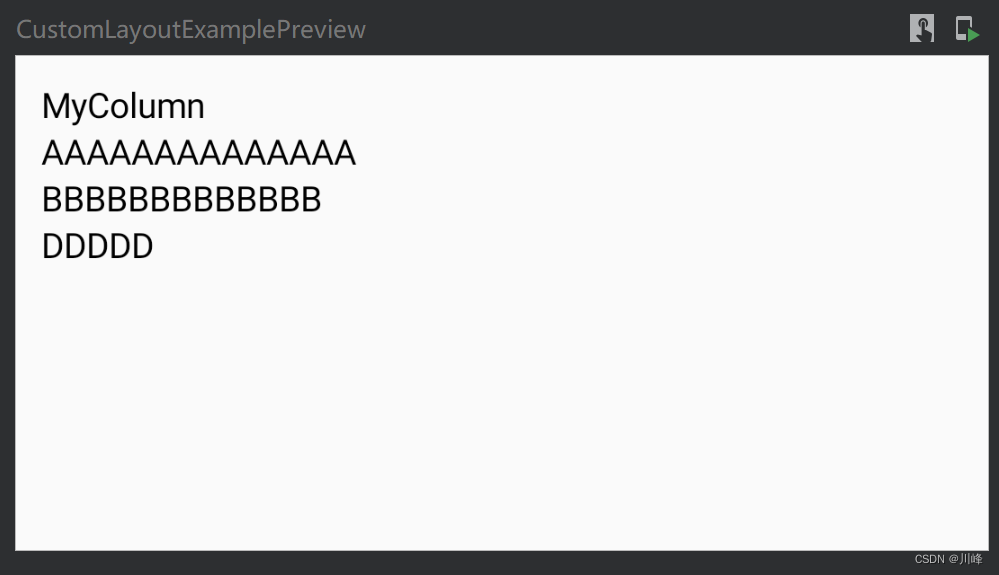
Layout 组件使用示例 下面通过 Layout 组件定制一个自己专属的 Column ,下面是实现代码:
1
2
3
4
5
6
7
8
9
10
11
12
13
14
15
@Composable fun MyColumn (modifier: Modifier = Modifier, content: @Composable () -> Unit ) Layout(content = content, modifier = modifier) { measurables, constraints -> val placeables = measurables.map { measurable -> measurable.measure(constraints) } var yOffset = 0 layout(constraints.maxWidth, constraints.maxHeight) { placeables.forEach { placeable -> placeable.placeRelative(x = 0 , y = yOffset) yOffset += placeable.height } } } }
和 Modifier.layout()修饰符一样,我们需要对所有子组件进行一次测量。切记,每个子元素只允许被测量一次 。
与Modifier.layout()修饰符不同的是,这里 Layout 组件的 measurePolicy提供的 measure 方法反回的 measurables 是一个 List,而在layout修饰符中则只是一个 measurable,因为它将所有子元素看作了一个整体。
在上面的示例中仍然不对子元素进行额外限制,最终将测量的结果保存到一个 placeables 的 List 中。 出于简单考虑,在调用 layout(width, height) 方法时,选择将宽度与高度设置为其父元素所允许的最大高度与宽度。 在调用placeable.placeRelative(x, y)摆放子元素的时候,由于 Column 是需要将子元素进行垂直排列的,所以仅需简单的将y坐标堆叠起来即可。
使用方式:
1
2
3
4
5
6
7
8
9
@Composable fun CustomLayoutExample () MyColumn(Modifier.padding(10. dp)) { Text(text = "MyColumn" ) Text(text = "AAAAAAAAAAAAAA" ) Text(text = "BBBBBBBBBBBBB" ) Text(text = "DDDDD" ) } }
预览一下效果:
1
2
3
4
5
6
7
@Preview(showBackground = true) @Composable fun CustomLayoutExamplePreview () Box(Modifier.height(200. dp)) { CustomLayoutExample() } }
前面提到 Layout 组件得到的 measurables 是一个 List,如果想从这个列表中查找某个子元素进行测量,可以通过为每个元素指定一个layoutId来查找,例如:
1 2 3 4 5 6 7 8 9 10 MyLayout(Modifier.fillMaxWidth().border(1. dp, Color.Cyan)) { Image( modifier = Modifier.size(150. dp).layoutId("image" ), ... ) Text( modifier = Modifier.border(2. dp, Color.Red).layoutId("text" ), text = "Hello world" ) }
1
2
3
4
5
6
7
8
9
10
11
12
13
14
15
16
17
18
19
20
21
@Composable private fun MyLayout (modifier: Modifier = Modifier, content: @Composable () -> Unit ) Layout(modifier = modifier, content = content) { measurables, constraints -> val imagePlaceable = measurables.firstOrNull { it.layoutId == "image" }?.measure( constraints.copy(minWidth = 0 , minHeight = 0 ) ) val textPlaceable = measurables.firstOrNull { it.layoutId == "text" }?.measure( constraints.copy( minWidth = imagePlaceable?.width ?: constraints.minWidth, maxWidth = imagePlaceable?.width ?: constraints.maxWidth ) ) val width = imagePlaceable?.width ?: constraints.minWidth val imagePlaceableHeight = imagePlaceable?.height ?: 0 val height = imagePlaceableHeight + (textPlaceable?.height ?: 0 ) layout(width, height) { imagePlaceable?.placeRelative(0 , 0 ) textPlaceable?.placeRelative(0 , imagePlaceableHeight) } } }
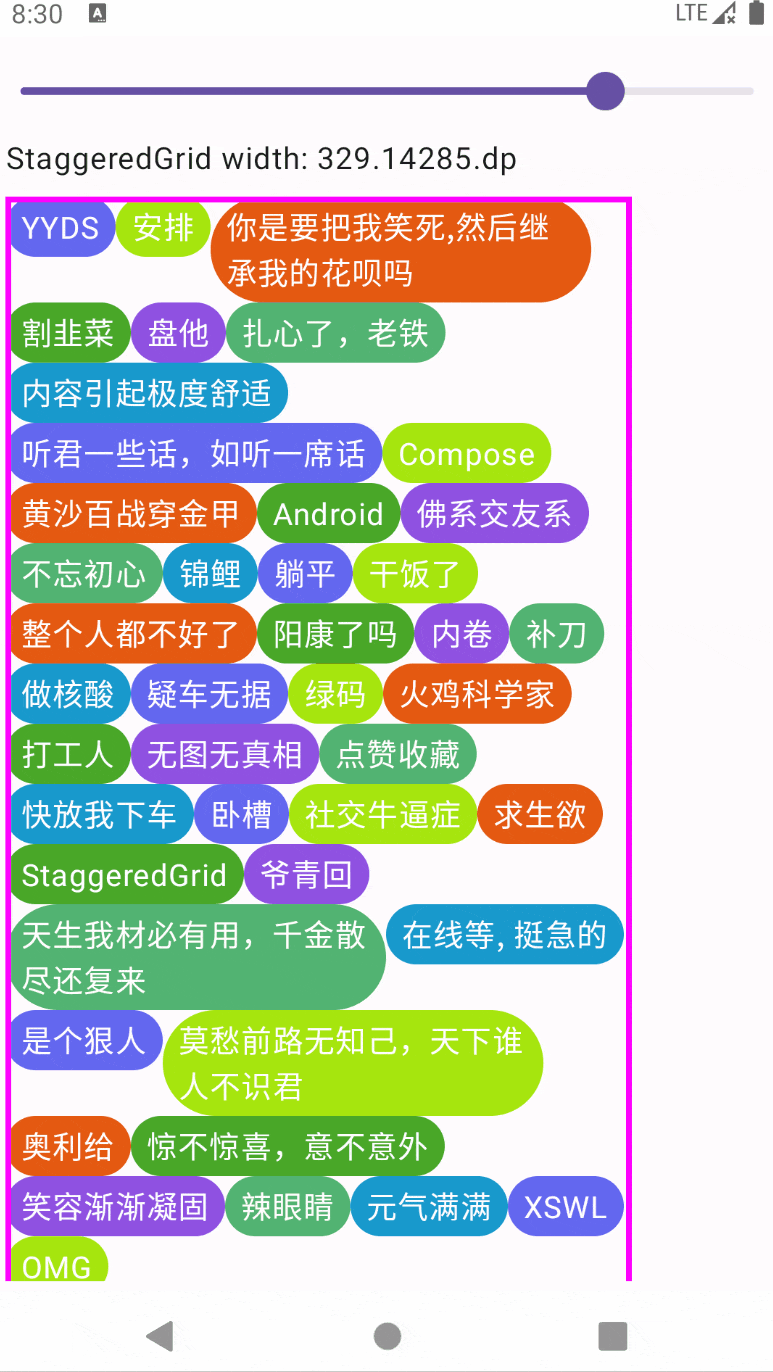
再来看一个例子,下面代码使用 Layout 组件实现了一个 StaggeredGrid 瀑布流布局,它根据上一行组件的最大高度来对齐下一行的组件,并且自动换行显示:
1
2
3
4
5
6
7
8
9
10
11
12
13
14
15
16
17
18
19
20
21
22
23
24
25
26
27
28
29
30
31
32
33
34
35
36
37
38
39
40
41
42
43
44
45
46
47
48
49
50
51
52
53
54
55
56
57
58
59
60
61
62
63
64
65
@Composable fun StaggeredGrid (modifier: Modifier = Modifier, content: @Composable () -> Unit ) Layout(content = content, modifier = modifier) { measurables, constraints -> val constraintMaxWidth = constraints.maxWidth var maxRowWidth = 0 var currentWidthOfRow = 0 var totalHeightOfRows = 0 val placeableMap = linkedMapOf<Int , Point>() val rowHeights = mutableListOf<Int >() var maxPlaceableHeight = 0 var lastRowHeight = 0 val placeables = measurables.mapIndexed { index, measurable -> val placeable = measurable.measure( constraints.copy(minWidth = 0 , maxWidth = Constraints.Infinity) ) val placeableWidth = placeable.width val placeableHeight = placeable.height val isSameRow = (currentWidthOfRow + placeableWidth <= constraintMaxWidth) val xPos = if (isSameRow) currentWidthOfRow else 0 val yPos: Int if (isSameRow) { currentWidthOfRow += placeableWidth maxPlaceableHeight = maxPlaceableHeight.coerceAtLeast(placeableHeight) maxRowWidth = maxRowWidth.coerceAtLeast(currentWidthOfRow) lastRowHeight = maxPlaceableHeight yPos = totalHeightOfRows } else { currentWidthOfRow = placeableWidth totalHeightOfRows += maxPlaceableHeight yPos = totalHeightOfRows rowHeights.add(maxPlaceableHeight) maxPlaceableHeight = placeableHeight lastRowHeight = maxPlaceableHeight } placeableMap[index] = Point(xPos, yPos) placeable } val totalHeight = (rowHeights.sumOf { it } + lastRowHeight) val finalHeight = constraints.constrainHeight(totalHeight) maxRowWidth = constraints.constrainWidth(maxRowWidth) layout(maxRowWidth, finalHeight) { placeables.forEachIndexed { index, placeable -> val point = placeableMap[index] point?.let { placeable.placeRelative(x = it.x, y = it.y) } } } } }
测试代码如下:
1
2
3
4
5
6
7
8
9
10
11
12
13
14
15
16
17
18
19
20
21
22
23
24
25
26
27
28
29
30
31
32
33
34
35
36
37
38
39
40
41
42
43
@Composable fun StaggeredGridExample (tips: List <String >) val screenWidth = Resources.getSystem().displayMetrics.widthPixels.toFloat() var width by remember { mutableStateOf(screenWidth*0.8f ) } Column(Modifier.padding(5. dp).fillMaxSize().verticalScroll(rememberScrollState())) { Slider(value = width, onValueChange = {width = it}, valueRange = 0f ..screenWidth) Text("StaggeredGrid width: ${width.toDp()} " ) Spacer(modifier = Modifier.height(10. dp)) StaggeredGrid( Modifier .width(width.toDp()) .border(3. dp, Color.Magenta) ) { tips.shuffled().forEachIndexed { index, tip -> Box( Modifier .clip(RoundedCornerShape(50 )) .background(colors[index % colors.size]) .widthIn(min = 50. dp, max = 200. dp), contentAlignment = Alignment.Center ) { Text( text = tip, color = Color.White, modifier = Modifier.padding(horizontal = 8. dp, vertical = 5. dp) ) } } } } } @Composable fun StaggeredGridExampleTest () val tips = listOf("Compose" , "Android" , "扎心了,老铁" , "干饭了" , "内卷" , "StaggeredGrid" , "锦鲤" , "整个人都不好了" , "卧槽" , "无图无真相" , "点赞收藏" , "在线等, 挺急的" , "打工人" , "是个狠人" , "佛系交友" , "火鸡科学家" , "你是要把我笑死,然后继承我的花呗吗" , "补刀" , "求生欲" , "辣眼睛" , "天生我材必有用,千金散尽还复来" , "不忘初心" , "割韭菜" , "惊不惊喜,意不意外" , "社交牛逼症" , "安排" , "YYDS" , "奥利给" , "内容引起极度舒适" , "OMG" , "笑容渐渐凝固" , "XSWL" , "莫愁前路无知己,天下谁人不识君" , "疑车无据" , "快放我下车" , "听君一些话,如听一席话" , "盘他" , "躺平" , "阳康了吗" , "做核酸" , "绿码" , "爷青回" , "元气满满" , "黄沙百战穿金甲" ) StaggeredGridExample(tips) }
为了查看自定义的StaggeredGrid在不同宽度下的表现,所以这里使用了Slider动态控制StaggeredGrid的宽度,实际中你可以直接对StaggeredGrid应用fillMaxWidth()或固定宽度值。
运行效果如下:
下面是本示例代码实现的核心要点:
测量每个Child时,不对其宽度进行约束限制,每个Child可以自由决定自己显示多大。
如何实现自动换行:逐步累加每一个Child的宽度,当宽度超过父约束的最大宽度值时,就应该另起一行放置该Child,否则该Child就放在同一行。
每个Child的x轴坐标计算:如果是同一行的Child,x坐标就是不断累加的当前行的总宽度,如果是另起一行的Child,则x坐标就是0。
每个Child的y轴坐标计算:每次换到下一行时,累加上一行中的最大高度值。如果Child没有换行,则y坐标就是这个累加的值。
StaggeredGrid的总宽度计算:所有行中的宽度总和的最大值,即最长的那一行。注意需要使用父约束对象对总宽度进行约束,防止溢出。
StaggeredGrid的总高度计算:在每次换行时,收集上一行中的最大高度值到一个List集合中,最后累加起来,但是由于是换到下一行时才会收集上一行的,因此最后会缺少一行的最大高度,因此记得要把最后一行的高度算进去。同样注意需要使用父约束对象对总高度进行约束,防止溢出。
Layout / Modifier.layout 小结 最后,针对 Modifier.layout() 修饰符和 Layout 组件的使用进行一个简要总结(因为二者在使用上是类似的):
并且我再次补充说明一下 Modifier.layout() 修饰符和 Layout 组件之间的使用区别:前者主要用于针对单个组件的定制,因为这时可能我们想要的不是在一个容器内包装很多个复杂的子组件,而是针对某个组件单元应用一些自定义的效果;而后者悄悄相反,这时说明我们的自定义组件使用到多个子组件,并需要处理它们之间的关系。
Constraints 约束详解 在 Jetpack Compose 中自定义布局时,需要永远记住的一条黄金法则就是:父组件向子组件传递约束条件,子组件根据父组件传递的约束条件来决定如何测量子元素。
约束条件限制了元素的 width 和 height 的最小值和最大值。如果某个元素拥有子元素,它可能会测量每个子元素,以帮助确定其尺寸。
约束条件会在整个视图树中从上往下进行传递,而测量结果的尺寸大小(表现为 placeable 对象)则会沿着视图树从下向上反馈:
只有在所有子元素测量完确定了尺寸大小之后,父组件才知道该如何摆放它们(执行place操作)。
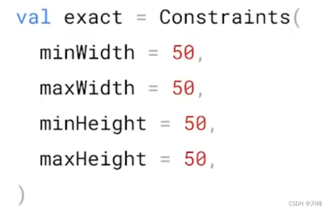
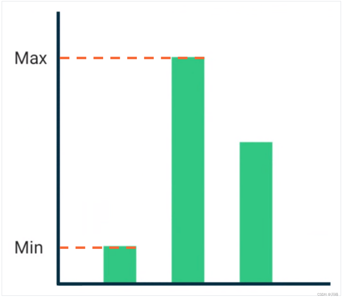
约束条件由 Constraints 对象表示,它包含了如下四个值:
下面通过以下示例代码来理解一下约束条件的传递对结果的影响:
1
2
3
4
5
6
7
8
9
10
11
12
13
14
15
16
17
18
19
20
21
22
23
24
25
26
27
28
29
30
31
32
33
34
35
36
37
38
39
40
41
42
43
44
45
46
47
@Composable private fun CustomColumnWithDefaultConstraints ( modifier: Modifier , content: @Composable () -> Unit ) Layout( modifier = modifier, content = content ) { measurables: List<Measurable>, constraints: Constraints -> createCustomColumnLayout(measurables, constraints, constraints) } } private fun MeasureScope.createCustomColumnLayout ( measurables: List <Measurable >, constraints: Constraints , updatedConstraints: Constraints ) val placeables = measurables.map { measurable -> measurable.measure(updatedConstraints) } val totalHeight = placeables.sumOf { it.height } val contentWidth = constraints.maxWidth return layout(contentWidth, totalHeight) { var y = 0 placeables.forEach { placeable -> placeable.placeRelative(x = 0 , y = y) y += placeable.height } } }
使用方式,例如:
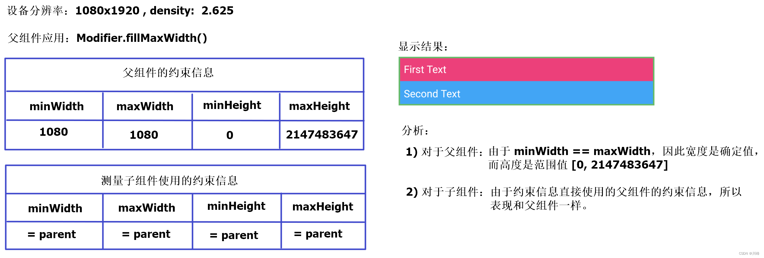
1
2
3
CustomColumnWithDefaultConstraints( modifier = Modifier.fillMaxWidth().border(2. dp, Green400) ) { Content() }
1
2
3
4
5
6
7
8
9
10
11
12
13
14
15
@Composable private fun Content () Text( "First Text" , modifier = Modifier .background(Pink400).padding(8. dp), color = Color.White ) Text( "Second Text" , modifier = Modifier .background(Blue400).padding(8. dp), color = Color.White ) }
其中为父组件添加了一个绿色的边框,为两个子组件添加了不同的背景色,以便区分。
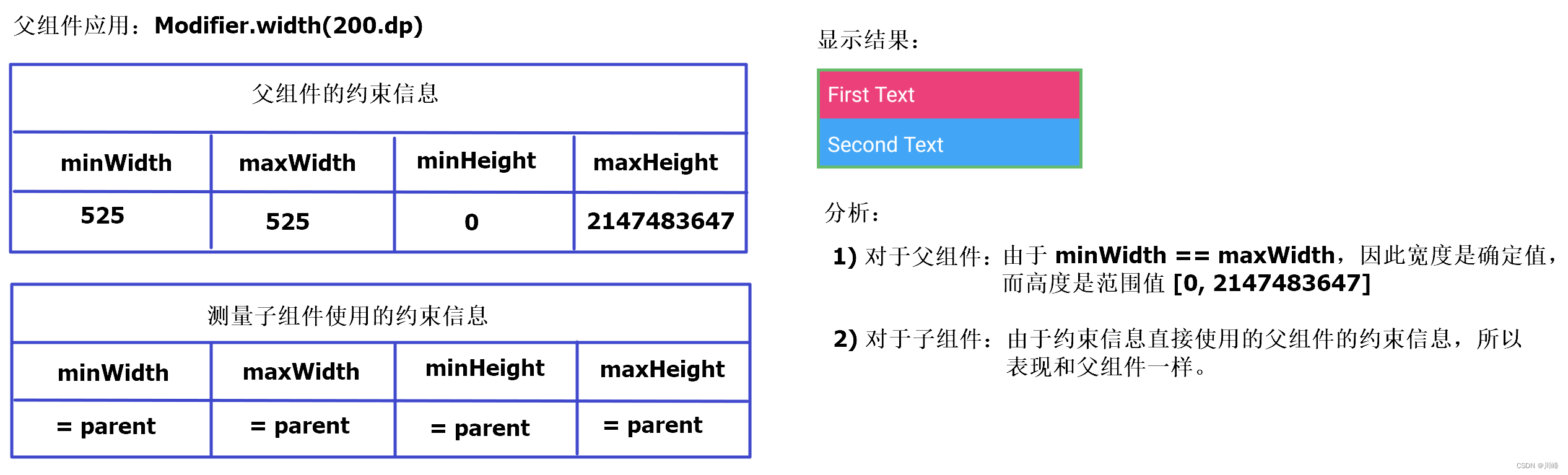
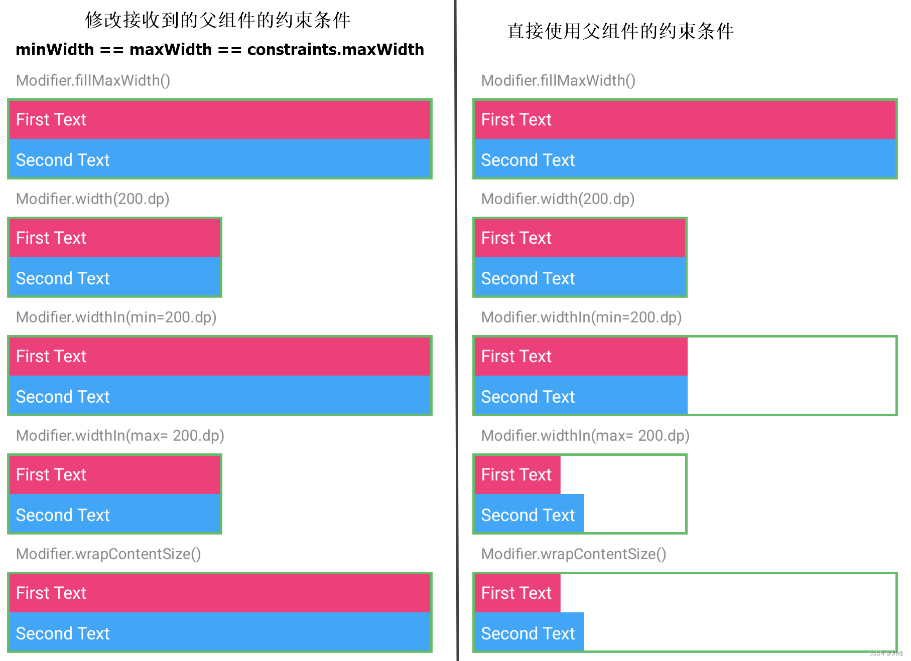
下面通过尝试在 CustomColumnWithDefaultConstraints 组件的 Modifier 上应用不同的尺寸约束条件,观察并分析结果:
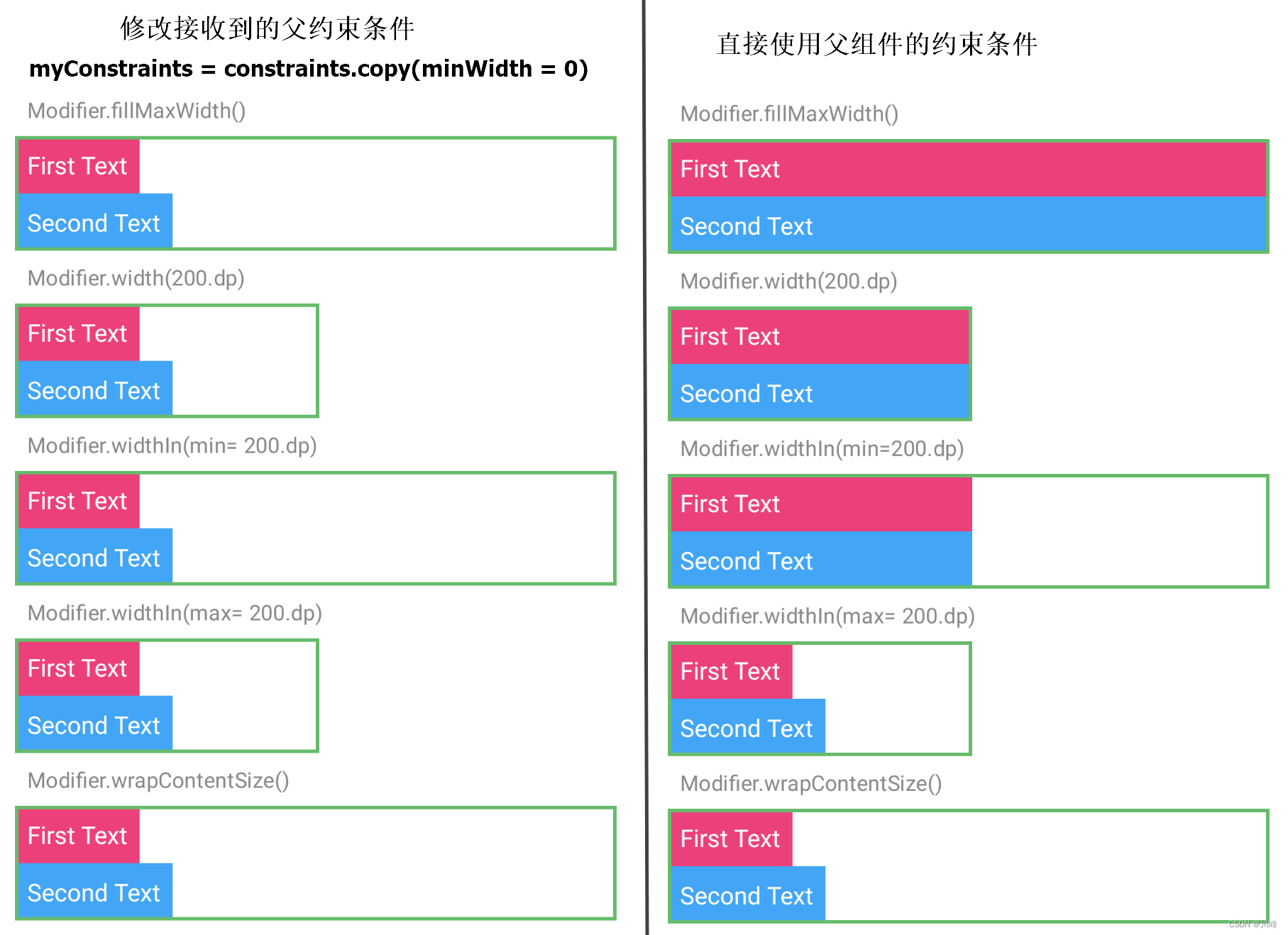
下面修改一下代码,自定义Layout组件测量子元素使用的约束条件不再直接使用父组件传入的约束条件,而是进行一些修改,比如将最大最小宽度值全部强制设为使用父约束的最大宽度值:
1
2
3
4
5
6
7
8
9
10
11
12
13
14
15
16
@Composable private fun CustomColumnWithCustomConstraints ( modifier: Modifier , content: @Composable () -> Unit ) Layout( modifier = modifier, content = content ) { measurables: List<Measurable>, constraints: Constraints -> val updatedConstraints = constraints.copy( minWidth = constraints.maxWidth, maxWidth = constraints.maxWidth ) createCustomColumnLayout(measurables, constraints, updatedConstraints) } }
其中 createCustomColumnLayout 方法和前面的一样。
调用方式还是和前面类似:
1
2
3
4
5
CustomColumnWithCustomConstraints( modifier = Modifier .wrapContentSize() .border(2. dp, Green400) ) { Content() }
同样通过尝试在 CustomColumnWithDefaultConstraints 组件的 Modifier 上应用不同的尺寸约束条件,观察并分析结果:
跟前面一样进行其他几种情况的应用后发现,结果都类似,所以这里只列出这一种情况的分析结果。因为子组件的约束信息都使用了固定宽度值来测量,测量结果的宽度总是保持和父组件的maxWidth一致。可以通过下图进行对比:
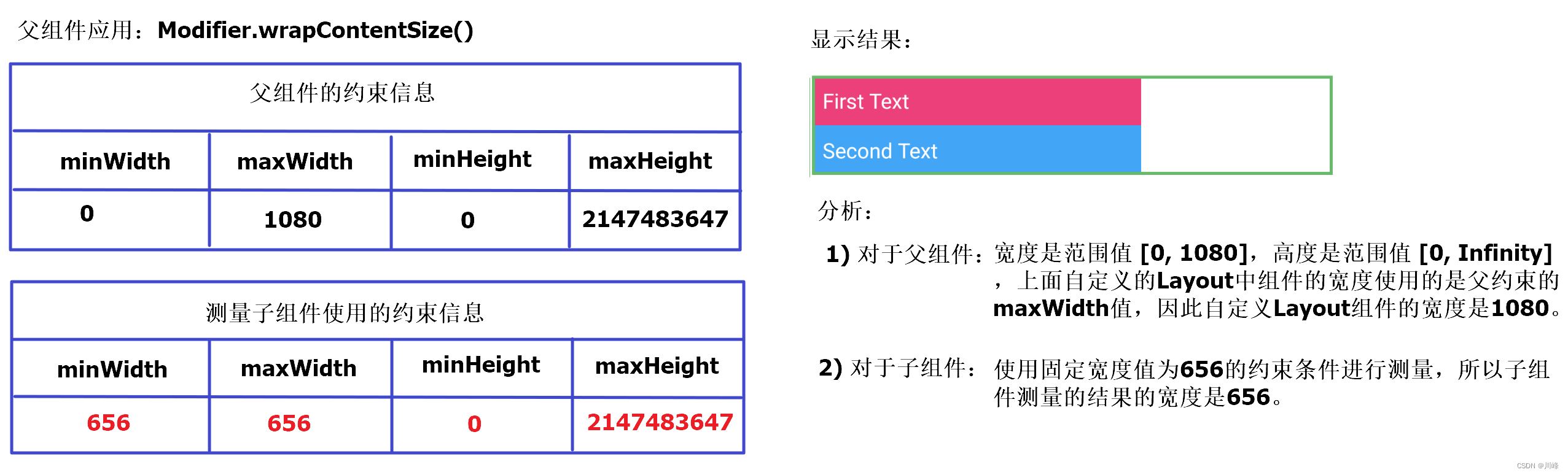
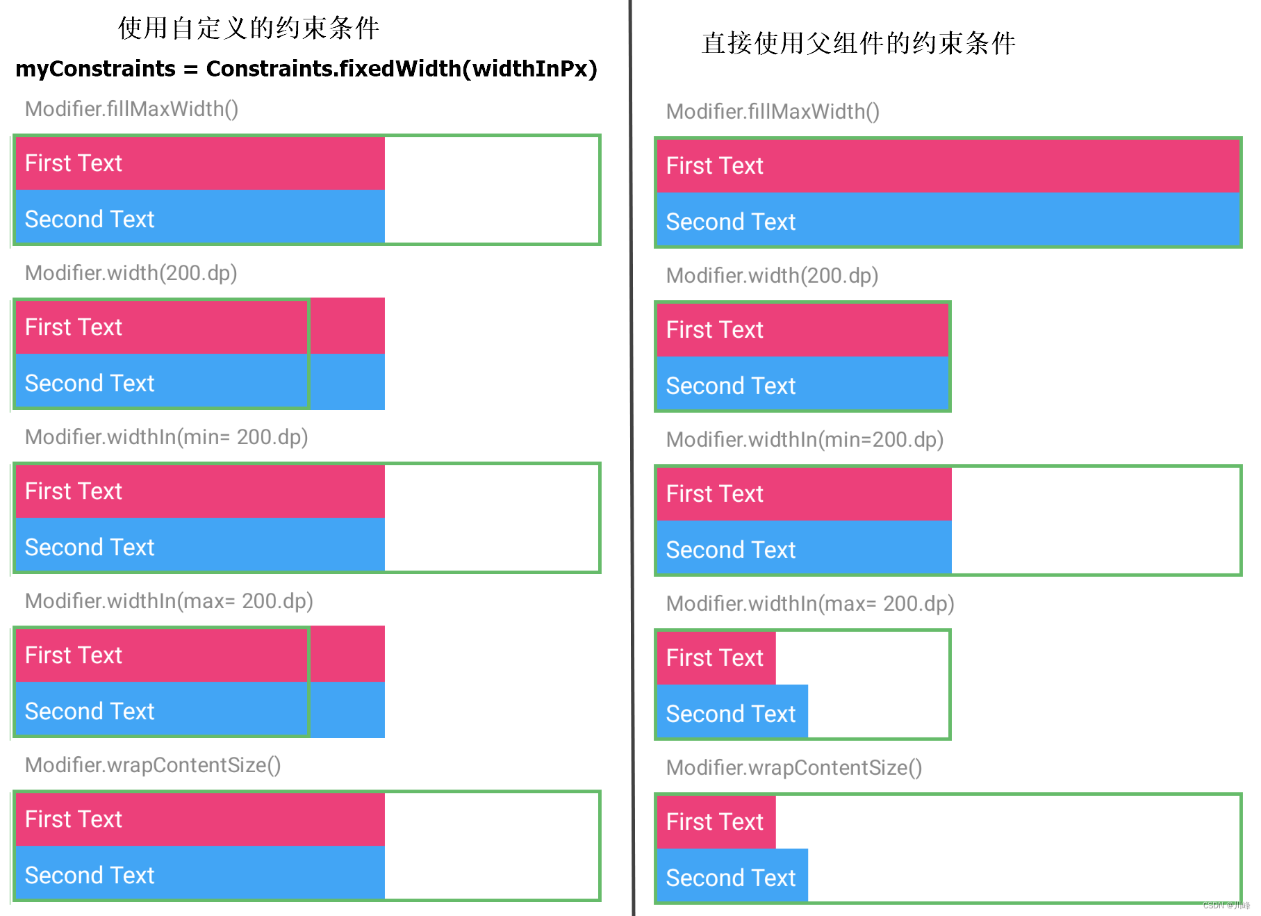
1
2
3
4
5
6
7
8
9
10
11
12
13
14
@Composable private fun CustomColumnWithCustomConstraints2 ( modifier: Modifier , content: @Composable () -> Unit ) val widthInPx = with(LocalDensity.current) { 250. dp.roundToPx() } Layout( modifier = modifier, content = content ) { measurables: List<Measurable>, constraints: Constraints -> val updatedConstraints = Constraints.fixedWidth(widthInPx) createCustomColumnLayout(measurables, constraints, updatedConstraints) } }
注意这里使用了 Constraints.fixedWidth() 来创建约束对象,它的内部源码实现是将 minWidth 和 maxWidth 修改为传入的宽度值,而 minHeight 保持默认值 0, maxHeight 保持默认值 Infinity :
1
2
3
4
5
6
7
8
9
10
11
12
13
14
@Stable fun fixedWidth ( width: Int ) require(width >= 0 ) { "width($width ) must be >= 0" } return createConstraints( minWidth = width, maxWidth = width, minHeight = 0 , maxHeight = Infinity ) }
使用代码跟之前一样,仍然以父组件应用Modifier.wrapContentSize() 的情况进行分析:
跟前面一样进行其他几种情况的应用后发现,结果都类似, 因为子组件的约束信息都使用了固定宽度值来测量,测量结果的宽度总是固定的,无论父组件的约束条件如何。也就是说这种情况下跟父组件没啥关系了,可以通过下图进行对比:
尝试更多的约束修改,效果跟之前对比如下:
Constraints 中的约束边界 Bounds 在使用 Layout 自定义布局时,用于测量子元素 measurables 的 Constraints 对象决定了子元素的大小,而设置 layout(width, height) { } 方法中的宽度值则会决定 Layout 组件在其父组件中的位置和其覆盖范围的大小。
当 Layout 组件的宽度不在其所接受的约束条件的 [Constraints.minWidth, Constraints.maxWidth] 范围内时, Layout 组件会被放置在-(layout.width-Constraints.maxWidth)/2或-(layout.width-Constraints.minWidth)/2 位置。
下面看几个例子来理解一下
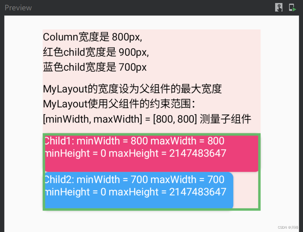
1
2
3
4
5
6
7
8
9
10
11
12
13
14
15
16
17
18
19
20
21
22
23
24
25
26
27
28
29
30
31
32
33
34
35
36
37
38
39
40
41
42
43
44
45
46
47
48
49
50
51
52
53
54
55
56
57
58
59
60
61
62
63
64
65
66
67
68
69
70
71
72
73
@Composable fun ConstraintsExample () Column( modifier = Modifier .padding(8. dp) .background(Color(0xffFBE9E7 )) .width(800f .toDp()) .fillMaxHeight(), verticalArrangement = Arrangement.spacedBy(10. dp) ) { Text("Column宽度是 800px, \n红色child宽度是 900px, \n蓝色child宽度是 700px" ) Text("MyLayout的宽度设为父组件的最大宽度\n" + "MyLayout使用父组件的约束范围:\n[minWidth, maxWidth] = [800, 800] 测量子组件" ) MyLayout(Modifier.border(3. dp, Green400)) { Content() } } } @Composable private fun MyLayout (modifier: Modifier = Modifier, content: @Composable () -> Unit ) Layout(modifier = modifier, content = content) { measurables, constraints -> val placeables = measurables.map { it.measure(constraints) } val totalHeight = placeables.sumOf { it.height } layout(constraints.maxWidth, totalHeight) { var y = 0 placeables.forEach { placeable -> placeable.placeRelative(0 , y) y += placeable.height } } } } @Composable private fun Content () val density = LocalDensity.current val child1Width = with(density) { 900f .toDp() } val child2Width = with(density) { 700f .toDp() } BoxWithConstraints( modifier = Modifier .shadow(2. dp, RoundedCornerShape(8. dp)) .width(child1Width) .background(Pink400) ) { Text("Child1: minWidth = ${constraints.minWidth} " + "maxWidth = ${constraints.maxWidth} \n" + "minHeight = ${constraints.minHeight} " + "maxHeight = ${constraints.maxHeight} \n" , color = Color.White) } BoxWithConstraints( modifier = Modifier .shadow(2. dp, RoundedCornerShape(8. dp)) .width(child2Width) .background(Blue400) ) { Text("Child2: minWidth = ${constraints.minWidth} " + "maxWidth = ${constraints.maxWidth} \n" + "minHeight = ${constraints.minHeight} " + "maxHeight = ${constraints.maxHeight} \n" , color = Color.White) } } @Preview(showBackground = true) @Composable fun Preview () Column( modifier = Modifier .padding(10. dp) .fillMaxSize() .verticalScroll(rememberScrollState()), horizontalAlignment = Alignment.CenterHorizontally ) { ConstraintsExample() } }
显示效果:
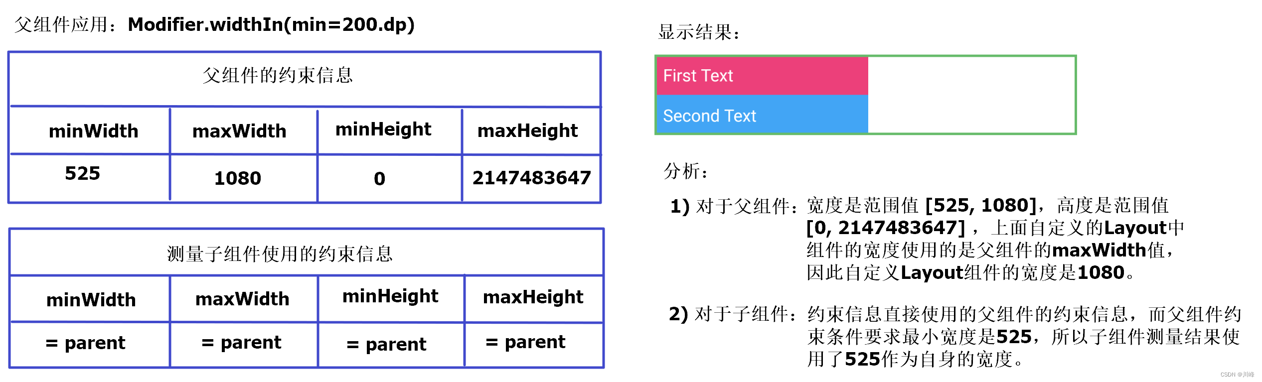
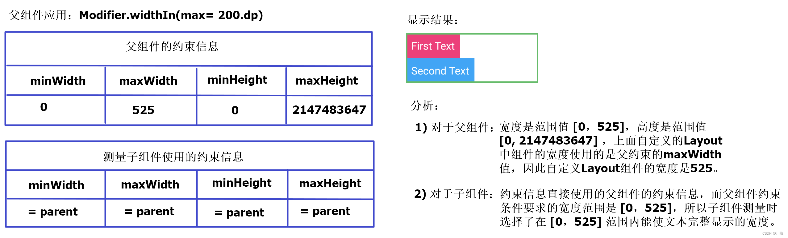
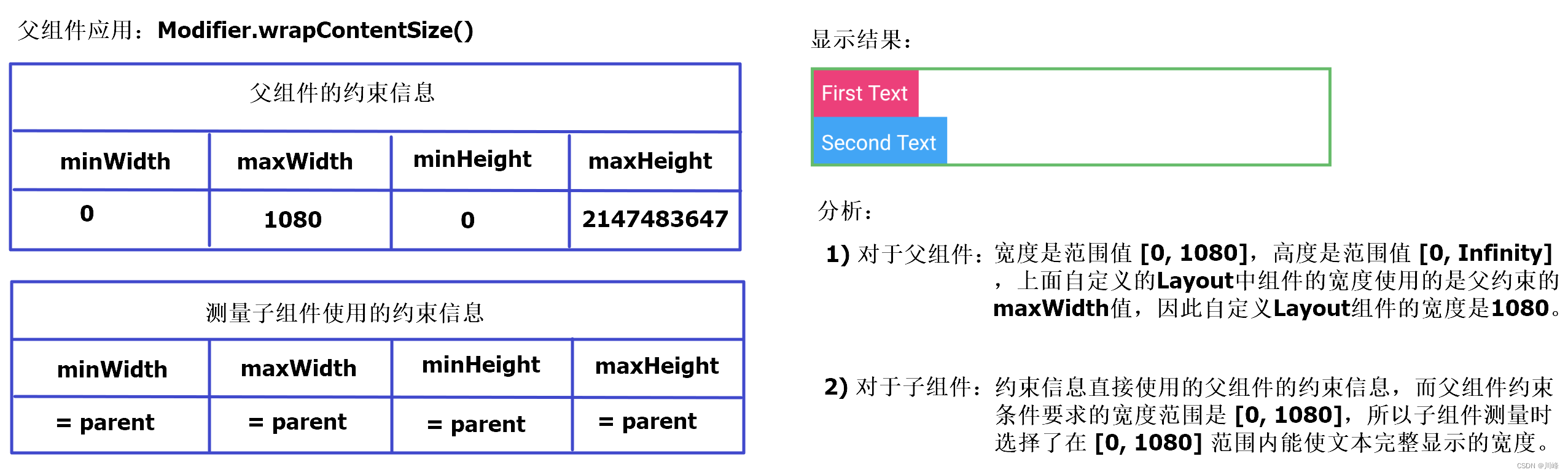
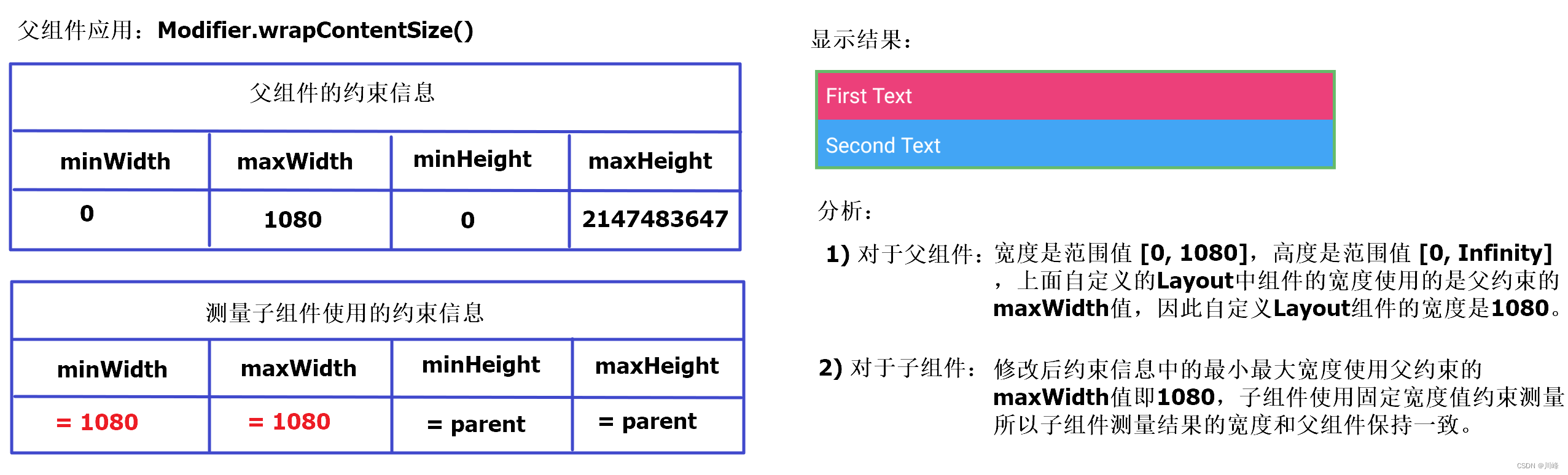
在上面代码中,
Column组件的宽度设置为800pxColumn包含的 MyLayout 组件的宽度设置为使用父组件的最大宽度即也是800pxMyLayout 直接使用父组件的约束信息即[minWidth, maxWidth] = [800, 800]测量子组件。红色Child的宽度设置为900px, 但超出了 MyLayout 的约束范围,所以最终宽度被限制为800px。蓝色Child的宽度设置为700px, 么有超出 MyLayout 的约束范围,所以最终宽度为700px。
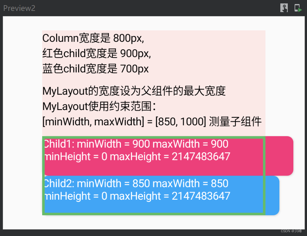
下面修改一下MyLayout测量子组件的约束范围,改为 [minWidth, maxWidth] = [850, 1000]:
1
2
3
4
5
6
7
8
9
10
11
12
13
14
15
16
17
18
19
20
21
22
23
24
25
26
27
28
29
30
31
32
@Composable fun ConstraintsExample2 () Column( modifier = Modifier .padding(8. dp) .background(Color(0xffFBE9E7 )) .width(800f .toDp()) .fillMaxHeight(), verticalArrangement = Arrangement.spacedBy(10. dp) ) { Text("Column宽度是 800px, \n红色child宽度是 900px, \n蓝色child宽度是 700px" ) Text("MyLayout的宽度设为父组件的最大宽度\n" + "MyLayout使用约束范围:\n[minWidth, maxWidth] = [850, 1000] 测量子组件" ) MyLayout2(Modifier.border(3. dp, Green400)) { Content() } } } @Composable private fun MyLayout2 (modifier: Modifier = Modifier, content: @Composable () -> Unit ) Layout(modifier = modifier, content = content) { measurables, constraints -> val updatedConstraints = constraints.copy(minWidth = 850 , maxWidth = 1000 ) val placeables = measurables.map { it.measure(updatedConstraints) } val totalHeight = placeables.sumOf { it.height } layout(constraints.maxWidth, totalHeight) { var y = 0 placeables.forEach { placeable -> placeable.placeRelative(0 , y) y += placeable.height } } } }
显示效果:
在上面代码中,
Column组件的宽度设置为800pxColumn包含的 MyLayout 组件的宽度设置为使用父组件的最大宽度即也是800pxMyLayout 使用约束范围[minWidth, maxWidth] = [850, 1000]测量子组件。红色Child的宽度设置为900px, 未超出 MyLayout 的约束范围,所以最终宽度显示为900px。这超过了Column组件的宽度,所以会在Column组件中溢出显示。蓝色Child的宽度设置为700px, 超出了 MyLayout 的约束范围,所以最终宽度使用父约束范围要求的下界即850px。这超过了Column组件的宽度,所以会在Column组件中溢出显示。
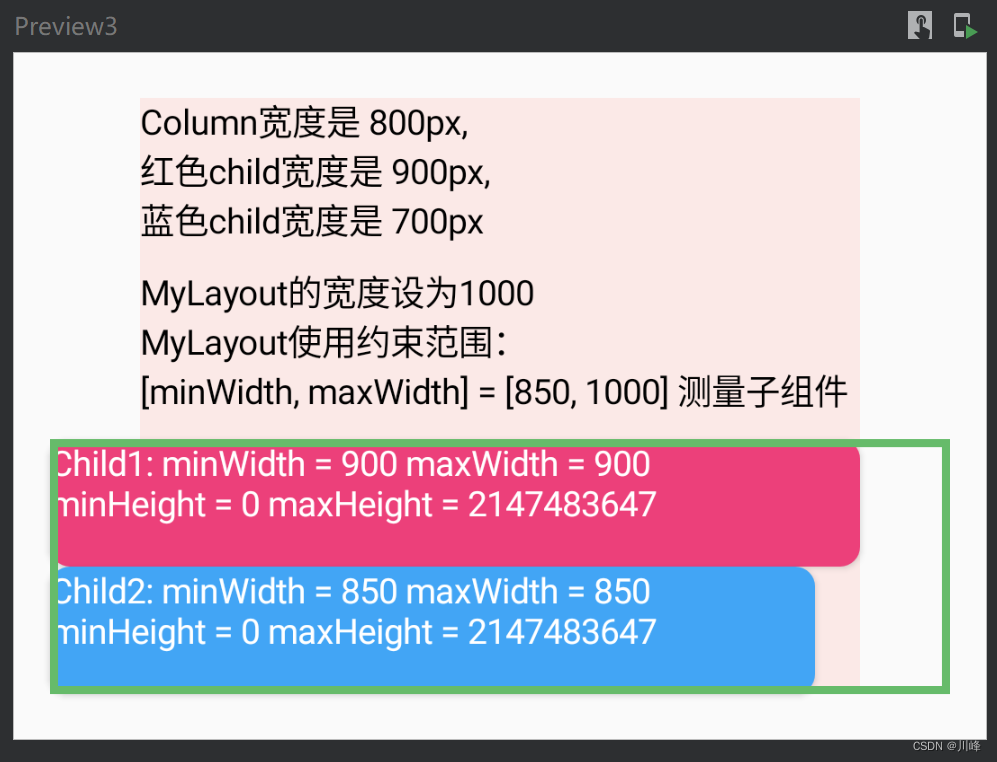
下面修改MyLayout的宽度为1000,同时测量子组件的约束范围改为 [minWidth, maxWidth] = [850, 1000]:
1
2
3
4
5
6
7
8
9
10
11
12
13
14
15
16
17
18
19
20
21
22
23
24
25
26
27
28
29
30
31
32
@Composable fun ConstraintsExample3 () Column( modifier = Modifier .padding(8. dp) .background(Color(0xffFBE9E7 )) .width(800f .toDp()) .fillMaxHeight(), verticalArrangement = Arrangement.spacedBy(10. dp) ) { Text("Column宽度是 800px, \n红色child宽度是 900px, \n蓝色child宽度是 700px" ) Text("MyLayout的宽度设为1000\n" + "MyLayout使用约束范围:\n[minWidth, maxWidth] = [850, 1000] 测量子组件" ) MyLayout3(Modifier.border(3. dp, Green400)) { Content() } } } @Composable private fun MyLayout3 (modifier: Modifier = Modifier, content: @Composable () -> Unit ) Layout(modifier = modifier, content = content) { measurables, constraints -> val updatedConstraints = constraints.copy(minWidth = 850 , maxWidth = 1000 ) val placeables = measurables.map { it.measure(updatedConstraints) } val totalHeight = placeables.sumOf { it.height } var y = 0 layout(width = 1000 , height = totalHeight) { placeables.forEach { placeable: Placeable -> placeable.placeRelative(0 , y) y += placeable.height } } } }
显示效果:
在上面代码中,
Column组件的宽度设置为800pxColumn包含的 MyLayout 组件的宽度设置为1000px,这超过了Column组件的宽度,因此 MyLayout 会在Column组件中溢出显示。MyLayout 使用约束范围[minWidth, maxWidth] = [850, 1000]测量子组件。红色Child的宽度设置为900px, 未超出 MyLayout 的约束范围,所以最终宽度显示为900px。这超过了Column组件的宽度,所以会在Column组件中溢出显示。蓝色Child的宽度设置为700px, 超出了 MyLayout 的约束范围,所以最终宽度使用父约束范围要求的下界即850px。这超过了Column组件的宽度,所以会在Column组件中溢出显示。
下面的测试代码通过Slider 组件动态控制相关参数,运行之后可以更直观的了解 Layout 各个参数之间的相互影响:
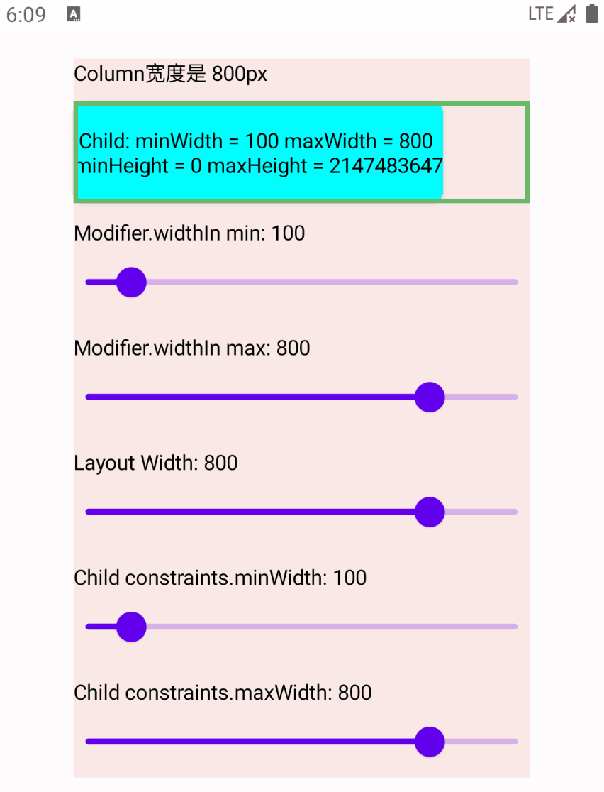
1
2
3
4
5
6
7
8
9
10
11
12
13
14
15
16
17
18
19
20
21
22
23
24
25
26
27
28
29
30
31
32
33
34
35
36
37
38
39
40
41
42
43
44
45
46
47
48
49
50
51
52
53
54
55
56
57
58
59
60
61
62
63
64
65
66
67
68
69
70
71
72
73
74
75
76
77
78
79
80
81
82
83
84
85
86
87
88
89
90
91
92
93
94
95
96
97
98
99
100
101
102
103
104
105
106
107
108
109
110
111
112
113
114
115
116
117
118
119
120
121
122
123
124
125
126
127
128
129
130
131
132
133
134
135
136
137
138
139
140
141
@Composable fun ConstraintsExample () Column( modifier = Modifier .padding(8. dp) .background(Color(0xffFBE9E7 )) .width(800f .toDp()) .fillMaxHeight(), verticalArrangement = Arrangement.spacedBy(10. dp) ) { Text("Column宽度是 800px" ) ConstraintsOffsetAndBoundsSample() } } @Composable private fun ConstraintsOffsetAndBoundsSample () var minWidth by remember { mutableStateOf(100f ) } var maxWidth by remember { mutableStateOf(800f ) } var constraintsMinWidth by remember { mutableStateOf(100f ) } var constraintsMaxWidth by remember { mutableStateOf(800f ) } var layoutWidth by remember { mutableStateOf(800f ) } LayoutWidthWidthParams( minWidth = minWidth.toInt(), maxWidth = maxWidth.toInt(), constraintsMinWidth = constraintsMinWidth.toInt(), constraintsMaxWidth = constraintsMaxWidth.toInt(), layoutWidth = layoutWidth.toInt() ) { BoxWithConstraints { Text( text = "\n Child: minWidth = ${constraints.minWidth} " + "maxWidth = ${constraints.maxWidth} \n" + "minHeight = ${constraints.minHeight} " + "maxHeight = ${constraints.maxHeight} \n" , modifier = Modifier .shadow(2. dp, RoundedCornerShape(8. dp)) .background(Color.Cyan) ) } } SliderWithLabel( label = "Modifier.widthIn min: ${minWidth.toInt()} " , value = minWidth ) { if (it <= maxWidth) minWidth = it } SliderWithLabel( label = "Modifier.widthIn max: ${maxWidth.toInt()} " , value = maxWidth ) { if (it >= minWidth) maxWidth = it } SliderWithLabel( label = "Layout Width: ${layoutWidth.toInt()} " , value = layoutWidth ) { layoutWidth = it } SliderWithLabel( label = "Child constraints.minWidth: ${constraintsMinWidth.toInt()} " , value = constraintsMinWidth ) { if (it <= constraintsMaxWidth) constraintsMinWidth = it } SliderWithLabel( label = "Child constraints.maxWidth: ${constraintsMaxWidth.toInt()} " , value = constraintsMaxWidth ) { if (it >= constraintsMinWidth) constraintsMaxWidth = it } } @Composable private fun LayoutWidthWidthParams ( minWidth: Int , maxWidth: Int , constraintsMinWidth: Int , constraintsMaxWidth: Int , layoutWidth: Int , content: @Composable () -> Unit ) val density = LocalDensity.current val minWidthDp = density.run { minWidth.toDp() } val maxWidthDp = density.run { maxWidth.toDp() } Layout( modifier = Modifier .widthIn(min = minWidthDp, max = maxWidthDp) .border(3. dp, Green400), content = content ) { measurables, constraints -> val updatedConstraints = constraints.copy( minWidth = constraintsMinWidth, maxWidth = constraintsMaxWidth ) val placeables = measurables.map { it.measure(updatedConstraints) } val totalHeight = placeables.sumOf { it.height } var y = 0 layout(width = layoutWidth, height = totalHeight) { placeables.forEach { placeable -> placeable.placeRelative(0 , y) y += placeable.height } } } } @Composable private fun SliderWithLabel (label: String , value: Float , onValueChange: (Float ) -> Unit ) Column { Text(label) Slider( value = value, onValueChange = onValueChange, valueRange = 0f ..1000f ) } } @Preview @Composable fun ConstraintsExamplePreview () ForPreviewUse { ConstraintsExample5() } Column( modifier = Modifier .padding(10. dp) .fillMaxWidth() .verticalScroll(rememberScrollState()), horizontalAlignment = Alignment.CenterHorizontally ) { ConstraintsExample() } }
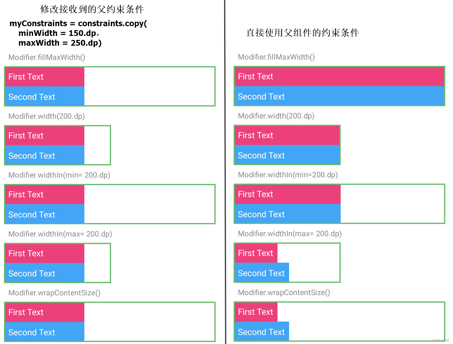
这里自定义的 Layout 组件上使用了 Modifier.widthIn(min, max) 修饰符,这个修饰符的作用是:根据输入的测量约束,将内容的宽度限制在[min, max]的dp值范围之间,如果输入的约束更严格,则请求的大小将服从传入约束,并试图尽可能接近首选大小。一句话就是它可以在父约束范围内做一定的修改,但不能违背父约束 。
我们运行上面的代码,改变 Layout 的 layout(width, height) 方法的 width 参数,查看效果:
可以看到当拖动Slider改变Layout的width时,正如开头所提到的,如果超过了其所受约束边界范围[minWidth, maxWidth],Layout在其父布局中的位置就会发生改变。具体发生的偏移量为 -(layout.width-Constraints.maxWidth)/2或-(layout.width-Constraints.minWidth)/2 ,可以通过为Layout添加Modifier.onPlaced修饰符来打印日志观察:
1
2
3
4
5
6
7
8
9
10
11
12
13
14
15
Layout( modifier = Modifier .widthIn(min = minWidthDp, max = maxWidthDp) .border(3. dp, Green400) .onPlaced { layoutCoordinates -> val posInParent = layoutCoordinates.positionInParent() val size = layoutCoordinates.size println("Layout>>>>>>>>>>>>>posInParent: $posInParent " ) println("Layout>>>>>>>>>>>>>size: $size " ) } , content = content ) { ...... }
另外当拖动Slider改变Layout的Child的约束条件时,只会影响Child的大小:
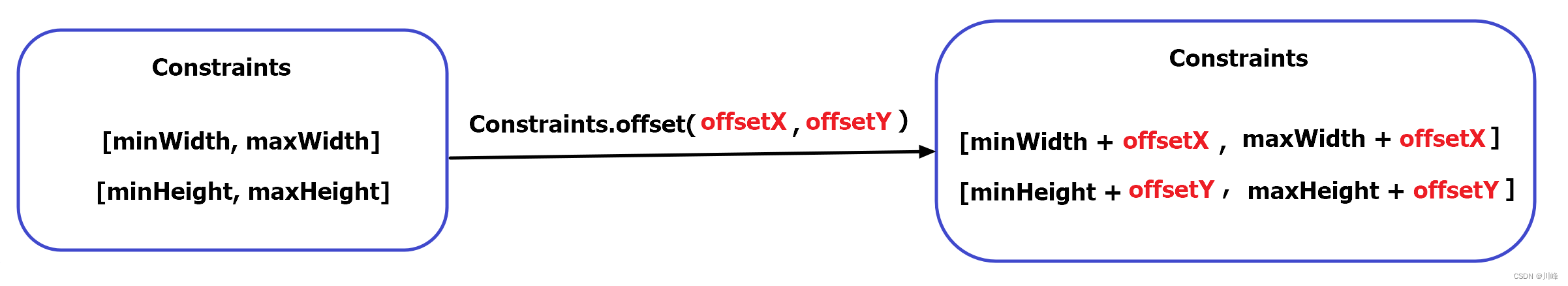
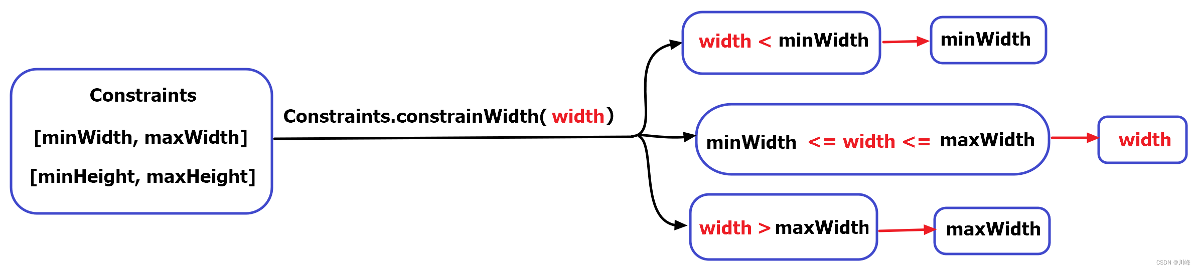
偏移量约束 Constraints.offset() 和 宽高约束 Constraints.constrainWidth/Height() 在前面使用 Modifier.layout() 自定义布局部分中,实现聊天对话框消息气泡的例子里,使用到了两个Constraints对象的方法:Constraints.offset() 和 Constraints.constrainWidth()/constrainHeight() ,这两个方法的作用是使用约束对象对偏移量和指定的宽高进行约束。
先看一下这两个方法分别会返回什么
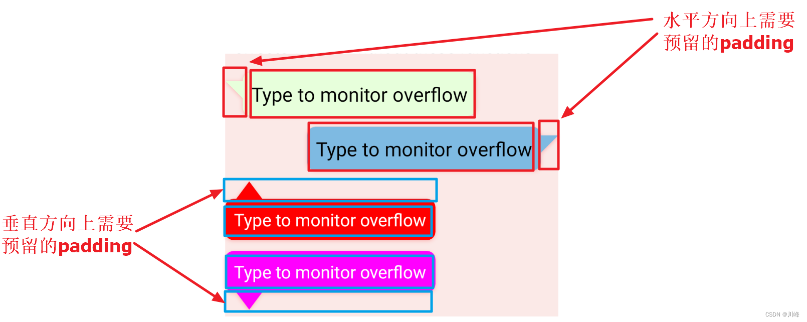
对于 constraints.offset(offsetX, offsetY) 其实就是将最大最小的宽高值分别加上对应方向的偏移量,然后返回一个新的 Constraints对象:
而对于 Constraints.constrainWidth(width) 或 Constraints.constrainHeight(height) 则会根据当前约束对象的最大最小宽高值判断输入的width或height是否在上下界范围内,如果在范围内就返回输入的值,如果低于下界就返回下界值,如果高于上界就返回上界值:
为什么要关注这两个方法呢?因为这两个方法在需要设置独立于内容区域之外的额外边距时非常有用。
先看一个简单的例子,比如系统内置的 Modifier.padding() 修饰符就使用了这两个约束方法,我们看一下其源码实现:
1
2
3
4
5
6
7
8
9
10
11
12
13
14
15
@Stable fun Modifier.padding (all: Dp ) this .then( PaddingModifier( start = all, top = all, end = all, bottom = all, rtlAware = true , inspectorInfo = debugInspectorInfo { name = "padding" value = all } ) )
1
2
3
4
5
6
7
8
9
10
11
12
13
14
15
16
17
18
19
20
21
22
23
24
25
26
27
28
29
30
31
private class PaddingModifier ( val start: Dp = 0. dp, val top: Dp = 0. dp, val end: Dp = 0. dp, val bottom: Dp = 0. dp, val rtlAware: Boolean , inspectorInfo: InspectorInfo.() -> Unit ) : LayoutModifier, InspectorValueInfo(inspectorInfo) { ... override fun MeasureScope.measure ( measurable: Measurable , constraints: Constraints ) val horizontal = start.roundToPx() + end.roundToPx() val vertical = top.roundToPx() + bottom.roundToPx() val placeable = measurable.measure(constraints.offset(-horizontal, -vertical)) val width = constraints.constrainWidth(placeable.width + horizontal) val height = constraints.constrainHeight(placeable.height + vertical) return layout(width, height) { if (rtlAware) { placeable.placeRelative(start.roundToPx(), top.roundToPx()) } else { placeable.place(start.roundToPx(), top.roundToPx()) } } } ... }
可以看到内部返回了一个 PaddingModifier 对象,该对象实现了 LayoutModifier 接口,因此其使用方式和 Modifier.layout() 类似,也需要覆写 MeasureScope.measure() 方法,在 measure()方法中我们看到 measurable.measure() 中传入的约束对象是 constraints.offset(-horizontal, -vertical),并且它调用 layout(width, height) 方法传入的宽高值使用了 Constraints.constrainWidth() 和 Constraints.constrainHeight() 进行约束。
但是为什么要这么写呢?如果不使用这两个方法会发生什么?例如我们可以在不使用这两个约束方法的前提下自己实现一个简单的padding功能,代码如下:
1
2
3
4
5
6
7
8
9
10
11
12
13
14
15
16
17
18
19
20
21
22
23
24
25
26
27
28
29
30
31
32
@Stable private fun Modifier.myPadding (all: Dp ) PaddingModifier(start = all, top = all, end = all, bottom = all, rtlAware = true ) ) private class PaddingModifier ( val start: Dp = 0. dp, val top: Dp = 0. dp, val end: Dp = 0. dp, val bottom: Dp = 0. dp, val rtlAware: Boolean , ) : LayoutModifier { override fun MeasureScope.measure (measurable: Measurable , constraints: Constraints ) val horizontal = start.roundToPx() + end.roundToPx() val vertical = top.roundToPx() + bottom.roundToPx() val placeable = measurable.measure(constraints) val width = (placeable.width + horizontal) val height = (placeable.height + vertical) return layout(width, height) { if (rtlAware) { placeable.placeRelative(start.roundToPx(), top.roundToPx()) } else { placeable.place(start.roundToPx(), top.roundToPx()) } } } }
代码实现非常简单,就是将设置的padding值附加到子元素测量结果的宽高值之上,再作为自身的宽高来应用。
使用测试代码如下:
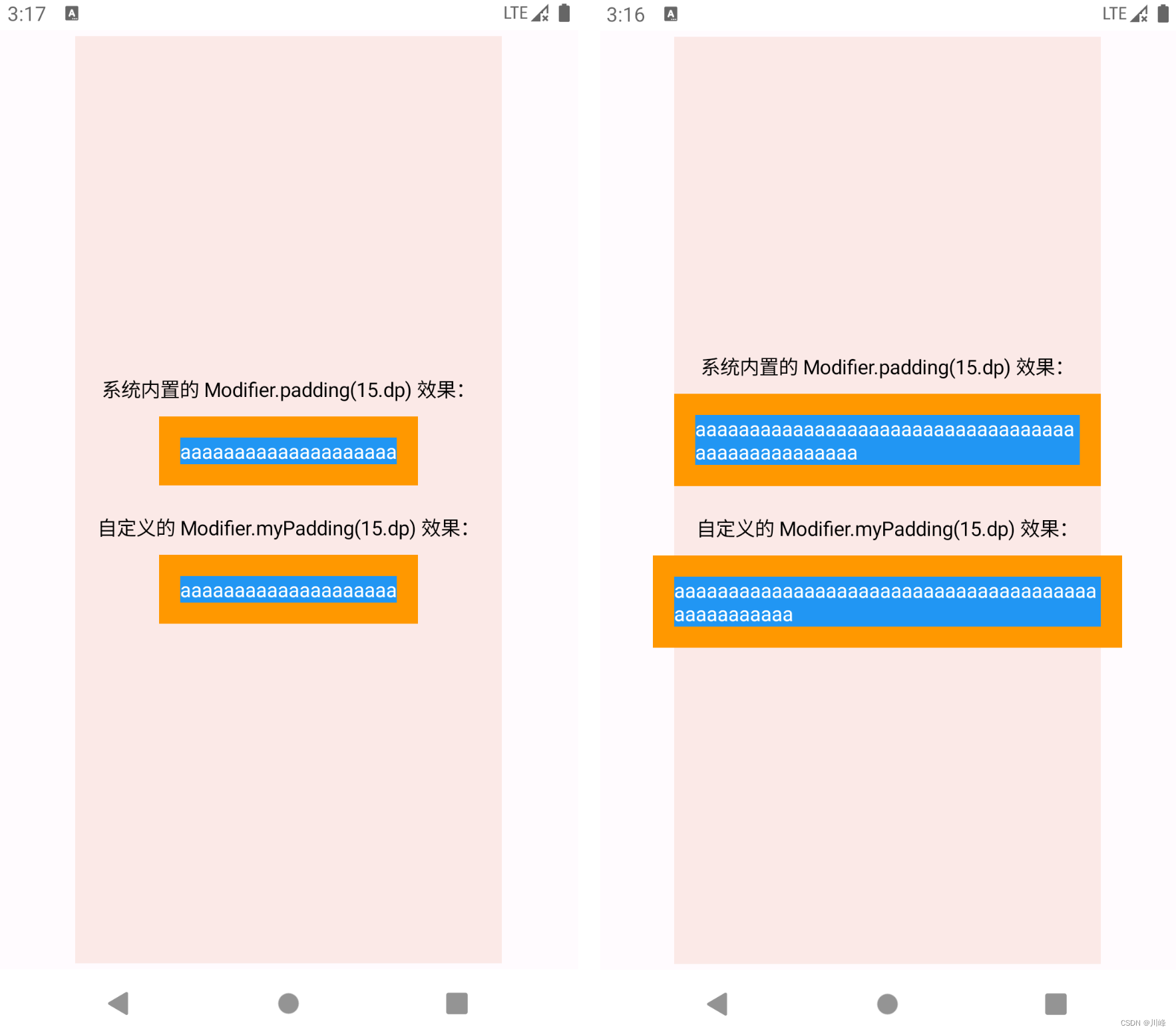
1
2
3
4
5
6
7
8
9
10
11
12
13
14
15
16
17
18
19
20
21
22
23
24
25
26
27
28
29
30
31
32
33
34
35
36
37
38
39
@Composable fun ConstraintOffsetAndWidthExample () Column( modifier = Modifier.fillMaxWidth(), horizontalAlignment = Alignment.CenterHorizontally ) { Column( modifier = Modifier .padding(vertical = 4. dp) .width(300. dp) .fillMaxHeight() .background(Color(0xffFBE9E7 )), horizontalAlignment = Alignment.CenterHorizontally, verticalArrangement = Arrangement.Center ) { Text("系统内置的 Modifier.padding(15.dp) 效果:" ) Spacer(modifier = Modifier.height(10. dp)) Column( Modifier .background(Color(0xffFF9800 )) .padding(15. dp) ) { MyText("aaaaaaaaaaaaaaaaaaaa" ) } Spacer(modifier = Modifier.height(20. dp)) Text("自定义的 Modifier.myPadding(15.dp) 效果:" ) Spacer(modifier = Modifier.height(10. dp)) Column( Modifier .background(Color(0xffFF9800 )) .myPadding(15. dp) ) { MyText("aaaaaaaaaaaaaaaaaaaa" ) } } } } @Composable fun MyText (text: String ) 0xff2196F3 )), Color.White)
运行上面代码之后发现,如果在在文本比较短的情况下是没有问题的,跟系统内置的padding修饰符几乎没有区别,但是如果在文本比较长的情况下就发现问题了,我们自定义的padding修饰符的padding部分会溢出父布局,而系统内置的则不会:
因此我们需要对自己的组件的最大宽度和高度进行限制,在应用padding的情况下也要保证不会超出父布局 的范围,因此就需要使用父布局 的Constraints对象的 constrainWidth() 和 constrainHeight() 方法对当前组件的宽高进行约束,使用约束之后的宽高进行布局,修改核心代码如下:
1
2
3
4
5
6
7
8
9
10
11
12
13
14
private class PaddingModifier (...) : LayoutModifier { override fun MeasureScope.measure (measurable: Measurable , constraints: Constraints ) val horizontal = start.roundToPx() + end.roundToPx() val vertical = top.roundToPx() + bottom.roundToPx() val placeable = measurable.measure(constraints) val width = constraints.constrainWidth(placeable.width + horizontal) val height = constraints.constrainHeight(placeable.height + vertical) return layout(width, height) { ...... } } }
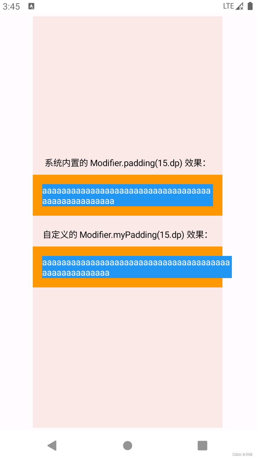
但是仅仅这样是不够的,因为运行之后你会发现,虽然文本很长的情况下,padding部分不会超出父布局了,但是内部的Text组件仍然会溢出Column的父布局:
Text组件进行了测量,测量结果的宽度可能是跟父布局的最大宽度相等(在上面的测试代码中是300.dp),然后应用padding修饰符的Column在摆放Text组件时,是从起始位置向右偏移15.dp的位置开始摆放的,所以Text组件的最终表现就是从 15.dp 的地方开始显示300.dp的长度,总共是315dp, 肯定超出父布局了。所以应该保证测量Text用的约束条件中的最大最小宽度排除padding区域的大小,剩余的部分才用来真正的显示内容,这就是该使用 constraints.offset() 的时刻了。修改核心代码如下:
1
2
3
4
5
6
7
8
9
10
11
12
13
14
15
private class PaddingModifier (...) : LayoutModifier { override fun MeasureScope.measure (measurable: Measurable , constraints: Constraints ) val horizontal = start.roundToPx() + end.roundToPx() val vertical = top.roundToPx() + bottom.roundToPx() val placeable = measurable.measure(constraints.offset(-horizontal, -vertical)) val width = constraints.constrainWidth(placeable.width + horizontal) val height = constraints.constrainHeight(placeable.height + vertical) return layout(width, height) { ... } } }
上面代码中 constraints.offset(-horizontal, -vertical),传入的都是对应方向上padding总和的负值,这是因为我们要减去它们,正如上面分析的那样。
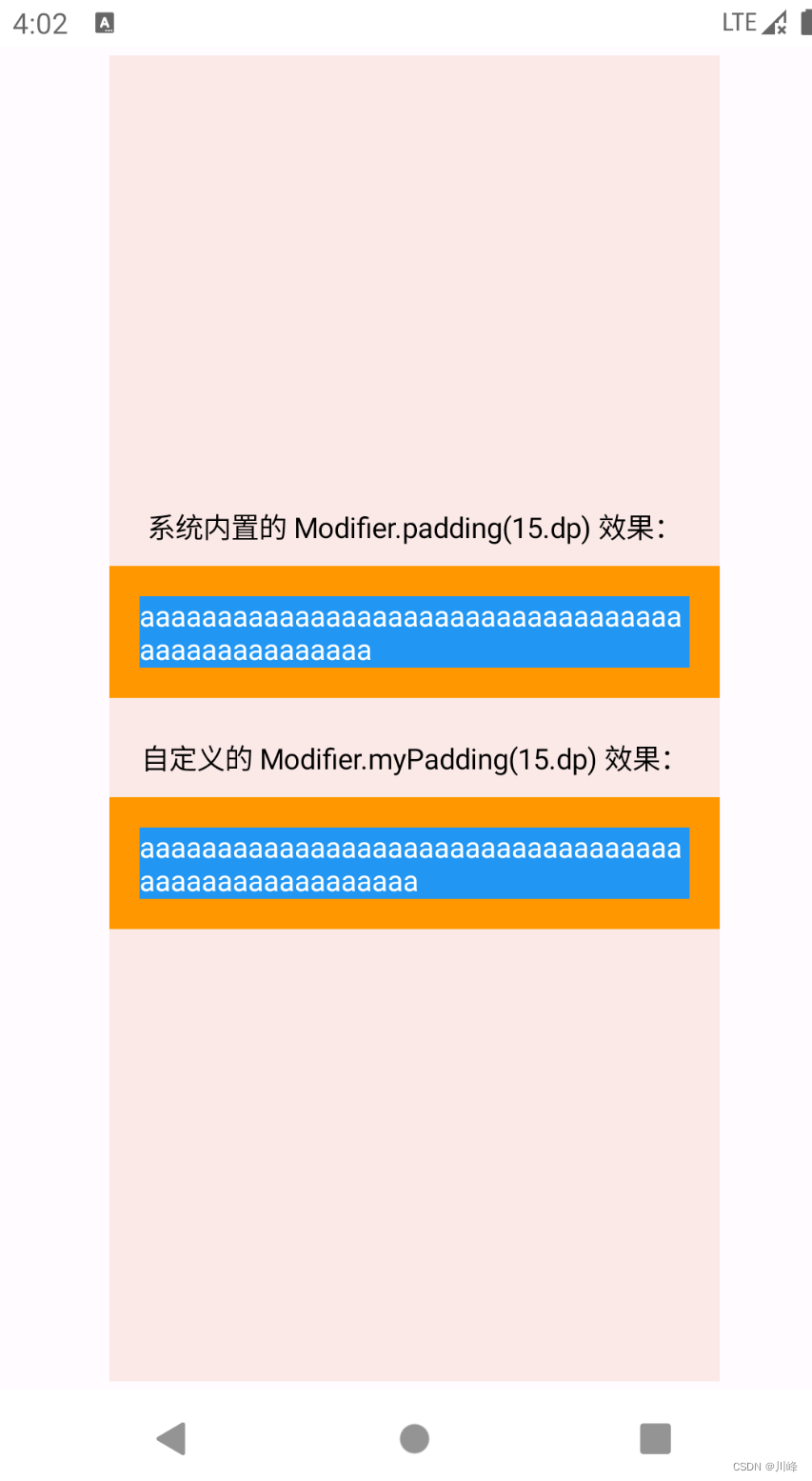
现在运行代码,效果就和系统的一模一样了:
但是好像还有一种情况没有分析,那就是我们可以只使用constraints.offset()对偏移量进行约束,但是不对当前组件的宽高进行约束,因为子元素使用经过偏移量修正后的约束进行测量之后,得到宽度和高度一定不会超过父布局的宽高,因此如果我们把代码修改成下面这样,运行之后发现也是可以的:
1
2
3
4
5
6
7
8
9
10
11
12
13
14
private class PaddingModifier (...) : LayoutModifier { override fun MeasureScope.measure (measurable: Measurable , constraints: Constraints ) val horizontal = start.roundToPx() + end.roundToPx() val vertical = top.roundToPx() + bottom.roundToPx() val placeable = measurable.measure(constraints.offset(-horizontal, -vertical)) val width = (placeable.width + horizontal) val height = (placeable.height + vertical) return layout(width, height) { ... } } }
虽然这样可行,但是存在一种极端的情况,就是我们的padding值设置的极大,甚至比父布局的最大宽度还要大,此时依然会发生溢出。但这种情况是非常极端的,正常人肯定不会在一个300dp的组件内设置一个400dp的内边距。。。即便如此,还是把constrainWidth() 和 constrainHeight() 这两个都加上才是最完美的,这样在任何情况下都不会出现溢出,就像系统的 Modifier.padding() 那样。
现在再来回顾一下前面实现聊天对话框消息气泡的例子里的核心代码,就比较容易理解了:
1
2
3
4
5
6
7
8
9
10
11
12
13
14
15
16
17
18
19
20
21
22
23
24
25
26
27
28
29
30
31
Modifier.then(shapeModifier) .background(color, shape) .layout { measurable, constraints -> val isHorizontalArrow = arrowDirection == ArrowDirection.Left || arrowDirection == ArrowDirection.Right val isVerticalArrow = arrowDirection == ArrowDirection.Top || arrowDirection == ArrowDirection.Bottom val offsetX = if (isHorizontalArrow) arrowWidthPx.toInt() else 0 val offsetY = if (isVerticalArrow) arrowHeightPx.toInt() else 0 val placeable = measurable.measure( constraints.offset(horizontal = -offsetX, vertical = -offsetY) ) val width = constraints.constrainWidth(placeable.width + offsetX) val height = constraints.constrainHeight(placeable.height + offsetY) val posX = when (arrowDirection) { ArrowDirection.Left -> arrowWidthPx.toInt() else -> 0 } val posY = when (arrowDirection) { ArrowDirection.Top -> arrowHeightPx.toInt() else -> 0 } layout(width, height) { placeable.placeRelative(posX, posY) } }
这里可以将气泡的箭头区域大小看成是上面padding修饰符的例子中的一种预留的padding,这样分析起来几乎和前面padding修饰符的例子是一模一样的思想。
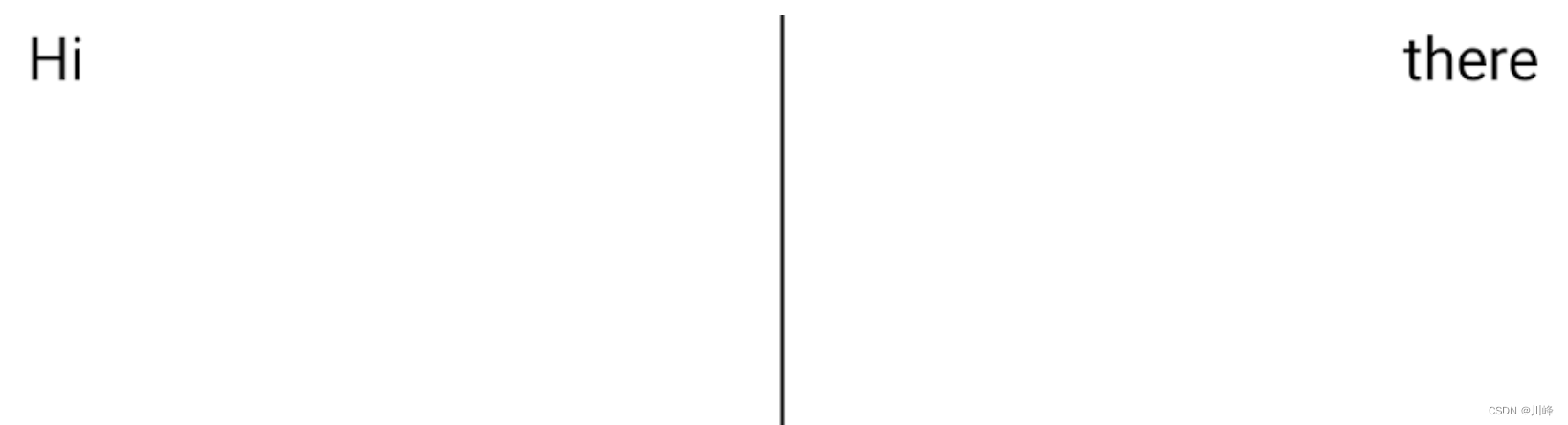
Intrinsic 固有特性测量 前面提到在Compose 中的每个 UI 组件是不允许多次进行测量的,多次测量在运行时会抛异常,禁止多次测量的好处是为了提高性能,但在很多场景中,多次测量子 UI 组件也可能是有意义的。例如,假设存在下面这样一个需求场景,我们希望两个文本中间的分割线高度与两边文案高的一边保持相等。如下图所示:
1
2
3
4
5
6
7
8
9
10
11
12
13
14
15
16
17
18
19
20
21
22
23
24
@Composable fun TwoTexts (text1: String , text2: String , modifier: Modifier = Modifier) Row(modifier = modifier) { Text( modifier = Modifier.weight(1f ).padding(start = 4. dp).wrapContentWidth(Alignment.Start), text = text1 ) Divider(color = Color.Black, modifier = Modifier.fillMaxHeight().width(1. dp)) Text( modifier = Modifier.weight(1f ).padding(end = 4. dp).wrapContentWidth(Alignment.End), text = text2 ) } } @Preview @Composable fun TwoTextsPreview () MaterialTheme { Surface { TwoTexts(text1 = "Hi" , text2 = "there" ) } } }
假设父组件可以预先获取到两边的文案组件高度信息,然后计算两边高度的最大值即可确定当前父组件的高度值,此时仅需将分割线高度值铺满整个父组件即可完美解决问题。
为了应对父组件需要预先获取子组件宽高信息来确定自身大小的这种场景,Compose 为开发者提供了一种特殊的固有特性测量机制,允许开发者在每个子组件正式测量前能获取到每个子组件的宽高等信息。总而言之一句话:借助固有特性测量,可以突破禁止多次测量的限制,预先查询子项,然后再进行实际测量。
在内置组件上应用固有特性测量 使用固有特性测量的前提是组件需要适配固有特性测量,目前许多内置的基础组件已经完成对固有特性测量的适配,可以直接使用。
在上面所提到的例子中,父组件所提供的能力使用基础组件中的 Row 组件即可承担,我们仅需为 Row 组件的高度设置固有特性测量即可。我们使用 Modifier.height(IntrinsicSize.Min) 即可为高度设置固有特性测量。
1
2
3
4
5
6
7
8
9
10
11
12
13
14
15
16
17
18
19
20
21
22
@Composable fun TwoTexts (modifier: Modifier = Modifier, text1: String , text2: String ) Row(modifier = modifier.height(IntrinsicSize.Min)) { Text( modifier = Modifier.weight(1f ).padding(start = 4. dp).wrapContentWidth(Alignment.Start), text = text1 ) Divider(color = Color.Black, modifier = Modifier.fillMaxHeight().width(1. dp)) Text( modifier = Modifier.weight(1f ).padding(end = 4. dp).wrapContentWidth(Alignment.End), text = text2 ) } } @Preview(showBackground = true) @Composable fun TwoTextsPreview () Box() { TwoTexts(text1 = "Hi" , text2 = "there" ) } }
显示效果:
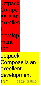
上面仅使用 Modifier.height(IntrinsicSize.Min) 为高度设置了固有特性测量,并没有对宽度进行设置。此时所表达的意思是:当宽度不限时,通过子组件预先测量的宽高信息所能计算的高度最少可以是多少。当然你也可以进行宽度的设置,当宽度受限时,通过子组件预先测量的宽高信息所能计算的高度最少可以是多少。
可能你不能理解宽度受限可能影响高度这件事,其实我们常用的 Text 组件当宽度收到不同限制时,其高度就是不一样的。例如:
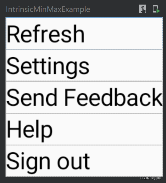
上面例子中使用的固有特性测量是 IntrinsicSize.Min,对应的还有一个 IntrinsicSize.Max,那么二者有什么区别呢? 可以通过下面的例子来了解二者的区别:
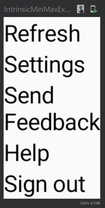
1
2
3
4
5
6
7
8
9
10
11
@Preview(showBackground = true) @Composable fun IntrinsicMinMaxExample () Column(Modifier.width(IntrinsicSize.Max)) { Text(text = "Refresh" , Modifier.fillMaxWidth()) Text(text = "Settings" , Modifier.fillMaxWidth()) Text(text = "Send Feedback" , Modifier.fillMaxWidth()) Text(text = "Help" , Modifier.fillMaxWidth()) Text(text = "Sign out" , Modifier.fillMaxWidth()) } }
可以看到,对 Column 组件应用 Modifier.width(IntrinsicSize.Max) 后,它选择了能让所有 Text 组件都能完整显示的宽度中的最大值 来作为自身的宽度。
如果设置为 IntrinsicSize.Min 会是什么效果呢?
1
2
3
4
5
6
7
8
9
10
11
@Preview(showBackground = true) @Composable fun IntrinsicMinMaxExample2 () Column(Modifier.width(IntrinsicSize.Min)) { Text(text = "Refresh" , Modifier.fillMaxWidth()) Text(text = "Settings" , Modifier.fillMaxWidth()) Text(text = "Send Feedback" , Modifier.fillMaxWidth()) Text(text = "Help" , Modifier.fillMaxWidth()) Text(text = "Sign out" , Modifier.fillMaxWidth()) } }
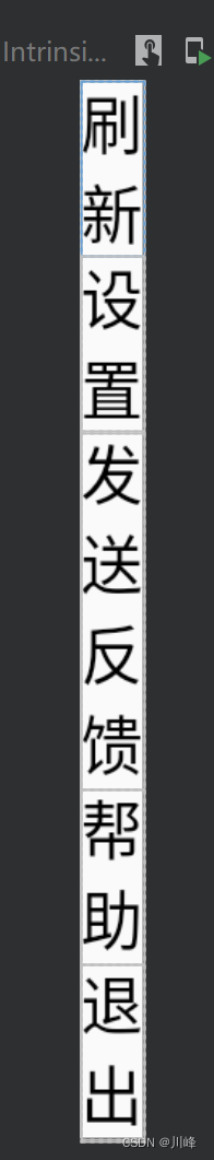
可以看到,对 Column 组件应用 Modifier.width(IntrinsicSize.Min) 后,Column 组件会查询一遍所有子组件,选择能让所有 Text 组件都能完整显示的宽度中的最小值 来作为自身的宽度。
假如把上面的代码中的文本换成中文,效果会更明显:
1
2
3
4
5
6
7
8
9
10
11
@Preview(showBackground = true) @Composable fun IntrinsicMinMaxExample () Column(Modifier.width(IntrinsicSize.Min)) { Text(text = "刷新" , Modifier.fillMaxWidth()) Text(text = "设置" , Modifier.fillMaxWidth()) Text(text = "发送反馈" , Modifier.fillMaxWidth()) Text(text = "帮助" , Modifier.fillMaxWidth()) Text(text = "退出" , Modifier.fillMaxWidth()) } }
可以看到Column选择了最少显示一个汉字的宽度来设置自身的宽度。
注意: 你只能对已经适配固有特性测量的内置组件 使用 IntrinsicSize.Min 或 IntrinsicSize.Max ,否则程序会运行崩溃。对于所有自定义 Layout 的开发者来说,如果打算支持使用固有特性测量,则必须要进行固有特性测量的适配工作。
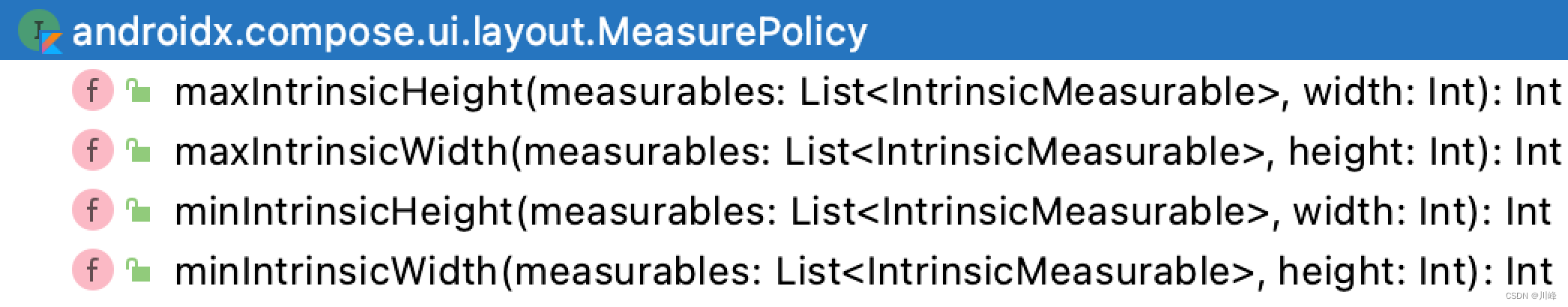
自定义固有特性测量 其实,绝大多数的内置组件都是用前面提到的 Layout 组件来实现的, 前面提到 Layout 组件中需要传入一个 measurePolicy , 默认只需实现其 measure() 方法,但是如果要实现固有特性测量,就需要额外重写 Intrinsic 系列方法。
1
2
3
4
5
@Composable inline fun Layout ( content: @Composable () -> Unit , modifier: Modifier = Modifier, measurePolicy: MeasurePolicy )
当组件使用 Modifier.width(IntrinsicSize.Max) 时,则会调用 maxIntrinsicWidth 方法
当组件使用 Modifier.width(IntrinsicSize.Min) 时,则会调用 minIntrinsicWidth 方法
当组件使用 Modifier.height(IntrinsicSize.Max) 时,则会调用 maxIntrinsicHeight 方法
当组件使用 Modifier.height(IntrinsicSize.Min) 时,则会调用 minIntrinsicHeight 方法
注意: 如果组件的 Modifier 使用了上面某一个, 但其对应方法在 Layout 组件中没有重写仍会导致崩溃。
在 Layout 声明时,我们就不能使用 SAM 形式了,而是要规规矩矩实现 MeasurePolicy
1
2
3
4
5
6
7
8
9
10
11
12
13
14
15
16
17
18
19
20
@Composable fun MyCustomComposable (modifier: Modifier = Modifier, content: @Composable () -> Unit ) Layout(content = content, modifier = modifier, measurePolicy = object : MeasurePolicy { override fun MeasureScope.measure ( measurables: List <Measurable >, constraints: Constraints ) } override fun IntrinsicMeasureScope.minIntrinsicHeight ( measurables: List <IntrinsicMeasurable >, width: Int ) Int { } } ) }
下面自定义一个 IntrinsicRow 组件来实现前面分割线对齐文本的例子:
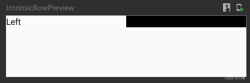
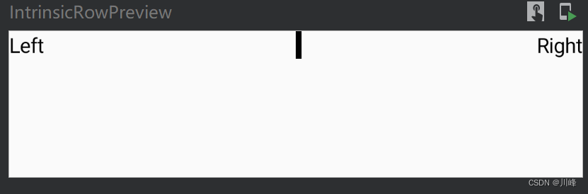
1
2
3
4
5
6
7
8
9
10
11
12
13
14
15
16
17
18
19
20
21
22
23
24
25
26
27
28
29
30
31
32
33
34
35
36
37
38
39
40
41
42
43
44
45
46
47
48
49
50
51
52
53
54
55
56
@Composable fun IntrinsicRow (modifier: Modifier , content: @Composable () -> Unit ) Layout(content = content, modifier = modifier, measurePolicy = object : MeasurePolicy { override fun MeasureScope.measure ( measurables: List <Measurable >, constraints: Constraints , ) val textPlaceables = measurables .filter { it.layoutId == "text" }.map { it.measure(constraints) } val dividerPlaceable = measurables .first { it.layoutId == "divider" }.measure(constraints) val midPos = constraints.maxWidth / 2 return layout(constraints.maxWidth, constraints.maxHeight) { textPlaceables.forEach { it.placeRelative(0 , 0 ) } dividerPlaceable.placeRelative(midPos, 0 ) } } override fun IntrinsicMeasureScope.minIntrinsicHeight ( measurables: List <IntrinsicMeasurable >, width: Int ) Int { var maxHeight = 0 measurables.forEach { maxHeight = it.maxIntrinsicHeight(width).coerceAtLeast(maxHeight) } return maxHeight } } ) } @Preview(showBackground = true) @Composable fun IntrinsicRowPreview () Box() { IntrinsicRow(Modifier.fillMaxWidth().height(IntrinsicSize.Min)) { Text( text = "Left" , Modifier.wrapContentWidth(Alignment.Start).layoutId("text" ) ) Divider( color = Color.Black, modifier = Modifier.width(4. dp).fillMaxHeight().layoutId("divider" ) ) Text( text = "Right" , Modifier.wrapContentWidth(Alignment.End).layoutId("text" ) ) } } }
在我们的案例中仅使用了 Modifier.height(IntrinsicSize.Min) ,出于简单考虑仅重写了 minIntrinsicHeight 以作示例。
minIntrinsicHeight 与 maxIntrinsicHeight 有相同的两个参数 measurables 与 width:
measurables 类似于 measure 方法的 measurables,用于获取子组件的宽高信息。width:父组件所能提供的最大宽度(无论此时是 minIntrinsicHeight 还是 maxIntrinsicHeight )
1
2
3
Modifier .widthIn(100. dp, 200. dp) .height(IntrinsicSize.Max)
显示效果:
出现这种效果的原因是:由于在 IntrinsicRow 上使用了 Modifier.fillMaxWidth(),导致我们自定义 Layout 的宽度是固定的(即measure方法的 constraints 参数中的最大最小宽度值相等 minWidth == maxWidth ),又因为我们使用了固有特性测量,导致组件的高度也是固定的(constraints 参数中 minHeight == maxHeight )。如果在measure方法中直接使用该 constraints 去测量 Divider ,就会导致 Divider 的宽度也被设置为父组件的宽度。
而我们希望 Divider 测量的宽度 不应与父组件相同,而是要根据其自身声明的宽度,也就是 Modifier.width(4.dp) ,所以我们需要对 Divider 测量使用的 constraints 进行修正,将其最小宽度值minWidth 设置为 0, 这样宽度范围变成 [0, maxWidth] 就不会作为一个确定的值影响 Divider 的测量结果。因为 constraints 的高度是确定的,这会使 Divider 的高度被强制指定为该确定值。
最终的实现代码:
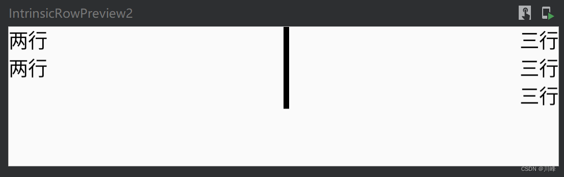
1
2
3
4
5
6
7
8
9
10
11
12
13
14
15
16
17
18
19
20
21
22
23
24
25
26
27
28
29
30
31
32
33
34
35
36
37
38
39
40
41
42
43
44
45
46
47
48
49
50
51
52
53
54
55
56
57
58
@Composable fun IntrinsicRow (modifier: Modifier , content: @Composable () -> Unit ) Layout(content = content, modifier = modifier, measurePolicy = object : MeasurePolicy { override fun MeasureScope.measure ( measurables: List <Measurable >, constraints: Constraints ) val textPlaceables = measurables .filter { it.layoutId == "text" }.map { it.measure(constraints) } val dividerConstraints = constraints.copy(minWidth = 0 ) val dividerPlaceable = measurables .first { it.layoutId == "divider" }.measure(dividerConstraints) val midPos = constraints.maxWidth / 2 return layout(constraints.maxWidth, constraints.maxHeight) { textPlaceables.forEach { it.placeRelative(0 , 0 ) } dividerPlaceable.placeRelative(midPos, 0 ) } } override fun IntrinsicMeasureScope.minIntrinsicHeight ( measurables: List <IntrinsicMeasurable >, width: Int ) Int { var maxHeight = 0 measurables.forEach { maxHeight = it.maxIntrinsicHeight(width).coerceAtLeast(maxHeight) } return maxHeight } } ) } @Preview(showBackground = true) @Composable fun IntrinsicRowPreview () Box() { IntrinsicRow(Modifier.fillMaxWidth().height(IntrinsicSize.Min)) { Text( text = "Left" , Modifier.wrapContentWidth(Alignment.Start).layoutId("text" ) ) Divider( color = Color.Black, modifier = Modifier.width(4. dp).fillMaxHeight().layoutId("divider" ) ) Text( text = "Right" , Modifier.wrapContentWidth(Alignment.End).layoutId("text" ) ) } } }
显示效果:
如果两侧的文案高度不同,则分割线会跟最高的那一侧文案对齐,效果如下:
Intrinsic 小结 固有特性测量的本质就是 允许父组件预先获取到每个子组件的宽高信息后,影响自身在测量阶段获取到的 constraints 参数的宽高信息,从而间接的控制和影响对子组件的测量。
在上面例子中,就是通过预先测量 Text 组件的高度,从而确定了父组件在测量时 constraints 的高度信息,变为固定高度,从而间接确定了分割线的高度。
在使用上:
如果是内置组件,根据需要直接在 width/height 修饰符上应用 IntrinsicSize.Min 或者 IntrinsicSize.Max
如果是自定义 Layout 组件,根据需要选择重写 measurePolicy 的 maxIntrinsicWidth/height 或 minIntrinsicWidth/height 方法,在使用自定义的组件时,同样是在修饰符上应用 IntrinsicSize.Min 或者 IntrinsicSize.Max。
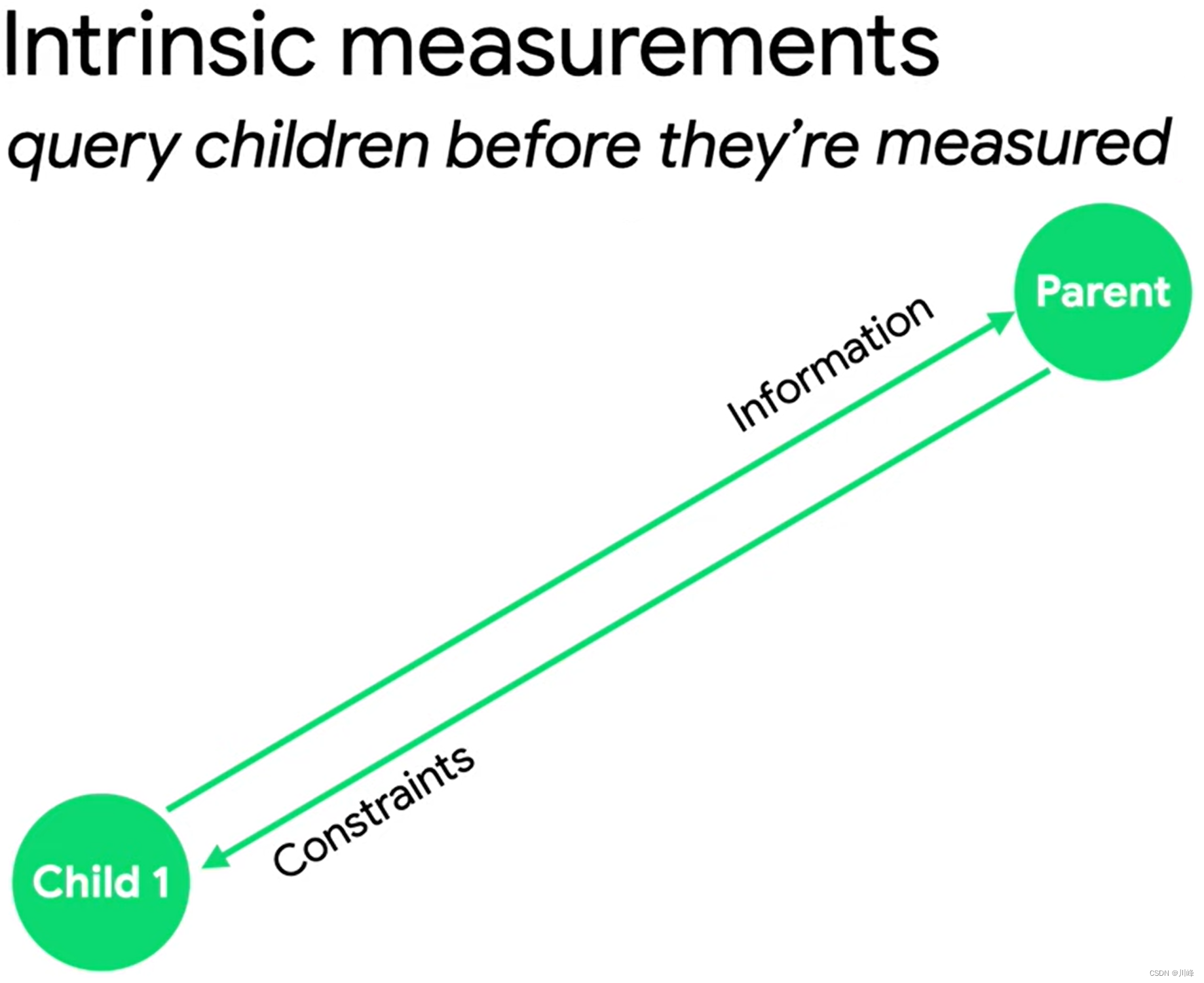
SubcomposeLayout 的超能力 如果说 Intrinsic 的超能力是可以预先感知子组件的宽高信息 ,那么 SubcomposeLayout 的超能力就是:可以允许我们 将某个子组件的合成过程延迟至其所依赖的同级组件测量之后进行 ,它为我们提供了更强的测量定制能力。而它的这个能力也说明了这个组件可以根据其他组件的测量结果来确定自身的尺寸,因此它可以用来取代固有特性测量。
我们仍然使用前面固有特性测量中分割线对齐两侧文本的例子,看看使用 SubcomposeLayout 该如何实现。
使用 SubcomposeLayout 可以允许组件根据定制测量顺序直接相互作用影响,与固有特性测量具有本质的区别,在这整个过程中父组件是没有参与的。
看一下 SubcomposeLayout 组件的声明:
1
2
3
4
5
@Composable fun SubcomposeLayout ( modifier: Modifier = Modifier, measurePolicy: SubcomposeMeasureScope .(Constraints ) -> MeasureResult )
其实 SubcomposeLayout 和 Layout 组件是差不多的,它也需要传入一个 measurePolicy 测量策略参数。不同的是,此时传入的 measurePolicy 是一个 SubcomposeMeasureScope 类型 Lambda,打开接口声明可以看到其中仅有一个名为 subcompose的接口方法:
1
2
3
interface SubcomposeMeasureScope : MeasureScope { fun subcompose (slotId: Any ?, content: @Composable () -> Unit ) }
subcompose 方法会根据传入的 slotId 和 content 生成一个 LayoutNode 用于构建子 Composition,最终会返回 content 中所有子 LayoutNode 的 Measurable 测量句柄列表,所以结果是一个 List<Measurable>。其中 content 是我们声明的Composable子组件,可以包含多个子元素。slotId 是用来让 SubcomposeLayout 追踪管理我们所创建的子 Composition 的,作为唯一索引每个 Composition 都需要具有唯一的 slotId。
简单的理解:你可以认为 subcompose 方法就是对某个 content的Composable启动了一个子组合,并返回测量句柄,以便接下来你可以进行测量。
由于我们的 Divider 组件的高度是依赖 Text 组件的,所以声明 Divider 组件时我们传入一个 Int 值作为测量高度。首先我们定义一个 Composable:
1
2
3
4
5
6
7
8
9
10
@Composable fun SubcomposeRow ( modifier: Modifier , text: @Composable () -> Unit , divider: @Composable (Int ) -> Unit ) SubcomposeLayout(modifier = modifier) { constraints-> ... } }
我们首先可以使用 subcompose 来先测量 text 中的所有 LayoutNode,并根据测量结果计算出最大高度 。
1
2
3
4
5
6
7
8
9
SubcomposeLayout(modifier = modifier) { constraints-> var maxHeight = 0 var textPlaceables = subcompose("text" , text).map { var placeable = it.measure(constraints) maxHeight = placeable.height.coerceAtLeast(maxHeight) placeable } ... }
既然计算得到了文本的最大高度,我们接下来可以将该高度值传入 Divider 组件中,完成组合阶段并进行测量。
1
2
3
4
5
6
7
SubcomposeLayout(modifier = modifier) { constraints-> ... var dividerPlaceable = subcompose("divider" ) { divider(maxHeight) }.map { it.measure(constraints.copy(minWidth = 0 )) } ... }
需要注意的是,与前面固有特性测量中的实现一样,在测量 Divider 组件时,仍需要拷贝一份 constraints 将 minWidth 设置为 0,避免 constraints 中的宽度变成固定值导致出现 Divider 组件宽度与整个父组件宽度相同的情况。
接下来分别对文本组件和分隔符组件进行摆放就可以了。
1
2
3
4
5
6
7
SubcomposeLayout(modifier = modifier) { constraints-> ... layout(constraints.maxWidth, constraints.maxHeight){ textPlaceables.forEach { it.placeRelative(0 , 0 ) } dividerPlaceable.forEach { it.placeRelative(midPos, 0 ) } } }
完整实现代码:
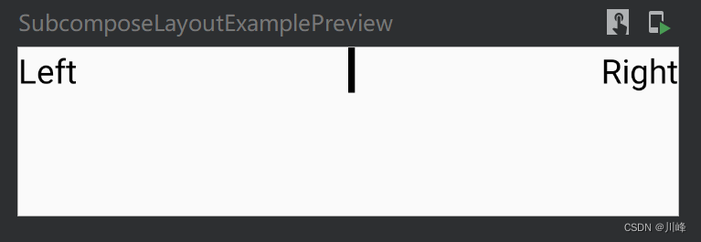
1
2
3
4
5
6
7
8
9
10
11
12
13
14
15
16
17
18
19
20
21
22
23
24
25
26
27
@Composable fun SubcomposeRow ( modifier: Modifier , text: @Composable () -> Unit , divider: @Composable (Int ) -> Unit ) SubcomposeLayout(modifier = modifier) { constraints-> var maxHeight = 0 val textPlaceables = subcompose("text" , text).map { val placeable = it.measure(constraints) maxHeight = placeable.height.coerceAtLeast(maxHeight) placeable } val dividerPlaceable = subcompose("divider" ) { divider(maxHeight) }.map { it.measure(constraints.copy(minWidth = 0 )) } assert(dividerPlaceable.size == 1 ) { "DividerScope Error!" } val midPos = constraints.maxWidth / 2 layout(constraints.maxWidth, constraints.maxHeight){ textPlaceables.forEach { it.placeRelative(0 , 0 ) } dividerPlaceable.forEach { it.placeRelative(midPos, 0 ) } } } }
使用方式:
1
2
3
4
5
6
7
8
9
10
11
12
13
@Composable fun TwoTextWithDivider () SubcomposeRow( modifier = Modifier.fillMaxWidth(), text = { Text(text = "Left" , Modifier.wrapContentWidth(Alignment.Start), fontSize = 20. sp) Text(text = "Right" , Modifier.wrapContentWidth(Alignment.End), fontSize = 20. sp) } ) { maxHeight -> val heightDp = with(LocalDensity.current) { maxHeight.toDp() } Divider(Modifier.width(4. dp).height(heightDp), Color.Black) } }
显示效果:
再来看一个例子,假设现在要实现一个搜索栏组件,它包含一个输入框和一个取消按钮,如下图所示:
在非搜索状态下,输入框占据全部父组件宽度,而在搜索状态下,输入框和取消按钮共享整个父组件的宽度。因此,输入框的宽度实际取决于取消按钮的宽度。
这里非常适合使用 SubcomposeLayout ,首先会先尝试测量取消按钮的宽度,获取到已消费的宽度,如果取消按钮不存在,则已消费宽度为 0,然后将输入框的宽度测量设置为剩余宽度。最终在布局摆放阶段,只需将两个组件水平摆放即可。
实现代码如下:
1
2
3
4
5
6
7
8
9
10
11
12
13
14
15
16
17
18
19
20
21
22
23
24
25
26
27
28
29
30
31
32
33
34
35
@Composable fun SubcomposeSearchFriendRow ( modifier: Modifier = Modifier, textField: @Composable () -> Unit , cancel: @Composable () -> Unit ) SubcomposeLayout(modifier) { constraints -> val cancelMeasureables = subcompose("cancel" ) { cancel() } val cancelPlaceable: Placeable? = cancelMeasureables.firstOrNull()?.measure(constraints) val consumeWidth = cancelPlaceable?.width ?: 0 val textFieldMeasureable = subcompose("text_field" ) { textField() }.first() val textFieldPlaceable = textFieldMeasureable.measure( constraints.copy( minWidth = constraints.maxWidth - consumeWidth, maxWidth = constraints.maxWidth - consumeWidth ) ) val width = constraints.maxWidth val height = max(cancelPlaceable?.height ?: 0 , textFieldPlaceable.height) layout(width, height) { textFieldPlaceable.placeRelative(0 , 0 ) cancelPlaceable?.placeRelative(textFieldPlaceable.width, 0 ) } } }
使用方式:
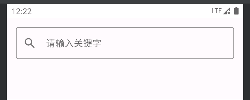
1
2
3
4
5
6
7
8
9
10
11
12
13
14
15
16
17
18
19
20
21
22
23
24
25
26
27
28
29
30
31
32
33
34
35
36
@Preview(showBackground = true) @Composable fun SubcomposeSearchFriendRowPreview () var isSearching by remember { mutableStateOf(false ) } val focusManager = LocalFocusManager.current Column { SubcomposeSearchFriendRow( modifier = Modifier.padding(16. dp), textField = { var text by remember { mutableStateOf("" ) } OutlinedTextField( value = text, onValueChange = { text = it }, singleLine = true , placeholder = { Text("请输入关键字" ) }, leadingIcon = { Icon(Icons.Filled.Search, null ) }, textStyle = TextStyle(fontSize = 15. sp), colors = TextFieldDefaults.textFieldColors( backgroundColor = Color.Transparent ), modifier = Modifier.onFocusChanged { isSearching = it.isFocused } ) }, cancel = { if (isSearching) { Button( modifier = Modifier.padding(horizontal = 5. dp), onClick = { focusManager.clearFocus() } ) { Text(text = "取消" ) } } } ) } }
当然,这个例子有点牵强,纯粹是为了练习 SubcomposeLayout 的使用。假如你在实际项目中有这样的需求,只需要使用 Row 组件搭配weight修饰符即可实现,例如,如下代码可以实现跟上面相同的效果:
1
2
3
4
5
6
7
8
9
10
11
12
13
14
15
16
17
18
19
20
21
22
23
24
25
26
27
28
29
@Composable fun SearchFriendRow () var isSearching by remember { mutableStateOf(false ) } val focusManager = LocalFocusManager.current Row(Modifier.padding(16. dp)) { var text by remember { mutableStateOf("" ) } OutlinedTextField( value = text, onValueChange = { text = it }, singleLine = true , placeholder = { Text("请输入关键字" ) }, leadingIcon = { Icon(Icons.Filled.Search, null ) }, textStyle = TextStyle(fontSize = 15. sp), colors = TextFieldDefaults.textFieldColors( backgroundColor = Color.Transparent ), modifier = Modifier.fillMaxWidth().weight(1f ) .onFocusChanged { isSearching = it.isFocused } ) if (isSearching) { Button( modifier = Modifier.padding(horizontal = 5. dp), onClick = { focusManager.clearFocus() } ) { Text(text = "取消" ) } } } }
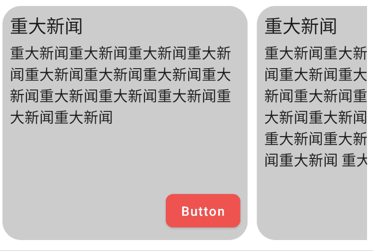
下面的例子使用 SubcomposeLayout 实现了一个可以横向滚动的新闻列表栏组件,它的每个子项的高度被设置为最大子项的高度:
1
2
3
4
5
6
7
8
9
10
11
12
13
14
15
16
17
18
19
20
21
22
23
24
25
26
27
28
29
30
31
32
33
34
35
36
37
38
39
40
41
42
43
44
45
46
47
48
49
50
51
52
53
54
55
56
57
58
59
60
61
62
63
64
65
66
67
68
69
70
71
72
73
74
75
76
77
78
79
80
81
82
83
84
85
86
87
88
89
90
91
92
@Composable private fun SubComposeRowExample () SubcomposeRow(Modifier.padding(horizontal = 8. dp).horizontalScroll(rememberScrollState())) { Item( text = "重大新闻重大新闻重大新闻重大新闻重大新闻重大新闻重大新闻重大新闻重大新闻重大新闻" + "重大新闻重大新闻重大新闻" ) Spacer(Modifier.width(10. dp)) Item( text = "重大新闻重大新闻重大新闻重大新闻重大新闻重大新闻重大新闻重大新闻重大新闻重大新闻 " + "重大新闻重大新闻重大新闻重大新闻重大新闻重大新闻重大新闻重大新闻重大新闻重大新闻 " + "重大新闻重大" ) Spacer(Modifier.width(10. dp)) Item( text = "重大新闻重大新闻重大新闻重大新闻重大新闻重大新闻重大新闻重大新闻" ) } } @Composable private fun Item (modifier: Modifier = Modifier, text: String , ) Column( modifier = modifier.clip(RoundedCornerShape(8 )) .background(Color.LightGray) .padding(8. dp).width(250. dp), horizontalAlignment = Alignment.End, verticalArrangement = Arrangement.SpaceBetween ) { Column { Text("重大新闻" , fontSize = 20. sp) Text(text, modifier = Modifier.padding(top = 5. dp)) } Button( modifier = Modifier.padding(top = 20. dp), colors = ButtonDefaults.buttonColors( backgroundColor = Red400, contentColor = Color.White ), shape = RoundedCornerShape(8. dp), onClick = {} ) { Text("Button" ) } } } @Composable private fun SubcomposeRow ( modifier: Modifier = Modifier, content: @Composable () -> Unit = {}, ) SubcomposeLayout(modifier = modifier) { constraints -> var subcomposeIndex = 0 var placeables = subcompose(subcomposeIndex++, content).map { it.measure(constraints) } var rowSize = placeables.fold(IntSize.Zero) { currentMax, placeable -> IntSize( width = currentMax.width + placeable.width, height = maxOf(currentMax.height, placeable.height) ) } if (placeables.size > 1 ) { placeables = subcompose(subcomposeIndex, content).map { measurable -> measurable.measure( Constraints( minHeight = rowSize.height, maxHeight = constraints.maxHeight ) ) } rowSize = placeables.fold(IntSize.Zero) { currentMax, placeable -> IntSize( width = currentMax.width + placeable.width, height = maxOf(currentMax.height, placeable.height) ) } } layout(rowSize.width, rowSize.height) { var x = 0 placeables.forEach { placeable: Placeable -> placeable.placeRelative(x, 0 ) x += placeable.width } } } }
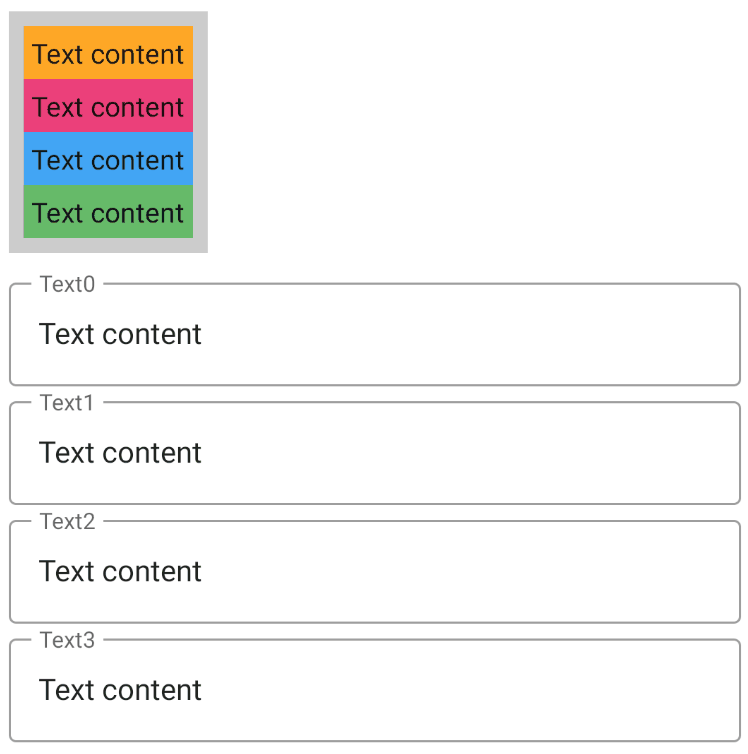
在下面的例子中,使用 SubcomposeLayout 实现了一个可以根据最大子项宽度自动调整每个子项宽度的Column组件:
1
2
3
4
5
6
7
8
9
10
11
12
13
14
15
16
17
18
19
20
21
22
23
24
25
26
27
28
29
30
31
32
33
34
35
36
37
38
39
40
41
42
43
44
45
46
47
48
49
50
51
52
53
54
55
56
57
58
59
60
61
62
63
64
65
66
67
68
69
70
@Composable private fun SubcomposeLayoutExample () val textList = List(4 ) { val textValue = remember { mutableStateOf(TextFieldValue("Text content" )) } textValue } val bgColors = listOf(Orange400, Pink400, Blue400, Green400) SubcomposeColumn( modifier = Modifier.padding(8. dp).background(Color.LightGray).padding(8. dp), content = { textList.forEachIndexed { index, textValue -> Column(Modifier.background(bgColors[index]).padding(4. dp)) { Text(text = textValue.value.text, fontSize = 15. sp) } } } ) textList.forEachIndexed { index, textValue -> OutlinedTextField( modifier = Modifier.padding(horizontal = 8. dp).fillMaxWidth(), value = textValue.value, label = { Text("Text${index} " ) }, placeholder = { Text("Set text to change main width" ) }, onValueChange = { textValue.value = it } ) } } @Composable fun SubcomposeColumn ( modifier: Modifier = Modifier, content: @Composable () -> Unit = {}, ) SubcomposeLayout(modifier = modifier) { constraints -> var subcomposeIndex = 0 var placeables = subcompose(subcomposeIndex++, content).map { it.measure(constraints) } val columnSize = placeables.fold(IntSize.Zero) { currentMax, placeable -> IntSize( width = maxOf(currentMax.width, placeable.width), height = currentMax.height + placeable.height ) } if (placeables.size > 1 ) { placeables = subcompose(subcomposeIndex, content).map { measurable -> measurable.measure(Constraints(columnSize.width, constraints.maxWidth)) } } layout(columnSize.width, columnSize.height) { var y = 0 placeables.forEach { placeable -> placeable.placeRelative(0 , y) y += placeable.height } } } }
运行效果:
SubcomposeLayout 小结 最后我们再来总结一下 SubcomposeLayout 跟前面介绍过的 Layout 组件的主要区别是,它会将子组件的合成阶段 延迟到自己的布局阶段 执行,也就是说在布局阶段会多启动一个子组合 过程(SubComposition):
虽然 SubcomposeLayout 具有很强的灵活性,然而性能上不如常规的 Layout 组件,因为子组件的合成需要要迟到父组件测量时才能进行,并且需要还需要额外创建一个子 Composition ,因此 SubcomposeLayout 可能并不适用在一些对性能要求比较高的 UI 场景 。在一些实在没有办法的特殊场景下,才推荐尝试使用它。
但这并不代表它完全没有用处。例如图片加载库 Coil 的 Jetpack Compose 版本 中的 SubcomposeAsyncImage 组件就是基于 SubcomposeLayout 能力实现的,再比如系统内置的 LazyRow 和 LazyColumn 等延迟列表系列组件的内部实现最终都调用了 SubcomposeLayout ,而系统内置的 Scaffold 脚手架组件内部也是通过SubcomposeLayout 来处理不同槽位之间的测量信息依赖。包括在后文中将要介绍的 BoxWithConstraints 组件,内部也是基于SubcomposeLayout 的封装。
以 LayzyList 系列的组件为例,之所以使用SubcomposeLayout 来实现它,是因为那些滑出屏幕之外的列表项组件是不需要在当前立即 进行组合的,因此这里它们的组合阶段 的执行会有一个延迟 的过程(也就是会延迟到当它们被滑入屏幕之内的时候再被执行),这对于提高长列表的性能而言是非常重要的,这也是为什么这一系列的组件的名字中包含了一个 “Lazy ” 单词的含义和原因。
可见在某些情况下我们是避不开使用它的,我不能说在所有这些情况下都推荐一定去使用它,只能说你需要 “对症下药”,了解它的能力有可能作为我们在极端情况下唯一的救命稻草或者灵丹妙药。
另外,Compose 官方也为我们提供了一些关于 SubcomposeLayout 的使用建议:
如果说,你的需求场景是:至少一个 child 的组合 依赖于其他 child 的测量 结果,那么你可以使用它。
但是如果说,你的需求场景只是:一个 child 的测量 结果依赖于另一个 child 的测量 结果,那么这种场景下就完全不需要使用 SubcomposeLayout ,因为通过前面介绍的常规 Layout 组件的自定义即可满足需求。
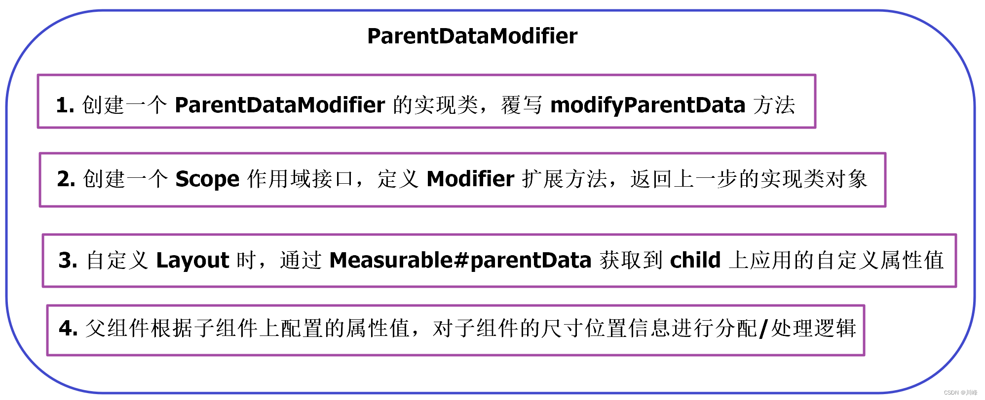
ParentDataModifier 和 Scope ParentDataModifier: 一个继承自Modifier.Element的接口,它是一个可以为父布局提供数据的修饰符。可以在测量和布局期间通过IntrinsicMeasurable.parentData 读取到设置的数据值。parentData 通常用于通知父类如何测量和定位子类布局。
1
2
3
interface ParentDataModifier : Modifier.Element { fun Density.modifyParentData (parentData: Any ?) }
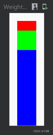
例如,以下代码利用ParentDataModifier 实现了一个简易版的Row/Column中的weight 属性的效果:
1
2
3
4
5
6
7
8
9
10
11
12
13
14
15
16
17
18
19
20
21
22
23
24
25
26
27
28
29
30
31
32
33
34
35
36
37
interface VerticalScope { @Stable fun Modifier.weight (weight: Float ) this .then( WeightParentData(weight) ) companion object : VerticalScope } class WeightParentData (val weight: Float =0f ) : ParentDataModifier { override fun Density.modifyParentData (parentData: Any ?) this @WeightParentData } @Composable fun WeightedVerticalLayout ( modifier: Modifier = Modifier, content: @Composable VerticalScope .() -> Unit ) val measurePolicy = MeasurePolicy { measurables, constraints -> val placeables = measurables.map {it.measure(constraints)} val weights = measurables.map { (it.parentData as WeightParentData).weight } val totalHeight = constraints.maxHeight val totalWeight = weights.sum() val width = placeables.maxOf { it.width } layout(width, totalHeight) { var y = 0 placeables.forEachIndexed() { i, placeable -> placeable.placeRelative(0 , y) y += (totalHeight * weights[i] / totalWeight).toInt() } } } Layout({ VerticalScope.content() }, modifier, measurePolicy) }
上面代码中的 Modifier.width 属性修饰符,只能在我们自定义的 VerticalScope 作用域内使用,因为WeightedVerticalLayout的 content Composable 的 Receiver 被限制为 VerticalScope 。
使用:
1
2
3
4
5
6
7
8
9
@Preview(showBackground = true) @Composable fun WeightedVerticalLayoutExample () WeightedVerticalLayout(Modifier.padding(16. dp).height(200. dp)) { Box(modifier = Modifier.width(40. dp).weight(1f ).background(Color.Red)) Box(modifier = Modifier.width(40. dp).weight(2f ).background(Color.Green)) Box(modifier = Modifier.width(40. dp).weight(7f ).background(Color.Blue)) } }
运行效果:
下面例子实现一个类似 Column 组件的 horizontalAlignment 参数,可以设置水平方向的对齐方式:
1 2 3 4 5 6 7 8 9 10 11 12 13 14 15 16 17 18 19 20 21 22 23 24 25 26 27 28 29 30 31 32 33 34 35 36 37 38 39 40 41 42 43 44 45 46 47 48 49 50 51 52 53 54 55 56 57 58 59 60 61 62 63 64 65 66 67 68 69 70 71 72 73 74 75 76 77 78 79 80 81 82 83 84 85 86 87 88 89 90 91 92 93 94 95 96 enum class HorizontalAlignment { Start, Center, End } private class CustomColumnData (val alignment: HorizontalAlignment) : ParentDataModifier { override fun Density.modifyParentData (parentData: Any ?) this @CustomColumnData override fun equals (other: Any ?) Boolean { if (this === other) return true if (javaClass != other?.javaClass) return false if (!(other is CustomColumnData)) return false if (alignment != other.alignment) return false return true } override fun hashCode () Int = alignment.hashCode() override fun toString () "CustomColumnData(alignment=$alignment )" } interface CustomColumnScope { @Stable fun Modifier.horizontalAlign (align: HorizontalAlignment ) this .then( CustomColumnData(align) ) companion object : CustomColumnScope } private val Measurable.childData: CustomColumnData? get () = parentData as ? CustomColumnData private val Measurable.alignment: HorizontalAlignment get () = childData?.alignment ?: HorizontalAlignment.Start @Composable fun CustomColumnWithScope ( modifier: Modifier = Modifier, content: @Composable CustomColumnScope .() -> Unit ) Layout( modifier = modifier, content = { CustomColumnScope.content() } ) { measurables, constraints -> val looseConstraints = constraints.copy(minWidth = 0 , minHeight = 0 ) val placeables = measurables.map { measurable -> measurable.measure(looseConstraints) } val measurableAlignments = measurables.map { measurable -> measurable.alignment } val totalHeight: Int = placeables.sumOf { it.height }.coerceAtLeast(constraints.minHeight) val maxWidth = constraints.maxWidth println("🤯 Constraints minWidth: ${constraints.minWidth} , " + "minHeight: ${constraints.minHeight} , maxWidth: ${constraints.maxWidth} , " + "maxHeight: ${constraints.maxHeight} , totalHeight: $totalHeight " ) layout(maxWidth, totalHeight) { var y = 0 placeables.forEachIndexed { index, placeable -> val x = when (measurableAlignments[index]) { HorizontalAlignment.Start -> 0 HorizontalAlignment.Center -> (maxWidth - placeable.measuredWidth) / 2 HorizontalAlignment.End -> maxWidth - placeable.measuredWidth } placeable.placeRelative(x, y) y += placeable.height } } } }
使用:
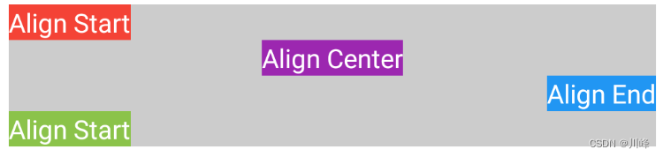
1
2
3
4
5
6
7
8
9
10
11
12
13
14
15
16
17
18
19
20
21
22
23
24
25
26
27
28
29
30
31
32
33
34
35
36
37
38
39
40
41
@Preview(showBackground = true) @Composable fun CustomColumnWithScopeExample () CustomColumnWithScope( modifier = Modifier .padding(8. dp) .fillMaxWidth() .wrapContentHeight() .background(Color.LightGray) ) { Text( "Align Start" , modifier = Modifier .background(Color(0xffF44336 )) .horizontalAlign(HorizontalAlignment.Start), color = Color.White ) Text( "Align Center" , modifier = Modifier .background(Color(0xff9C27B0 )) .horizontalAlign(HorizontalAlignment.Center), color = Color.White ) Text( "Align End" , modifier = Modifier .background(Color(0xff2196F3 )) .horizontalAlign(HorizontalAlignment.End), color = Color.White ) Text( "Align Start" , modifier = Modifier .background(Color(0xff8BC34A )) .horizontalAlign(HorizontalAlignment.Start), color = Color.White ) } }
运行效果:
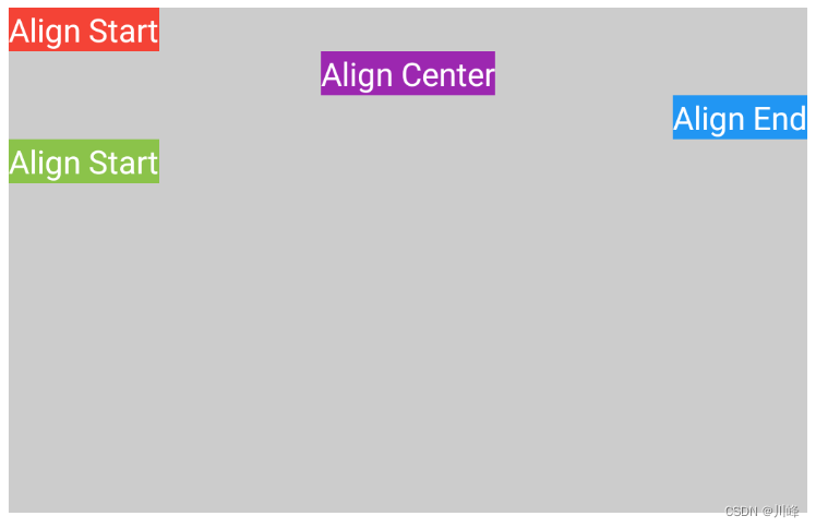
如果把 CustomColumnWithScope 高度改为 Modifier.height(250.dp) 则效果如下:
类似的,下面例子实现一个类似 Row 组件的 verticalAlignment 参数,可以设置垂直方向上的对齐方式:
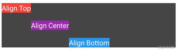
1 2 3 4 5 6 7 8 9 10 11 12 13 14 15 16 17 18 19 20 21 22 23 24 25 26 27 28 29 30 31 32 33 34 35 36 37 38 39 40 41 42 43 44 45 46 47 48 49 50 51 52 53 54 55 56 57 58 59 60 61 62 63 64 65 66 67 68 69 70 71 72 73 74 75 76 77 78 79 80 81 82 83 84 85 86 87 88 89 90 91 92 93 94 95 96 97 98 99 100 101 102 103 104 105 106 107 108 109 110 111 112 113 114 115 116 117 118 119 120 121 122 123 124 125 126 127 128 129 130 131 132 enum class VerticalAlignment { Top, Center, Bottom } private class CustomRowData ( val alignment: VerticalAlignment ) : ParentDataModifier { override fun Density.modifyParentData (parentData: Any ?) this @CustomRowData override fun equals (other: Any ?) Boolean { if (this === other) return true if (javaClass != other?.javaClass) return false if (!(other is CustomRowData)) return false if (alignment != other.alignment) return false return true } override fun hashCode () Int = alignment.hashCode() override fun toString () "CustomRowData(alignment=$alignment )" } interface CustomRowScope { @Stable fun Modifier.verticalAlign (align: VerticalAlignment ) this .then( CustomRowData(align) ) companion object : CustomRowScope } private val Measurable.data : CustomRowData? get () = parentData as ? CustomRowData private val Measurable.verticalAlignment: VerticalAlignment get () = data ?.alignment ?: VerticalAlignment.Center @Composable fun CustomRowWithScope ( modifier: Modifier = Modifier, content: @Composable CustomRowScope .() -> Unit ) Layout( modifier = modifier, content = { CustomRowScope.content() }, ) { measurables, constraints -> val looseConstraints = constraints.copy(minWidth = 0 , minHeight = 0 ) val placeables = measurables.map { measurable -> measurable.measure(looseConstraints) } val measurableAlignments = measurables.map { measurable -> measurable.verticalAlignment } val totalWidth: Int = placeables.sumOf { it.width }.coerceAtLeast(constraints.minWidth) val maxHeight: Int = (placeables.maxOfOrNull { it.height } ?: 0 ).coerceAtLeast(constraints.minHeight) println("🧨 Constraints minWidth: ${constraints.minWidth} , " + "minHeight: ${constraints.minHeight} , maxWidth: ${constraints.maxWidth} , " + "maxHeight: ${constraints.maxHeight} , totalWidth: ${totalWidth} , height: $maxHeight " ) layout(totalWidth, maxHeight) { var x = 0 placeables.forEachIndexed { index, placeable -> val y = when (measurableAlignments[index]) { VerticalAlignment.Top -> 0 VerticalAlignment.Center -> (maxHeight - placeable.measuredHeight) / 2 VerticalAlignment.Bottom -> maxHeight - placeable.measuredHeight } placeable.placeRelative(x, y) x += placeable.width } } } } @Preview(showBackground = true) @Composable fun CustomRowWithScopeExample () CustomRowWithScope( modifier = Modifier .padding(8. dp) .fillMaxWidth() .height(100. dp) .background(Color.DarkGray) ) { Text( "Align Top" , modifier = Modifier .background(Color(0xffF44336 )) .verticalAlign(VerticalAlignment.Top), color = Color.White ) Text( "Align Center" , modifier = Modifier .background(Color(0xff9C27B0 )) .verticalAlign(VerticalAlignment.Center), color = Color.White ) Text( "Align Bottom" , modifier = Modifier .background(Color(0xff2196F3 )) .verticalAlign(VerticalAlignment.Bottom), color = Color.White ) } }
ParentDataModifier 小结 下面对 ParentDataModifier 的使用步骤进行一个简要概况总结:
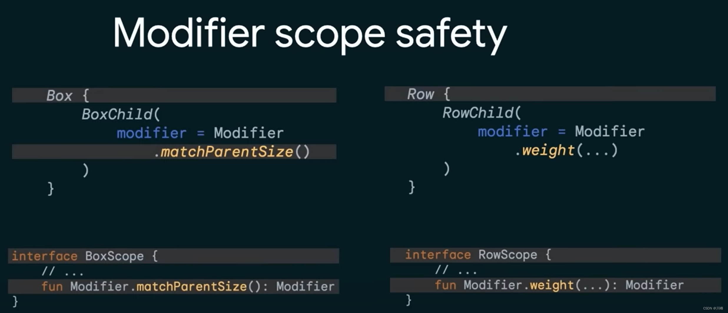
在上面几个例子的代码中,我们都会创建一个Scope作用域的接口,并在该接口中自定义 Modifier 的扩展函数,为什么要这样做呢?这是因为限制自定义属性的作用域是非常有意义的,例如系统的 Box 组件的 matchParentSize() 修饰符只能在 BoxScope 作用域范围内使用,同样的 Row 组件的 weight() 修饰符只能在 RowScope 作用域范围内使用。这样的好处是可以避免在某个组件上使用不属于它的修饰符,否则这会让人非常困惑,就像在 Android 传统 View 体系开发过程中编写 xml 布局文件时,有时我们并不能确定是否应该在某个控件上应用某个属性。
BoxWithConstraints 构建自适应布局 BoxWithConstraints 是一种类似于 Box 的布局组件,但它的优点是可以获取到当前Composable的最小/最大可用宽度和高度信息 以及来自父组件的约束信息 。你可以利用这些信息来决定如何显示不同的内容,它会自行调整大小以适应内容。这对于需要构建自适应屏幕的布局场景非常有用。
1
2
3
4
5
BoxWithConstraints { val boxWithConstraintsScope = this ... }
在 BoxWithConstraints 的 lambda 代码块内,你可以直接访问到 BoxWithConstraintsScope 作用域对象的minWidth, maxWidth, minHeight, maxHeight(dp值)和 constraints(父组件传入的约束对象,可以获取前面四个属性对应的px值)属性,从而根据这几个属性值做出进一步的决定,来安排你要显示的内容。
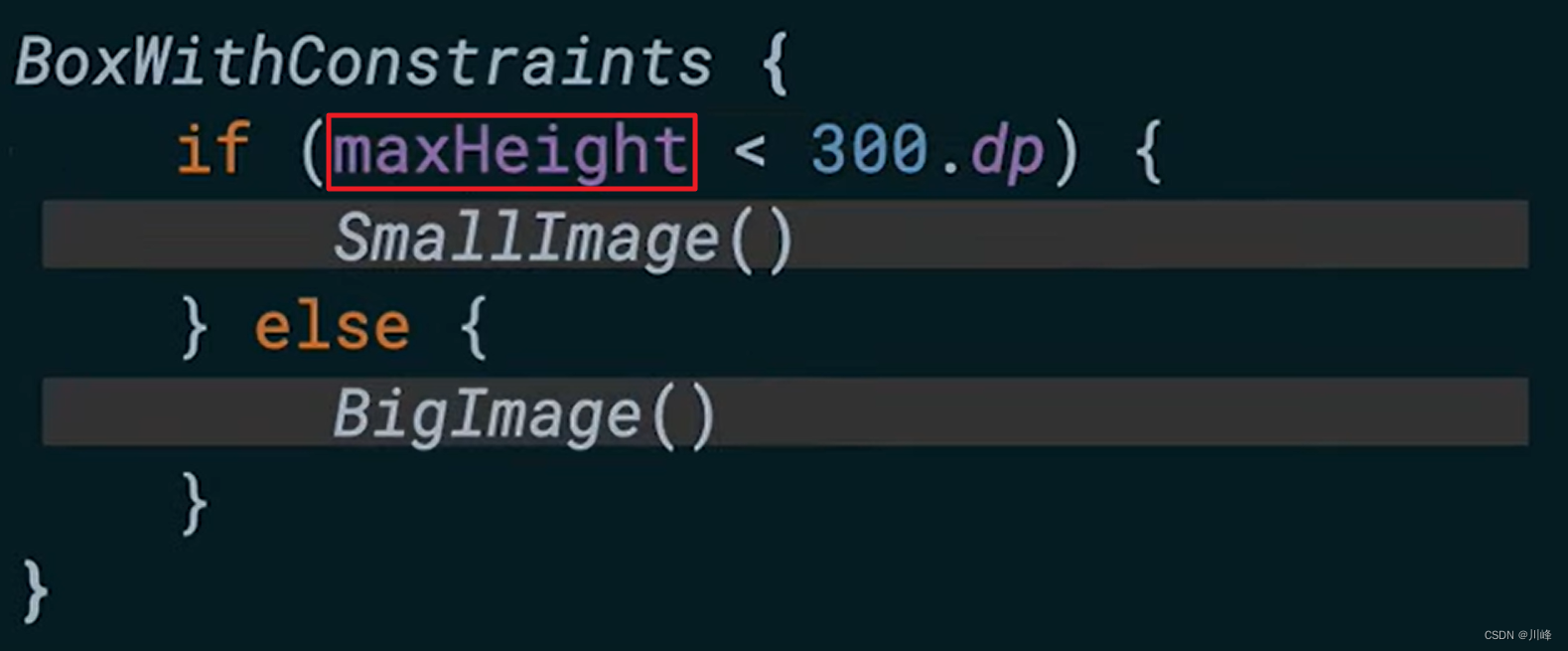
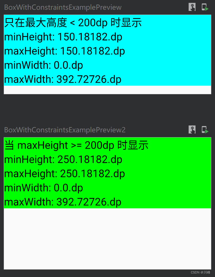
例如,下面的示例Composable跟据maxHeight的值不同而显示不同内容:
1
2
3
4
5
6
7
8
9
10
11
12
13
14
15
16
17
18
19
20
21
22
23
24
25
26
27
@Composable fun BoxWithConstraintsExample () BoxWithConstraints { val boxWithConstraintsScope = this if (maxHeight < 200. dp) { Column(Modifier.fillMaxWidth().background(Color.Cyan)) { Text("只在最大高度 < 200dp 时显示" , fontSize = 20. sp) with(boxWithConstraintsScope) { Text("minHeight: $minHeight " , fontSize = 20. sp) Text("maxHeight: $maxHeight " , fontSize = 20. sp) Text("minWidth: $minWidth " , fontSize = 20. sp) Text("maxWidth: $maxWidth " , fontSize = 20. sp) } } } else { Column(Modifier.fillMaxWidth().background(Color.Green)) { Text("当 maxHeight >= 200dp 时显示" , fontSize = 20. sp) with(boxWithConstraintsScope) { Text("minHeight: $minHeight " , fontSize = 20. sp) Text("maxHeight: $maxHeight " , fontSize = 20. sp) Text("minWidth: $minWidth " , fontSize = 20. sp) Text("maxWidth: $maxWidth " , fontSize = 20. sp) } } } } }
由于 minWidth, maxWidth, minHeight, maxHeight 必须在BoxWithConstraintsScope 作用域内才能访问到,因此上面代码中位于 Column 的 ColumnScope 作用域内的 Text 组件无法访问到,所以必须先暂存一下当前作用域对象,随后通过 boxWithConstraintsScope.minWidth 方式调用,这里使用了Kotlin中一个比较方便的 with 函数来指定要访问属性的 Receiver。
可以定义两个不同高度的预览函数来进行测试:
1
2
3
4
5
6
7
8
9
10
11
@Preview(heightDp = 150, showBackground = true) @Composable fun BoxWithConstraintsExamplePreview () BoxWithConstraintsExample() } @Preview(heightDp = 250, showBackground = true) @Composable fun BoxWithConstraintsExamplePreview2 () BoxWithConstraintsExample() }
预览效果:
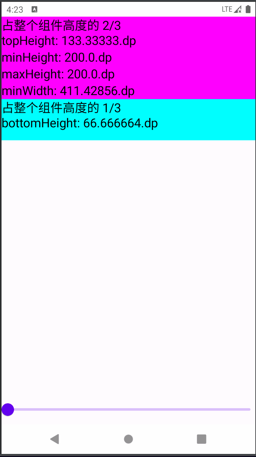
下面的示例中,定义BoxWithConstraints 中的两个子元素的高度分别占总空间可用高度的2/3和1/3,实现类似 weight 的效果:
1
2
3
4
5
6
7
8
9
10
11
12
13
14
15
16
17
18
19
20
21
22
23
24
@Composable private fun BoxWithConstraintsExample2 (modifier: Modifier = Modifier) BoxWithConstraints(modifier.background(Color.LightGray)) { val boxWithConstraintsScope = this val topHeight = maxHeight * 2 / 3f Column(Modifier.fillMaxWidth()) { Column(Modifier.background(Color.Magenta).fillMaxWidth().height(topHeight)) { Text("占整个组件高度的 2/3 \ntopHeight: $topHeight " , fontSize = 20. sp) with(boxWithConstraintsScope) { Text("minHeight: $minHeight " , fontSize = 20. sp) Text("maxHeight: $maxHeight " , fontSize = 20. sp) Text("minWidth: $minWidth " , fontSize = 20. sp) Text("maxWidth: $maxWidth " , fontSize = 20. sp) } } val bottomHeight = boxWithConstraintsScope.maxHeight * 1 / 3f Box(Modifier.background(Color.Cyan).fillMaxWidth().height(bottomHeight)) { Text("占整个组件高度的 1/3 \nbottomHeight: $bottomHeight " , fontSize = 20. sp) } } } }
测试代码:
1
2
3
4
5
6
7
8
9
10
11
12
@Preview(showBackground = true) @Composable fun BoxWithConstraintsExample2Preview () Column(verticalArrangement = Arrangement.SpaceBetween) { var height by remember { mutableStateOf(200f ) } BoxWithConstraintsExample2( Modifier.fillMaxWidth() .height(height.dp) ) Slider(value = height, onValueChange = { height = it}, valueRange = 200f ..600f ) } }
运行效果:
下面假设这样一个需求,现在有一个卡片布局,我们希望卡片布局在空间允许的情况下能够显示更多的内容详情。如下所示:
我们应该避免尝试使用设备的实际屏幕尺寸,对于多屏幕设备或者不是全屏显示的应用,这会不准确。使用 BoxWithConstraints 可以轻松地解决此需求,代码实现可以像下面这样:
1
2
3
4
5
6
7
8
9
10
11
12
13
14
15
16
17
18
19
20
21
22
23
@Composable fun Card ( imageUrl: String , title: String , description: String ) BoxWithConstraints { if (maxWidth < 400. dp) { Column { Image(imageUrl) Title(title) } } else { Row { Column { Title(title) Description(description) } Image(imageUrl) } } } }
再来看一个更加实际一点的场景,假设我们的 UI 设计师现在设计了一个按照以下要求进行展示的卡片列表:
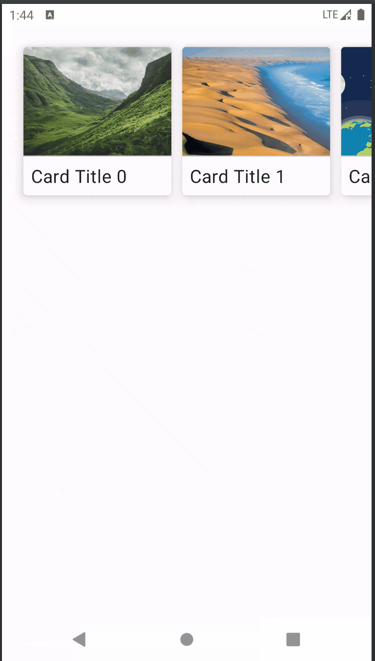
在竖屏模式下,有 2 张卡片是完全可见的,第 3 张卡片只显示一小部分,以便让用户知道还有更多的内容可以滚动查看
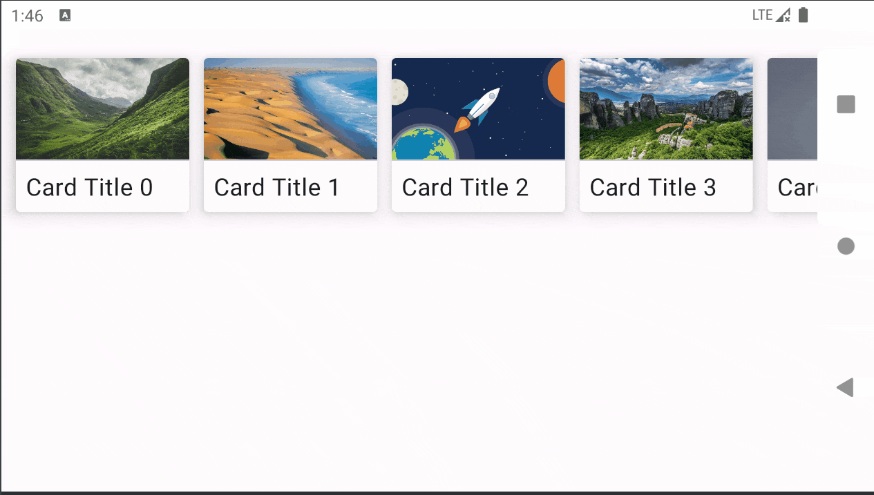
在横屏模式下,有 4 张卡片是完全可见的,第 5 张卡片只显示一小部分,以便让用户知道还有更多的内容可以滚动查看
展示效果如下图所示:
由于 BoxWithConstraints 能让我们访问到 maxWidth 和 maxHeight,我们可以:
判断当前是竖屏模式还是横屏模式
根据可用的屏幕宽度计算每张卡片的宽度,同时考虑到一张卡片应该是部分可见的
看一下实现代码:
1
2
3
4
5
6
7
8
9
10
11
12
13
14
15
16
17
18
19
20
21
22
23
24
25
26
27
28
29
30
31
32
@Composable fun MyAdaptiveCardList (cardDataList: List <Pair <String , Int >>) BoxWithConstraints { LazyRow( horizontalArrangement = Arrangement.spacedBy(12. dp), verticalAlignment = Alignment.CenterVertically, contentPadding = PaddingValues(24. dp) ) { items(cardDataList) { card -> if (maxWidth > maxHeight) { val cardWidth = maxWidth / 4 MyCard( title = card.first, imgId = card.second, height = maxHeight / 3 , width = cardWidth - cardWidth * 0.15f ) } else { val cardWidth = maxWidth / 2 MyCard( title = card.first, imgId = card.second, height = maxHeight / 4 , width = cardWidth - cardWidth * 0.2f ) } } } } }
上面代码中,BoxWithConstraints 中使用了 LazyRow 组件,在 LazyRow 的 lambda 代码块内不属于特定的Scope作用域(使用的是DSL语法),因此在上面的代码中是可以直接访问到 BoxWithConstraintsScope 作用域对象的属性值。但是假如 BoxWithConstraints 里面换成别的组件,例如普通的 Row 组件,就会比较麻烦:
1
2
3
4
5
6
7
8
9
10
11
12
13
14
15
16
17
18
19
20
21
22
23
24
25
26
@Composable fun MyAdaptiveCardList2 (cardDataList: List <Pair <String , Int >>) BoxWithConstraints { val boxWithConstraintsScope = this Row( horizontalArrangement = Arrangement.spacedBy(12. dp), verticalAlignment = Alignment.CenterVertically, ) { if (boxWithConstraintsScope.maxWidth > boxWithConstraintsScope.maxHeight) { val cardWidth = boxWithConstraintsScope.maxWidth / 4 MyCard( ... height = boxWithConstraintsScope.maxHeight / 3 , width = cardWidth - cardWidth * 0.15f ) } else { val cardWidth = boxWithConstraintsScope.maxWidth / 2 MyCard( ... height = boxWithConstraintsScope.maxHeight / 4 , width = cardWidth - cardWidth * 0.2f ) } } } }
此时在每次需要访问属性的地方就必须显示地调用 boxWithConstraintsScope 来访问,甚是麻烦,可以选择使用第一个例子中提到的 with 语法来解决。但其实还有一个更简单的方法是,我们可以将展示列表内容的逻辑部分定义为 BoxWithConstraintsScope 的一个扩展函数来解决:
1
2
3
4
5
6
7
8
9
10
11
12
13
14
15
16
17
18
19
20
21
22
23
24
25
26
27
28
29
30
@Composable fun BoxWithConstraintsScope.AdaptiveCardList (cardDataList: List <Pair <String , Int >>) LazyRow( horizontalArrangement = Arrangement.spacedBy(12. dp), verticalAlignment = Alignment.CenterVertically, contentPadding = PaddingValues(24. dp) ) { items(cardDataList) { card -> if (maxWidth > maxHeight) { val cardWidth = maxWidth / 4 MyCard( title = card.first, imgId = card.second, height = maxHeight / 3 , width = cardWidth - cardWidth * 0.15f ) } else { val cardWidth = maxWidth / 2 MyCard( title = card.first, imgId = card.second, height = maxHeight / 4 , width = cardWidth - cardWidth * 0.2f ) } } } }
由于扩展函数的 Receiver 是 BoxWithConstraintsScope ,因此里面就可以直接访问其属性了。
使用时也非常简单,只需要在外层套上 BoxWithConstraints 即可:
1
2
3
4
5
6
7
8
@Preview(showBackground = true) @Composable fun AdaptiveCardListPreview () val cardData = remember { getCardDatas() } BoxWithConstraints { AdaptiveCardList(cardData) } }
另外,通过这个例子,我们知道了一个技能点就是可以通过如下代码来判断屏幕当前的横竖屏模式:
1 2 3 4 5 6 7 8 if (maxWidth > maxHeight) { ... } else { ... }
这里顺便提一下,如果是在其他非 BoxWithConstraints 的 Composable 组件中,常规的判断横竖屏模式的方法是使用 LocalConfiguration 来判断:
1
2
3
4
5
6
7
8
9
val configuration = LocalConfiguration.currentwhen (configuration.orientation) { Configuration.ORIENTATION_LANDSCAPE -> { } Configuration.ORIENTATION_PORTRAIT -> { } }
由于本示例使用了 BoxWithConstraints ,所以就没必要再使用 LocalConfiguration 来判断了。
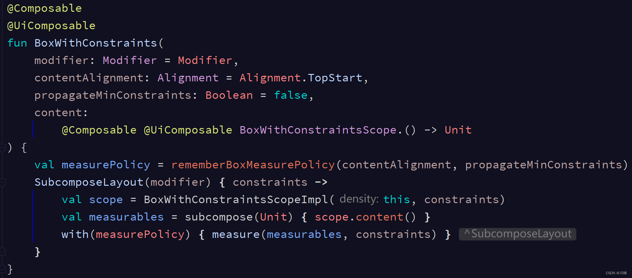
BoxWithConstraints 小结 BoxWithConstraints 在默认情况下不会将它接收到的约束信息继续传递给子组件(不被子组件 Layout 的 lambda 的 constraints参数所接收),这是在Compose可能是一个特例,但是它有一个参数 propagateMinConstraints 可以控制是否希望将约束继续往下传,该参数默认值为 false,如果你有需要可以改成 true 则约束会继续往下传。所以我们可以认为 BoxWithConstraints 还具有一种可以拒绝父组件约束条件的超能力,正所谓 “将在外,君命有所不受” 。
虽然 BoxWithConstraints 在构建自适应布局方面有着强大的优势,但是,使用它也会带来一些后果,因为 BoxWithConstraints 会将组合 推迟到布局阶段 (此时已知道这些约束条件),从而导致在布局 期间执行更多的工作。
BoxWithConstraints 会在布局阶段 启动子组合 ,出于性能原因的考虑,我们应该尽可能避免在布局期间进行组合,尽量使用根据尺寸变化的布局,首选使用前面提到的layout修饰符或 Layout 组件来自定义布局,而非 BoxWithConstraints 。只有在信息内容的类型会随着大小变化时才推荐使用BoxWithConstraints 。
如果要深究一下 BoxWithConstraints 为啥能将组合 延迟到布局 阶段,只需要点开它的源码看一眼就会发现,它的内部是基于 SubcomposeLayout 实现的:
前面提到过 SubcomposeLayout 的超能力就是能将某个子组件的组合阶段延迟到依赖的其他组件的测量阶段之后进行,因此 BoxWithConstraints 只不过是 SubcomposeLayout 的一个套壳而已。它只是简单的对传入的 content Composable 调用了 subcompose 启动子组合,同时为 content 添加了一个 Receiver,而通过该 Receiver 对象你能够访问到父组件的 constraints 对象的信息。
LookaheadLayout 超前测量 LookaheadLayout 的能力和 Intrinsic 固有特性测量有点类似,它也可以提前获取子组件的测量信息,但是貌似官方提供该组件的主要目的是为了动画 专供。使用它你可以实现一些比较fashion的动画效果。
为什么说是动画 专供,比如这样一种场景:我想在当前组件显示的尺寸大小的基础之上,通过动画渐变的方式逐渐变化到另一个尺寸大小。很明显,这是需要从一个初始值 过渡到一个目标值 ,假如我们使用animate*AsState 或者Animatable动画API(当然也可以选择其他的API,这不是重点),那么问题来了,这里的初始值 是指组件开始显示的尺寸大小,那么我们如何一上来就能获取到组件的初始大小 呢?显然,这也是一个需要解除Compose禁止多次测量的魔咒 的方法,那么跟Intrinsic 的情况其实就有一定的类似了,官方提供的 LookaheadLayout 主要是来做这件事的。
通过 LookaheadLayout 布局,你可以对子组件进行两次 测量和布局(解除只能1次测量的魔咒),它会先进行一次叫做前瞻性 的或者叫超前 的测量和布局,随后紧接着它会再进行一次真正 的测量和布局。在前瞻性 的测量和布局阶段之后,它就获得了子组件的尺寸信息,然后在真正 的测量和布局阶段,你就可以通过 LookaheadLayoutScope 作用域的 Modifier.intermediateLayout 修饰符提供的 lookaheadSize 参数来获取到子组件的初始化大小 。其中在前瞻性 的测量阶段中并不会执行 Modifier.intermediateLayout 中的测量逻辑,只有在真正测量阶段才会调用,这是其特意为之。(注意:官方目前 API中标注 SubcomposeLayout目前还不支持LookaheadLayout)
使用 LookaheadLayout 需要提供三个参数:content 就是子组件的内容,modifier 以及 measurePolicy。其实跟 Layout 组件的使用类似,也需要覆写 measurePolicy 的measure方法。
1
2
3
4
5
fun LookaheadLayout ( content: @Composable @UiComposable LookaheadLayoutScope .() -> Unit , modifier: Modifier = Modifier, measurePolicy: MeasurePolicy )
直接看一个例子(也是官方的例子):
1
2
3
4
5
6
7
8
9
10
11
12
13
14
15
16
17
18
19
20
21
22
23
24
25
26
27
28
29
30
31
32
33
34
35
36
37
38
39
40
41
42
43
44
45
46
47
48
49
50
51
52
53
54
55
56
57
58
59
60
61
62
63
64
65
66
67
68
@OptIn(ExperimentalComposeUiApi::class) @Composable fun LookaheadLayoutSample () Column { LookaheadLayout( content = { val lookaheadScope = this var useFullWidth by remember { mutableStateOf(false ) } Row( Modifier.then(if (useFullWidth) Modifier.fillMaxWidth() else Modifier.width(200. dp)) .height(200. dp) .animateConstraints(lookaheadScope) .clickable { useFullWidth = !useFullWidth } ) { Box(Modifier.weight(1f ).fillMaxHeight().background(Color.Red)) Box(Modifier.weight(2f ).fillMaxHeight().background(Color.Blue)) } } ) { measurables, constraints -> val placeables = measurables.map { it.measure(constraints) } val maxWidth = placeables.maxOf { it.width } val maxHeight = placeables.maxOf { it.height } layout(maxWidth, maxHeight) { placeables.forEach { it.place(0 , 0 ) } } } } } @OptIn(ExperimentalComposeUiApi::class) fun Modifier.animateConstraints (lookaheadScope: LookaheadLayoutScope ) var sizeAnimation by remember { mutableStateOf<Animatable<IntSize, AnimationVector2D>?>(null ) } var targetSize by remember { mutableStateOf<IntSize?>(null ) } LaunchedEffect(Unit ) { snapshotFlow { targetSize }.collect { target -> if (target != null && target != sizeAnimation?.targetValue) { sizeAnimation?.run { launch { animateTo(target) } } if (sizeAnimation == null ) { sizeAnimation = Animatable(target, IntSize.VectorConverter) } } } } with(lookaheadScope) { this @composed .intermediateLayout { measurable, _, lookaheadSize -> targetSize = lookaheadSize val (width, height) = sizeAnimation?.value ?: lookaheadSize val animatedConstraints = Constraints.fixed(width, height) val placeable = measurable.measure(animatedConstraints) layout(placeable.width, placeable.height) { placeable.place(0 , 0 ) } } } }
这个例子中,它的子组件的测量约束信息跟当前动画的状态值有关,而当前动画的状态值的初始值就是通过超前测量之后获得的 lookaheadSize 来设置的,也就是说在第一帧显示的时候,它初始化动画API的值就是子组件的大小。而在点击之后,Row的宽度改变,触发重组,再次进行超前测量,随后在真正测量阶段targetSize被更新成新的lookaheadSize,因此 snapshotFlow { targetSize }收集的值会发生变化,进而触发Animatable的 animateTo(target) 方法被执行,那么当前动画的状态值开始变化,而intermediateLayout中依赖动画状态值的约束信息就被不断的更新,最终用该约束信息测量的子组件的尺寸大小就不断变化。
运行效果:
LookaheadLayout 除了可以前瞻性的获取尺寸信息,还可以前瞻性的获取位置 信息, LookaheadLayoutScope 作用域的 Modifier.onPlaced 修饰符提供了这一能力,该修饰符的lambda中提供了两个参数 lookaheadScopeCoordinates 和 layoutCoordinates分别表示当前LookaheadLayout的坐标信息,以及应用当前modifier的组件的坐标信息,并提供了两个方法lookaheadScopeCoordinates.localLookaheadPositionOf(layoutCoordinates) 和 lookaheadScopeCoordinates.localPositionOf(layoutCoordinates, Offset.Zero),能分别获取到前瞻性的位置和当前的位置信息(相对于父组件LookaheadLayout),随后就能在 intermediateLayout 中基于这些信息使用动画。
下面是官方的一个使用示例:
1
2
3
4
5
6
7
8
9
10
11
12
13
14
15
16
17
18
19
20
21
22
23
24
25
26
27
28
29
30
31
32
33
34
35
36
37
38
39
40
41
42
43
44
45
46
47
48
49
50
51
52
53
54
55
56
57
58
59
60
61
62
63
64
65
66
67
68
69
70
71
72
73
74
75
76
77
@OptIn(ExperimentalComposeUiApi::class) @Composable fun LookaheadLayoutCoordinatesSample () val colors = listOf( Color(0xffff6f69 ), Color(0xffffcc5c ), Color(0xff264653 ), Color(0xff2a9d84 ) ) val items = remember { movableContentWithReceiverOf<LookaheadLayoutScope> { colors.forEach { color -> Box(Modifier.padding(15. dp).size(100. dp, 80. dp) .animatePlacement(this ) .background(color, RoundedCornerShape(20 )) ) } } } var isInColumn by remember { mutableStateOf(true ) } LookaheadLayout( content = { if (isInColumn) { Column { items() } } else { Row { items() } } }, modifier = Modifier.fillMaxSize().clickable { isInColumn = !isInColumn } ) { measurables, constraints -> val placeables = measurables.map { it.measure(constraints) } val maxWidth: Int = placeables.maxOf { it.width } val maxHeight = placeables.maxOf { it.height } layout(maxWidth, maxHeight) { placeables.forEach { it.place(0 , 0 ) } } } } @OptIn(ExperimentalComposeUiApi::class) private fun Modifier.animatePlacement (lookaheadScope: LookaheadLayoutScope ) var offsetAnimation by remember { mutableStateOf<Animatable<IntOffset, AnimationVector2D>?>(null ) } var placementOffset by remember { mutableStateOf(IntOffset.Zero) } var targetOffset by remember { mutableStateOf<IntOffset?>(null ) } LaunchedEffect(Unit ) { snapshotFlow { targetOffset }.collect { target -> if (target != null && target != offsetAnimation?.targetValue) { offsetAnimation?.run { launch { animateTo(target) } } if (offsetAnimation == null ) { offsetAnimation = Animatable(target, IntOffset.VectorConverter) } } } } with(lookaheadScope) { this @composed .onPlaced { lookaheadScopeCoordinates, layoutCoordinates -> targetOffset = lookaheadScopeCoordinates.localLookaheadPositionOf(layoutCoordinates).round() placementOffset = lookaheadScopeCoordinates.localPositionOf(layoutCoordinates, Offset.Zero).round() } .intermediateLayout { measurable, constraints, _ -> val placeable = measurable.measure(constraints) layout(placeable.width, placeable.height) { val (x, y) = offsetAnimation?.run { value - placementOffset } ?: (targetOffset!! - placementOffset) placeable.place(x, y) } } } }
运行效果:
在这个例子中,子组件被摆放的位置信息跟当前基于偏移量动画的状态值有关。在初始时,会进行一次前瞻性测量,这会在onPlaced回调中更新targetOffset 的值,那么snapshotFlow { targetOffset }收集的值变化,在其collect方法中,就会以该值初始化偏移量动画offsetAnimation。随后在点击时,items会在Column和Row之间移动,它们在lookheadlayout中的位置将发生变化,LookaheadLayout又会进行前瞻性测量,在onPlaced回调中,就可以通过 lookaheadScopeCoordinates.localLookaheadPositionOf 观测到最终的变化位置,并将该最终位置更新给 targetOffset ,这会再次触发snapshotFlow { targetOffset }的collect方法,这时偏移量动画offsetAnimation的animateTo(target),这会导致当前位置信息会渐变到target值。而 placeable.place(x, y) 依赖偏移量动画offsetAnimation的当前状态值,因此位置就会逐渐变化。
可能还是感觉不是很好理解,可以看下图:
以第二个黄色方块为例,点击时,它从Column中跑到Row中,在前瞻性测量阶段,可以拿到其在父组件中的目标位置是(380, 39),而此时offsetAnimation动画的初始值还处在初始化时设置的 (39, 327), 因此动画就会从 (39, 327) 坐标向 (380, 39) 坐标位置变化,而 placeable.place(x, y) 这个方法如果最终要摆放的组件位置没有偏移,那么x和y应该都是0,也就是 placeable.place(0, 0),因此 (x, y) 的变化范围就是从某一个值变化到 (0, 0) ,因此需要拿动画当前值和目标值作差,得出 (-341, 288) ,则 (x, y) 的变化就是从 (-341, 288) 变化到 (0, 0) 。
上面两个例子看不出使用LookaheadLayout有什么特别的值得哇塞的效果,下面再看一个例子。下面代码中利用前面的代码稍加修改,实现了一个在列表页面和详情页面之间的共享元素动画效果:
1
2
3
4
5
6
7
8
9
10
11
12
13
14
15
16
17
18
19
20
21
22
23
24
25
26
27
28
29
30
31
32
33
34
35
36
37
38
39
40
41
42
43
44
45
46
47
48
49
50
51
52
53
54
55
56
57
58
59
60
61
62
63
64
65
66
67
68
69
70
71
72
73
74
75
76
77
78
79
80
81
82
83
84
85
86
87
88
89
90
91
92
93
94
95
96
97
98
99
100
101
102
103
104
105
106
107
108
109
110
111
112
113
114
115
116
117
118
119
120
121
122
123
124
125
126
127
128
129
130
131
132
133
134
135
136
137
138
139
140
141
142
143
144
145
146
147
@OptIn(ExperimentalComposeUiApi::class) @Composable fun LookaheadLayoutShareAnimationExample () var isSmall by remember { mutableStateOf(true ) } var clickIndex = -1 val headImages = remember { List(6 ) { index -> movableContentWithReceiverOf<LookaheadLayoutScope> { Box(Modifier .size(if (isSmall) 50. dp else 250. dp) .shareAnimation(this , isSmall) .clickable { isSmall = !isSmall clickIndex = index } ) { Image(painter = painterResource(id = R.drawable.ic_head), contentDescription = null ) } } } } SimpleLookaheadLayout { if (isSmall) { ListScreen(headImages) { clickedIndex -> isSmall = !isSmall clickIndex = clickedIndex } } else { DetailScreen(headImages[clickIndex]) } } } @OptIn(ExperimentalComposeUiApi::class) @Composable fun SimpleLookaheadLayout ( modifier: Modifier = Modifier, content: @Composable LookaheadLayoutScope .() -> Unit , ) LookaheadLayout(content = content, modifier = modifier) { measurables, constraints -> val placeables = measurables.map { it.measure(constraints) } val maxWidth = placeables.maxOf { it.width } val maxHeight = placeables.maxOf { it.height } layout(maxWidth, maxHeight) { placeables.forEach { it.place(0 , 0 ) } } } } @OptIn(ExperimentalComposeUiApi::class) @Composable fun LookaheadLayoutScope.ListScreen ( headImages: List <@Composable (LookaheadLayoutScope .() -> Unit )>, onItemClick: (Int ) -> Unit ) Column(Modifier.fillMaxSize()) { headImages.forEachIndexed { index, headImage -> Spacer(Modifier.height(5. dp)) Row(Modifier.padding(8. dp).clickable { onItemClick(index) }) { headImage() Spacer(Modifier.width(10. dp)) Text("$index " + "简介" .repeat(15 )) } Spacer(Modifier.height(5. dp)) Divider() } } } @OptIn(ExperimentalComposeUiApi::class) @Composable fun LookaheadLayoutScope.DetailScreen (headImage: @Composable (LookaheadLayoutScope .() -> Unit )) Column( Modifier.fillMaxSize(), horizontalAlignment = Alignment.CenterHorizontally, verticalArrangement = Arrangement.Center ) { headImage() Spacer(Modifier.height(10. dp)) Divider() Spacer(Modifier.height(10. dp)) Text("详情" .repeat(200 )) } } @OptIn(ExperimentalComposeUiApi::class) private fun Modifier.shareAnimation (lookaheadScope: LookaheadLayoutScope , isSmall: Boolean = true ) var offsetAnimation by remember { mutableStateOf<Animatable<IntOffset, AnimationVector2D>?>(null ) } var placementOffset by remember { mutableStateOf(IntOffset.Zero) } var targetOffset by remember { mutableStateOf<IntOffset?>(null ) } LaunchedEffect(Unit ) { snapshotFlow { targetOffset }.collect { target -> if (target != null && target != offsetAnimation?.targetValue) { offsetAnimation?.run { launch { animateTo(target) } } if (offsetAnimation == null ) { offsetAnimation = Animatable(target, IntOffset.VectorConverter) } } } } var sizeAnimation by remember { mutableStateOf<Animatable<IntSize, AnimationVector2D>?>(null ) } var targetSize by remember { mutableStateOf<IntSize?>(null ) } LaunchedEffect(Unit ) { snapshotFlow { targetSize }.collect { target -> if (target != null && target != sizeAnimation?.targetValue) { sizeAnimation?.run { launch { animateTo(target) } } if (sizeAnimation == null ) { sizeAnimation = Animatable(target, IntSize.VectorConverter) } } } } val maxPercent = 50 val minPercent = 5 var cornerPercent by remember { mutableStateOf(maxPercent) } val cornerPercentAnimation = remember { Animatable(maxPercent, Int .VectorConverter) } cornerPercent = if (isSmall) maxPercent else minPercent LaunchedEffect(Unit ) { snapshotFlow { cornerPercent }.collect { target -> if (target != cornerPercentAnimation.targetValue) { launch { cornerPercentAnimation.animateTo(target) } } } } with(lookaheadScope) { this @composed .onPlaced { lookaheadScopeCoordinates, layoutCoordinates -> targetOffset = lookaheadScopeCoordinates .localLookaheadPositionOf(layoutCoordinates).round() placementOffset = lookaheadScopeCoordinates .localPositionOf(layoutCoordinates, Offset.Zero).round() } .intermediateLayout { measurable, constraints, lookaheadSize -> targetSize = lookaheadSize val (width, height) = sizeAnimation?.value ?: lookaheadSize val animatedConstraints = Constraints.fixed(width, height) val placeable = measurable.measure(animatedConstraints) layout(placeable.width, placeable.height) { val (x, y) = offsetAnimation?.run { value - placementOffset } ?: (targetOffset!! - placementOffset) placeable.place(x, y) } } .clip(RoundedCornerShape(cornerPercentAnimation.value)) .border(1. dp, Color.Red, RoundedCornerShape(cornerPercentAnimation.value)) } }
运行效果:
注意,上面代码中每个列表项中的头像和其详情页面的头像其实是同一个元素,因此需要执行6次movableContentWithReceiverOf,创建6个共享头像,为每一个列表项和对应详情页面分配一个共享头像,这样点击的时候才会从对应列表项的小头像放大到对应详情页的大头像,再次点击大头像的时候会返回点击的列表项位置。如果只创建一个共享头像,则所有列表项都会共用这一个,效果是放大之后再次点击会全部缩小到第一个列表项中。
LookaheadLayout 小结 相对于前面提到的组件,LookaheadLayout 是我至今发现的使用方式最复杂的一个了,但是它能实现的动画效果相当不错。下面总结一下 LookaheadLayout 使用的大概流程:
自定义对齐线 Compose中提供了一个默认的 Modifier.alignByBaseline() 对齐线修饰符,可以用来做组件的基线对齐效果,该修饰符的效果可以透传父组件中。
例如,下面是一个应用 Modifier.alignByBaseline() 的简单例子:
1
2
3
4
5
6
7
8
9
10
11
12
13
14
15
16
17
18
19
20
@Preview(showBackground = true, heightDp = 200, widthDp = 250) @Composable fun AlignmentBasicExample () Column( horizontalAlignment = Alignment.CenterHorizontally, verticalArrangement = Arrangement.Center ) { Row { Text("Jetpack " ) Button(onClick = {}) { Text("Compose" , color = Color.White) } } Spacer(Modifier.height(20. dp)) Row { Text("Jetpack " , modifier = Modifier.alignByBaseline()) Button(onClick = {}, modifier = Modifier.alignByBaseline()) { Text("Compose" , color = Color.White) } } } }
预览效果:
可以看到如果不使用对齐线,默认 Row 组件中的 Text 文本和 Button 组件中的 Text 文本是不会自动对齐的,当对 Button 组件使用对齐线以后,Button 组件会从它的子组件 Text 来获取对齐线,因此对齐线透传到了 Row 组件中,两个文本便被对齐。
再来看下面这样一个场景,我想让下面的卡片中的红心按钮与它左侧的文本基线对齐,如下图所示:
我们可以这样来实现:
1
2
3
4
5
6
7
8
9
10
11
12
13
14
15
16
17
18
19
20
21
22
23
24
25
26
27
28
29
30
31
32
33
34
35
36
37
38
39
40
41
42
43
44
45
46
47
48
49
50
51
52
53
54
55
56
57
58
59
60
61
62
63
64
65
66
67
68
69
70
71
72
73
@Composable fun UserCard (title: String , msg: String ) Row( modifier = Modifier.padding(all = 8. dp), verticalAlignment = Alignment.CenterVertically ) { Image( painter = painterResource(id = R.drawable.ic_doctor_strange), modifier = Modifier .size(80. dp) .clip(RoundedCornerShape(15 )), contentScale = ContentScale.Crop, contentDescription = "head" ) Spacer(Modifier.width(8. dp)) var isExpanded by remember { mutableStateOf(false ) } Column( modifier = Modifier .weight(1f ) .clickable { isExpanded = !isExpanded } ){ Text(text = title, color = Color.Black, fontSize = 18. sp) Spacer(Modifier.height(15. dp)) Row(horizontalArrangement = Arrangement.SpaceBetween) { Text( text = msg, fontSize = 16. sp, maxLines = if (isExpanded) Int .MAX_VALUE else 1 , modifier = Modifier .weight(1f ) .alignByBaseline() ) Row( modifier = Modifier .padding(start = 8. dp, end = 8. dp) .alignByBaseline() ) { Icon( imageVector = Icons.Filled.Favorite, contentDescription = null , tint = Color.Red, modifier = Modifier.size(18. dp) ) Text("65663" , modifier = Modifier.padding(start = 5. dp), fontSize = 13. sp) } } } } } @Preview(heightDp = 200, widthDp = 500) @Composable fun AlignmentExample () Box( modifier = Modifier .fillMaxSize() .background(Color.Cyan), contentAlignment = Alignment.Center ) { Surface( shape = RoundedCornerShape(15 ), shadowElevation = 1.5 .dp, modifier = Modifier .padding(all = 8. dp) .fillMaxWidth() .wrapContentHeight(), ){ UserCard( title = "The Avengers" , msg = "This is the only way we can beat Thanos!" .repeat(3 ) ) } } }
运行效果:
但是我们发现,当文本展开显示多行以后,右侧收藏按钮会跟随文本跑到上面去。假如我想让收藏按钮始终保留在卡片的底部且与文本的基线对齐该怎么办?此时可以使用另一个比较有用的修饰符 Modifier.alignBy{ },alignBy 的 lambda block 中会传入一个 Measured 对象,通过该对象可以获取到当前组件已测量的宽度和高度值,然后你可以选择以哪个值为标准进行对齐。修改上面的部分代码如下:
1
2
3
4
5
6
7
8
9
10
11
12
13
14
15
16
17
18
19
20
21
@Composable fun UserCard (title: String , msg: String ) Row(...) { Image(...) Column(...) { Text(...) Row(...) { Text(... modifier = Modifier.weight(1f ) .alignBy { it.measuredHeight } ) Row( modifier = Modifier.padding(...) .alignBy { it.measuredHeight } ) { ... } } } } }
运行效果:
需要注意的是, Modifier.alignByBaseline() 只能在RowScope中使用,而 Modifier.alignBy{ } 系列可以在 RowScope 和 ColumnScope 中使用,在其他组件中是没有办法使用这两个修饰符的。
创建自定义对齐线 除了上面提到的两个修饰符可以直接使用外,官方也为我们提供了一个创建自定义对齐线的示例。
以下示例展示了一个自定义 BarChart 可组合项,它公开了两条对齐线:MaxChartValue 和 MinChartValue ;这样,其他可组合项就可以对齐到图表的最大和最小数据值。两个文本元素“Max”和“Min” 可以与自定义对齐线的中心对齐。
1
2
3
4
5
6
7
8
9
10
11
12
13
import kotlin.math.maximport kotlin.math.minimport androidx.compose.ui.layout.HorizontalAlignmentLineprivate val MaxChartValue = HorizontalAlignmentLine(merger = { old, new -> min(old, new) })private val MinChartValue = HorizontalAlignmentLine(merger = { old, new -> max(old, new) })
我们的示例中用到的自定义对齐线属于 HorizontalAlignmentLine 类型,因为它们用于垂直对齐子项。如果多个布局为这些对齐线提供了一个值,系统就会以参数的形式传递合并政策。由于 Compose 布局坐标系和 Canvas 坐标系都以 [0, 0]代表左上角,并且 x 轴和 y 轴的正方向都是向下的,因此 MaxChartValue 值将始终小于 MinChartValue。因此,对于最大图表数据值基线,合并策略为 min;对于最小图表数据值基线,合并策略为 max。
在创建自定义 Layout 或 LayoutModifier 时,请在接收 alignmentLines: Map<AlignmentLine, Int> 参数的 MeasureScope.layout() { } 方法中指定自定义对齐线。
BarChart 的完整代码:
1 2 3 4 5 6 7 8 9 10 11 12 13 14 15 16 17 18 19 20 21 22 23 24 25 26 27 28 29 30 31 32 33 34 35 36 37 38 39 40 41 42 43 44 45 46 47 48 49 50 51 52 53 54 55 56 57 58 59 60 61 62 63 64 65 66 67 68 69 70 71 private val MaxChartValue = HorizontalAlignmentLine(merger = { old, new -> min(old, new) })private val MinChartValue = HorizontalAlignmentLine(merger = { old, new -> max(old, new) })@Composable private fun BarChart (dataPoints: List <Int >, modifier: Modifier = Modifier) val maxValue: Float = remember(dataPoints) { dataPoints.maxOrNull()!! * 1.2f } BoxWithConstraints(modifier = modifier) { val density = LocalDensity.current with(density) { val yPositionRatio = remember(density, maxHeight, maxValue) { maxHeight.toPx() / maxValue } val xPositionRatio = remember(density, maxWidth, dataPoints) { maxWidth.toPx() / (dataPoints.size + 1 ) } val xOffset = remember(density) { xPositionRatio / dataPoints.size } val maxYBaseline = remember(dataPoints) { dataPoints.maxOrNull()?.let { (maxValue - it) * yPositionRatio } ?: 0f } val minYBaseline = remember(dataPoints) { dataPoints.minOrNull()?.let { (maxValue - it) * yPositionRatio } ?: 0f } Layout(content = {}, modifier = Modifier.drawBehind { dataPoints.forEachIndexed { index, dataPoint -> val rectSize = Size(60f , dataPoint * yPositionRatio) val topLeftOffset = Offset( x = xPositionRatio * (index + 1 ) - xOffset, y = (maxValue - dataPoint) * yPositionRatio ) drawRect(Color(0xFF3DDC84 ), topLeftOffset, rectSize) } drawLine( Color(0xFF073042 ), start = Offset(0f , 0f ), end = Offset(0f , maxHeight.toPx()), strokeWidth = 6f ) drawLine( Color(0xFF073042 ), start = Offset(0f , maxHeight.toPx()), end = Offset(maxWidth.toPx(), maxHeight.toPx()), strokeWidth = 6f ) }) { _, constraints -> with(constraints) { layout( width = if (hasBoundedWidth) maxWidth else minWidth, height = if (hasBoundedHeight) maxHeight else minHeight, alignmentLines = mapOf( MinChartValue to minYBaseline.roundToInt(), MaxChartValue to maxYBaseline.roundToInt() ) ) {} } } } } }
BarChart 的直接和间接父级均可使用对齐线。 在下面的代码中创建了一个自定义布局 BarChartMinMax ,在其中使用了 BarChart 组件,它将两个 Text 槽和数据点作为参数,并将两个文本与最大和最小图表数据值对齐。
1
2
3
4
5
6
7
8
9
10
11
12
13
14
15
16
17
18
19
20
21
22
23
24
25
26
27
28
29
30
31
32
33
34
35
36
37
38
39
40
41
42
43
44
@Composable private fun BarChartMinMax ( dataPoints: List <Int >, maxText: @Composable () -> Unit , minText: @Composable () -> Unit , modifier: Modifier = Modifier ) Layout( content = { maxText() minText() BarChart(dataPoints, Modifier.size(200. dp)) }, modifier = modifier ) { measurables, constraints -> check(measurables.size == 3 ) val placeables = measurables.map { it.measure(constraints.copy(minWidth = 0 , minHeight = 0 )) } val maxTextPlaceable = placeables[0 ] val minTextPlaceable = placeables[1 ] val barChartPlaceable = placeables[2 ] val minValueBaseline = barChartPlaceable[MinChartValue] val maxValueBaseline = barChartPlaceable[MaxChartValue] layout(constraints.maxWidth, constraints.maxHeight) { maxTextPlaceable.placeRelative( x = 0 , y = maxValueBaseline - (maxTextPlaceable.height / 2 ) ) minTextPlaceable.placeRelative( x = 0 , y = minValueBaseline - (minTextPlaceable.height / 2 ) ) barChartPlaceable.placeRelative( x = max(maxTextPlaceable.width, minTextPlaceable.width) + 20 , y = 0 ) } } }
使用:
1
2
3
4
5
6
7
8
9
10
11
12
@Preview(showBackground = true, heightDp = 300) @Composable private fun ChartDataPreview () MaterialTheme { BarChartMinMax( dataPoints = listOf(4 , 24 , 15 ), maxText = { Text("Max" ) }, minText = { Text("Min" ) }, modifier = Modifier.padding(24. dp) ) } }
预览效果:
这个例子涉及到了一个自定义的图表,如果在实际项目中想要使用图表的话,建议最好在Github中进行搜索,选择使用一些功能比较完整的图表库。当然如果你只是使用一种类型的图表,完全可以自己用Canvas来绘制自定义组件,但如果是涉及到很多图表类型,这对于个人来说将会是一个项长期且工作量巨大的工作。这里推荐一个功能相对来说比起齐全的图表库 Charty 。
That’s the END.