默认样式
Button的lambda块中可以传入任意的Composable组件,但一般是放一个Text在里面
1
2
3
Button(onClick = { println("确认onClick" ) }) { Text("默认样式" ) }
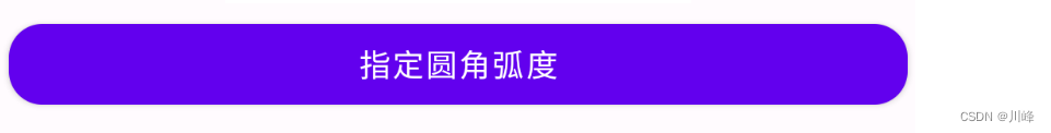
按钮的宽高
如果想要宽一点或高一点的Button,可以通过Modifier修改宽高,例如在Column中可以通过Modifier.fillMaxWidth()指定占满父控件,此外还可以通过 shape 参数修改Button的圆角弧度
1
2
3
4
5
6
7
8
9
Column(horizontalAlignment = Alignment.CenterHorizontally) { Button( onClick = { println("确认onClick" ) }, modifier = Modifier.fillMaxWidth().padding(all = 5. dp), shape = RoundedCornerShape(15. dp) ) { Text("指定圆角弧度" ) } }
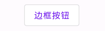
按钮的边框
通过 Button 的 border 参数指定按钮的边框
1
2
3
4
5
6
Button( onClick = { println("click the button" ) }, border = BorderStroke(1. dp, Color.Red) ) { Text(text = "按钮的边框" ) }
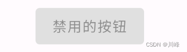
按钮的禁用状态
通过 Button 的 enabled 参数指定按钮的禁用状态
1
2
3
4
5
6
Button( onClick = { println("click the button" ) }, enabled = false ) { Text(text = "禁用的按钮" ) }
按钮的内容
由于Button的内部使用的是一个Row组件来包装的,因此lambda块中实际上可以传入多个Composable组件,它们会按照水平行排列
1
2
3
4
5
6
7
8
9
10
Button(onClick = { println("喜欢onClick" ) }) { Icon( Icons.Filled.Favorite, contentDescription = null , modifier = Modifier.size(ButtonDefaults.IconSize) ) Spacer(Modifier.size(ButtonDefaults.IconSpacing)) Text("喜欢" ) }
自定义按钮按下状态的背景
可以通过 interactionSource 参数指定一个 MutableInteractionSource 对象,可以 remember 该对象,然后通过该对象的collectIsPressedAsState()方法来收集按钮的交互状态,然后根据状态值创建不同的背景或文字颜色
1 2 3 4 5 6 7 8 9 10 11 12 13 14 15 16 17 18 19 20 21 22 23 data class ButtonState (var text: String, var textColor: Color, var buttonColor: Color)val interactionState = remember { MutableInteractionSource() }val pressState = interactionState.collectIsPressedAsState()val (text, textColor, buttonColor) = when { pressState.value -> ButtonState("按下状态" , Color.Red, Color.Black) else -> ButtonState( "正常状态" , Color.White, Color.Red) } Button( onClick = { println(" onClick" ) }, interactionSource = interactionState, elevation = null , shape = RoundedCornerShape(50 ), colors = ButtonDefaults.buttonColors(backgroundColor = buttonColor, contentColor = textColor), modifier = Modifier .width(200. dp) .height(IntrinsicSize.Min) ) { Text(text = text, fontSize = 16. sp) }
文本按钮
正常状态下就是一个文字,但是可以点击,点击的时候有ripple效果
1
2
3
TextButton(onClick = { println("click the TextButton" ) },) { Text(text = "文本按钮" ) }
边框按钮
1
2
3
OutlinedButton(onClick = { println("click the OutlinedButton" ) }) { Text(text = "边框按钮" ) }
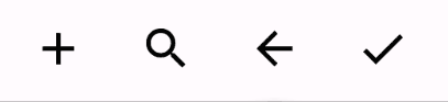
图标按钮
1
2
3
4
5
6
7
8
9
10
11
12
13
14
Row { IconButton(onClick = { println("click the Add" )}) { Icon(imageVector = Icons.Default.Add, contentDescription = null ) } IconButton(onClick = { println("click the Search" )}) { Icon(imageVector = Icons.Default.Search, contentDescription = null ) } IconButton(onClick = { println("click the ArrowBack" )}) { Icon(imageVector = Icons.Default.ArrowBack, contentDescription = null ) } IconButton(onClick = { println("click the Done" )}) { Icon(imageVector = Icons.Default.Done, contentDescription = null ) } }
取消IconButton的波纹
IconButton 的源码中其实将 Box 里的 Modifier.clickable 的Indication 参数设置成波纹了,我们只需要复制源码的代码添加到自己的项目中,并且将 indication 设置为 null 就好了
1
2
3
4
5
6
7
8
9
10
11
12
13
14
15
16
17
18
19
20
21
22
23
24
@Composable fun IconButtonWithNoRipple ( onClick: () -> Unit , modifier: Modifier = Modifier, enabled: Boolean = true , interactionSource: MutableInteractionSource = remember { MutableInteractionSource() content: @Composable () -> Unit ) { Box( modifier = modifier .size(48. dp) .clickable( onClick = onClick, enabled = enabled, role = Role.Button, interactionSource = interactionSource, indication = null ), contentAlignment = Alignment.Center ) { content() } }
使用:
1
2
3
4
5
6
7
8
var myColor by remember { mutableStateOf(Color.Gray) }var flg by remember { mutableStateOf(false ) }IconButtonWithNoRipple(onClick = { flg = !flg myColor = if (flg) Color.Red else Color.Gray }) { Icon(imageVector = Icons.Default.Favorite, contentDescription = null , tint = myColor) }
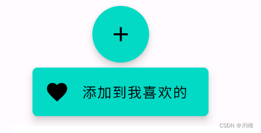
FloatingActionButton
1
2
3
4
5
6
7
8
9
10
11
12
13
FloatingActionButton( onClick = { println("click the FloatingActionButton" ) }, shape = CircleShape ) { Icon(Icons.Filled.Add, contentDescription = "Add" ) } ExtendedFloatingActionButton( icon = { Icon(Icons.Filled.Favorite, contentDescription = null ) }, text = { Text("添加到我喜欢的" ) }, onClick = { println("click the ExtendedFloatingActionButton" ) }, shape = RoundedCornerShape(5. dp) )
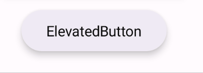
ElevatedButton
注意,这个是在 androidx.compose.material3 包中。可以通过 elevation 参数指定按钮的高度效果
1
2
3
4
5
6
ElevatedButton( onClick = { }, elevation = ButtonDefaults.buttonElevation(defaultElevation = 5. dp, pressedElevation = 10. dp) ) { Text(text = "ElevatedButton" ) }
elevation ,它有默认值,默认效果如下
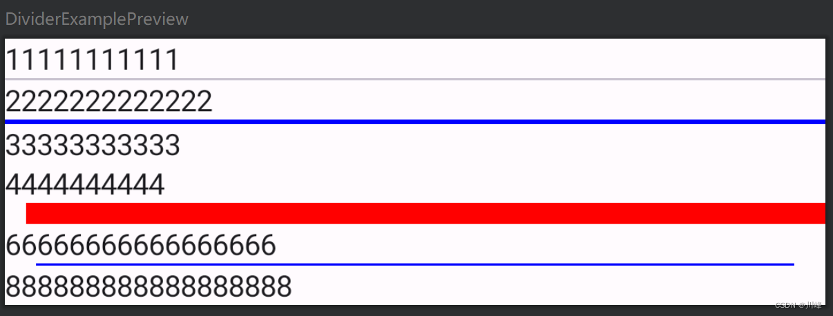
Divider Divider 是一个分割线,可以指定颜色、厚度等。
1
2
3
4
5
6
7
8
9
10
11
12
13
14
15
@Composable fun DividerExample () Column { Text("11111111111" ) Divider() Text("2222222222222" ) Divider(color = Color.Blue, thickness = 2. dp) Text("33333333333" ) Text("4444444444" ) androidx.compose.material.Divider(color = Color.Red, thickness = 10. dp, startIndent = 10. dp) Text("66666666666666666" ) Divider(color = Color.Blue, modifier = Modifier.padding(horizontal = 15. dp)) Text("888888888888888888" ) } }
Icon Icon 的主要参数:
ImageVector:矢量图对象,可以显示 SVG 格式的图标ImageBitmap:位图对象,可以显示 JPG,PNG 等格式的图标tint:图标的颜色Painter:代表一个自定义画笔,可以使用画笔在 Canvas 上直接绘制图标 我们除了直接传入具体类型的实例,也可以通过 res/ 下的图片资源来设置图标
ImageVector 和 ImageBitmap 都提供了对应的加载 Drawable 资源的方法, vectorResource 用来加载一个矢量 XML,imageResource 用来加载 jpg 或者 png 图片。 painterResource 对以上两种类型的 Drawable 都支持,内部会根据资源的不同类型创作对应的画笔进行图标的绘制。
1
2
3
4
5
6
7
8
9
10
Icon( imageVector = Icons.Filled.Favorite, contentDescription = null , tint = Color.Red ) Icon( imageVector = ImageVector.vectorResource(id = R.drawable.ic_launcher_foreground), contentDescription = "矢量图资源" , tint = Color.Blue )
Icon加载资源图片显示黑色没有加载出图片?
别慌,因为默认的tint模式是LocalContentColor.current,我们需要去掉它默认的着色模式,将tint的属性设置为Color.Unspecified
1
2
3
4
5
6
Icon( bitmap = ImageBitmap.imageResource(id = R.drawable.ic_head3), contentDescription = "图片资源" , tint = Color.Unspecified, modifier = Modifier.size(100. dp).clip(CircleShape), )
Icon支持任意类型的图片资源,完全可以当做一个图片组件来使用
1
2
3
4
5
6
7
8
Icon( painter = painterResource(id = R.drawable.ic_head), contentDescription = "任意类型资源" , tint = Color.Unspecified, modifier = Modifier.size(100. dp) .clip(CircleShape) .border(1. dp, MaterialTheme.colorScheme.primary, CircleShape), )
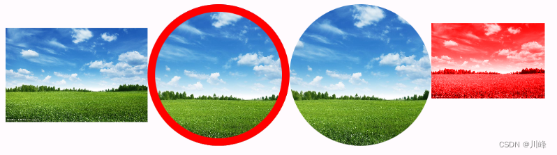
Image Image 组件加载本地资源图片时,跟 Icon的使用类似,通过 painter 参数指定 painterResource 来加载 R.drawable 资源图片
1
2
3
4
5
6
7
8
9
10
11
12
13
14
15
16
17
18
19
20
21
22
23
24
25
26
27
28
29
30
31
32
33
34
35
36
37
@Composable fun ImageExample () Column(modifier = Modifier.padding(10. dp)){ Row{ Image( painter = painterResource(id = R.drawable.ic_sky), contentDescription = null , modifier = Modifier.size(100. dp), ) Surface( shape = CircleShape, border = BorderStroke(5. dp, Color.Red) ) { Image( painter = painterResource(id = R.drawable.ic_sky), contentDescription = null , modifier = Modifier.size(100. dp), contentScale = ContentScale.Crop ) } Image( painter = painterResource(id = R.drawable.ic_sky), contentDescription = null , modifier = Modifier .size(100. dp) .clip(CircleShape), contentScale = ContentScale.Crop, ) Image( painter = painterResource(id = R.drawable.ic_sky), contentDescription = null , modifier = Modifier.size(80. dp), colorFilter = ColorFilter.tint(Color.Red, blendMode = BlendMode.Color) ) } } }
contentScale 参数是图片缩放类型,取值在 ContentScale 伴生对象中,含义参考 Android 原生 ImageView 的scaleType缩放类型,差不多类似的。
另外设置圆形图片有两种方式,如上面代码中,一种是使用 Surface 组件包装起来,然后指定 Surface 的 shape 为 CircleShape,另一种是使用 Modifier.clip(CircleShape) 直接作用于 Image组件。不过这两种方式都要设置宽高为固定相等的值,否则不是正圆。
有时设置成圆形时,图片的上下被剪裁了,
这是因为 Image 中源码的 contentScale 参数默认是 ContentScale.Fit,也就是保持图片的宽高比,缩小到可以完整显示整张图片。 而 ContentScale.Crop 也是保持宽高比,但是尽量让宽度或者高度完整的占满。 所以我们将 contentScale 设置成 ContentScale.Crop即可解决此问题。
Compose 自带的 Image 只能加载资源管理器中的图片文件,如果想加载网络图片或者是其他本地路径下的文件, 可以使用 Coil 加载网络图片: https://coil-kt.github.io/coil/compose/
1
2
3
4
5
6
7
8
9
10
11
12
13
14
15
16
17
18
19
20
21
22
23
24
25
26
27
28
29
30
31
32
33
@Composable fun CoilImageLoaderExample () Row { Image( painter = rememberAsyncImagePainter("https://picsum.photos/300/300" ), contentDescription = null ) AsyncImage( model = "https://picsum.photos/300/300" , contentDescription = null ) AsyncImage( model = ImageRequest.Builder(LocalContext.current) .data ("https://picsum.photos/300/300" ) .crossfade(true ) .build(), placeholder = painterResource(R.drawable.ic_launcher_background), contentDescription = null , contentScale = ContentScale.Crop, onSuccess = { success -> }, onError = { error -> }, onLoading = { loading -> }, modifier = Modifier.clip(CircleShape) ) } }
SubcomposeAsyncImage
SubcomposeAsyncImage会根据组件的约束空间来确定图片的最终大小,这说明在图片装载前,需要预先获取SubcomposeAsyncImage的约束信息, 而Subcomposelayout可以在子组件合成前,获取到父组件的约束信息或其他组件的约束信息。SubcomposeAsyncImage就是Subcomposelayout的能力来实现的,子组件就是我们传入的content内容,它会在SubcomposeAsyncImage组件测量时进行组合。
1
2
3
4
5
6
7
8
9
10
11
12
13
14
15
16
17
18
19
20
21
22
23
24
25
26
27
28
29
30
31
32
33
34
35
36
37
38
39
40
41
@Composable fun CoilImageLoaderExample2 () Column(horizontalAlignment = Alignment.CenterHorizontally) { SubcomposeAsyncImage( model = "https://picsum.photos/350/350" , loading = { CircularProgressIndicator() }, contentDescription = null , modifier = Modifier.size(200. dp) ) SubcomposeAsyncImage( model = "https://picsum.photos/400/400" , contentDescription = null , modifier = Modifier.size(200. dp) ) { val state = painter.state when (state) { is AsyncImagePainter.State.Loading -> CircularProgressIndicator() is AsyncImagePainter.State.Error -> Text("${state.result.throwable} " ) is AsyncImagePainter.State.Success -> SubcomposeAsyncImageContent() is AsyncImagePainter.State.Empty -> Text("Empty" ) } } SubcomposeAsyncImage( model = ImageRequest.Builder(LocalContext.current) .data ("https://picsum.photos/800/600" ) .size(800 , 600 ) .crossfade(true ) .build(), contentDescription = null , ) { val state = painter.state when (state) { is AsyncImagePainter.State.Loading -> CircularProgressIndicator() is AsyncImagePainter.State.Error -> Text("${state.result.throwable} " ) is AsyncImagePainter.State.Success -> SubcomposeAsyncImageContent() is AsyncImagePainter.State.Empty -> Text("Empty" ) } } } }
Coil加载网络svg图片
1
2
3
4
5
6
7
8
9
10
11
12
13
14
15
16
17
18
19
20
21
22
23
24
25
26
27
28
29
30
31
32
33
34
35
36
@Composable fun CoilSVGExample () Row { val context = LocalContext.current val imageLoader = ImageLoader.Builder(context) .components { add(SvgDecoder.Factory()) } .build() Image( painter = rememberAsyncImagePainter ( "https://coil-kt.github.io/coil/images/coil_logo_black.svg" , imageLoader = imageLoader ), contentDescription = null , modifier = Modifier.size(100. dp) ) var flag by remember { mutableStateOf(false ) } val size by animateDpAsState(targetValue = if (flag) 300. dp else 100. dp) CoilImage( imageModel = { "https://coil-kt.github.io/coil/images/coil_logo_black.svg" }, imageOptions = ImageOptions( contentScale = ContentScale.Crop, alignment = Alignment.Center ), modifier = Modifier .size(size) .clickable( onClick = { flag = !flag }, indication = null , interactionSource = MutableInteractionSource() ), imageLoader = { imageLoader } ) } }
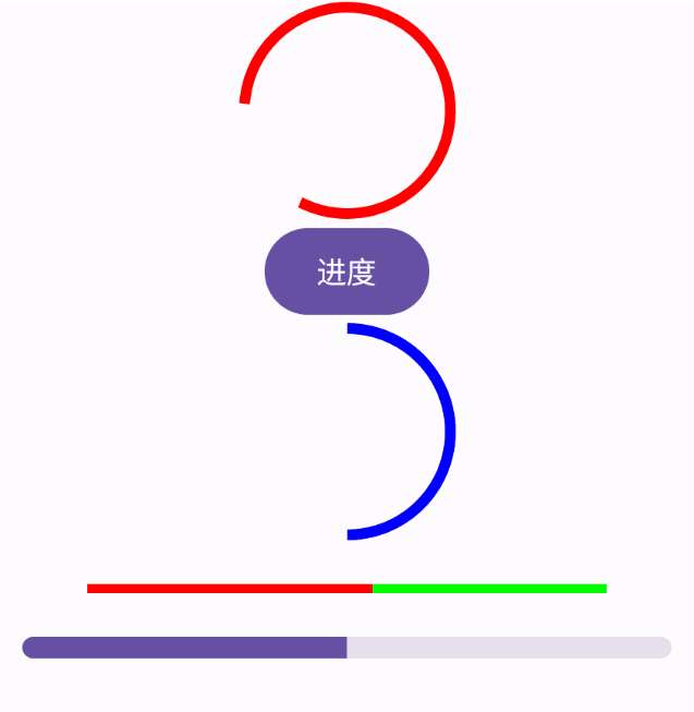
ProgressIndicator ProgressIndicator 进度条在Compose中也分为两种,水平LinearProgressIndicator和圆形CircularProgressIndicator,如果不指定进度值,就是无限动画的进度条。
1
2
3
4
5
6
7
8
9
10
11
12
13
14
15
16
17
18
19
20
21
22
23
24
25
26
27
28
29
30
31
@Composable fun ProgressIndicatorExample () Column(horizontalAlignment = Alignment.CenterHorizontally) { CircularProgressIndicator( Modifier.size(100. dp), color = Color.Red, strokeWidth = 5. dp ) var progress by remember { mutableStateOf(0.5f ) } Button(onClick = { progress += 0.1f }) { Text(text = "进度" ) } CircularProgressIndicator( modifier = Modifier.size(100. dp), progress = progress, strokeWidth = 5. dp, color = Color.Blue, ) Spacer(modifier = Modifier.height(20. dp)) LinearProgressIndicator( color = Color.Red, trackColor = Color.Green, ) Spacer(modifier = Modifier.height(20. dp)) LinearProgressIndicator( progress = progress, modifier = Modifier .width(300. dp) .height(10. dp) .clip(RoundedCornerShape(5. dp)), ) } }
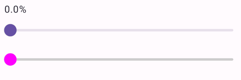
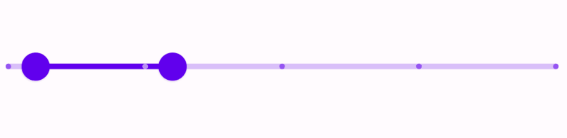
Slider Slider 相当于Android 原来的 SeekBar
1
2
3
4
5
6
7
8
9
10
11
12
13
14
15
16
17
18
19
20
21
22
23
@Composable fun SliderExample () var progress by remember{ mutableStateOf(0f )} Column(modifier = Modifier.padding(15. dp)) { Text("${"%.1f" .format(progress * 100 )} %" ) Slider( value = progress, onValueChange = { progress = it }, ) Slider( value = progress, colors = SliderDefaults.colors( thumbColor = Color.Magenta, activeTrackColor = Color.Blue, inactiveTrackColor = Color.LightGray ), onValueChange = { progress = it println(it) }, ) } }
RangeSlider 范围选择的SeekBar 目前还是实验性的 API
1
2
3
4
5
6
7
8
9
10
11
12
13
14
15
@OptIn(ExperimentalMaterialApi::class) @Composable fun SliderExample2 () var values by remember { mutableStateOf(5f ..30f ) } RangeSlider( value = values, onValueChange = { values = it println(it.toString()) }, valueRange = 0f ..100f , steps = 3 ) }
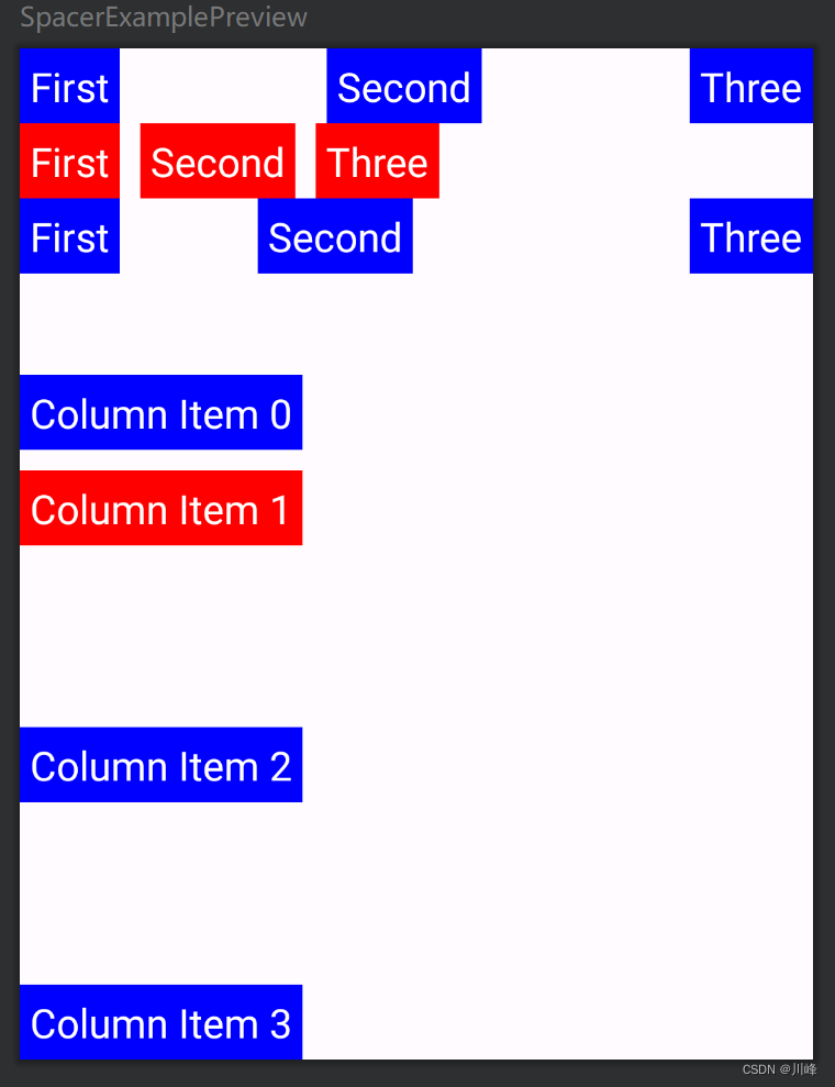
Spacer 一个占位组件
1
2
3
4
5
6
7
8
9
10
11
12
13
14
15
16
17
18
19
20
21
22
23
24
25
26
27
28
29
30
31
32
33
34
35
36
37
38
39
40
41
42
43
44
45
46
47
48
49
50
51
52
53
54
55
56
57
58
59
60
61
62
@Composable fun SpacerExample () Column { Row { MyText("First" , Color.Blue) Spacer(Modifier.weight(1f )) MyText("Second" , Color.Blue) Spacer(Modifier.weight(1f )) MyText("Three" , Color.Blue) } Row { MyText("First" , Color.Red) Spacer(Modifier.width(10. dp)) MyText("Second" , Color.Red) Spacer(Modifier.width(10. dp)) MyText("Three" , Color.Red) } Row { MyText("First" , Color.Blue) Spacer(Modifier.weight(1f )) MyText("Second" , Color.Blue) Spacer(Modifier.weight(2f )) MyText("Three" , Color.Blue) } Spacer(Modifier.height(50. dp)) MyText("Column Item 0" , Color.Blue) Spacer(Modifier.height(10. dp)) MyText("Column Item 1" , Color.Red) Spacer(Modifier.weight(1f )) MyText("Column Item 2" , Color.Blue) Spacer(Modifier.weight(1f )) MyText("Column Item 3" , Color.Blue) } } @Composable fun MyText (text : String , color : Color ) Text(text, modifier = Modifier.background(color).padding(5. dp), fontSize = 20. sp, color = Color.White ) }
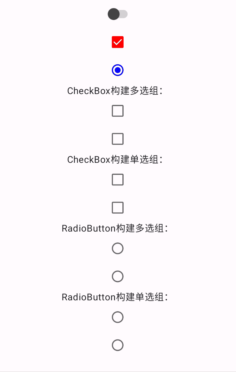
使用示例
1
2
3
4
5
6
7
8
9
10
11
12
13
14
15
16
17
18
19
20
21
22
23
24
25
26
27
28
29
30
31
32
33
34
35
36
37
38
39
40
41
42
43
44
45
46
47
48
49
50
51
52
53
54
55
56
57
58
59
60
61
62
63
64
65
66
67
68
69
70
71
72
73
74
75
76
77
78
79
80
81
82
83
84
85
86
87
88
89
90
91
92
93
94
@Composable fun SwitchExample () Column(horizontalAlignment = Alignment.CenterHorizontally) { var value by remember { mutableStateOf(false ) } Switch( checked = value, onCheckedChange = { value = it }, colors = SwitchDefaults.colors( checkedThumbColor = Color.Blue, checkedTrackColor = Color.Blue, uncheckedThumbColor = Color.DarkGray, uncheckedTrackColor = Color.Gray ), ) var boxState by remember { mutableStateOf(true ) } Checkbox( checked = boxState, onCheckedChange = { boxState = it }, colors = CheckboxDefaults.colors( checkedColor = Color.Red, uncheckedColor = Color.Gray ) ) var selectState by remember { mutableStateOf(true ) } RadioButton( selected = selectState, onClick = { selectState = !selectState }, colors = RadioButtonDefaults.colors( selectedColor = Color.Blue, unselectedColor = Color.Gray ) ) Text("CheckBox构建多选组:" ) CheckBoxMultiSelectGroup() Text("CheckBox构建单选组:" ) CheckBoxSingleSelectGroup() Text("RadioButton构建多选组:" ) RadioButtonMultiSelectGroup() Text("RadioButton构建单选组:" ) RadioButtonSingleSelectGroup() } } @Composable fun CheckBoxMultiSelectGroup () var checkedList by remember { mutableStateOf(listOf(false , false )) } Column { checkedList.forEachIndexed { i, item -> Checkbox(checked = item, onCheckedChange = { checkedList = checkedList.mapIndexed { j, b -> if (i == j) it else b } }) } } } @Composable fun CheckBoxSingleSelectGroup () var checkedList by remember { mutableStateOf(listOf(false , false )) } Column { checkedList.forEachIndexed { i, item -> Checkbox(checked = item, onCheckedChange = { checkedList = List(checkedList.size) { j -> i == j } }) } } } @Composable fun RadioButtonMultiSelectGroup () var checkedList by remember { mutableStateOf(listOf(false , false )) } LazyColumn { items(checkedList.size) { i -> RadioButton(selected = checkedList[i], onClick = { checkedList = checkedList.mapIndexed { j, b -> if (i == j) !b else b } }) } } } @Composable fun RadioButtonSingleSelectGroup () var checkedList by remember { mutableStateOf(listOf(false , false )) } LazyColumn { items(checkedList.size) { i -> RadioButton(selected = checkedList[i], onClick = { checkedList = List(checkedList.size) { j -> i == j } }) } } }
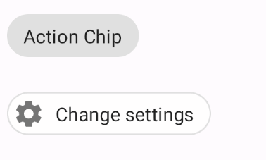
Chip 类似于标签的组件,可以设置边框和颜色等,可以响应点击事件。
1
2
3
4
5
6
7
8
9
10
11
12
13
14
15
16
17
18
19
20
21
22
23
24
@OptIn(ExperimentalMaterialApi::class) @Composable fun ChipSample () val context = LocalContext.current Chip(onClick = { context.showToast("Action Chip" ) }) { Text("Action Chip" ) } } @OptIn(ExperimentalMaterialApi::class) @Composable fun OutlinedChipWithIconSample () val context = LocalContext.current Chip( onClick = { context.showToast("Change settings" )}, border = ChipDefaults.outlinedBorder, colors = ChipDefaults.outlinedChipColors(), leadingIcon = { Icon(Icons.Filled.Settings, contentDescription = "Localized description" ) } ) { Text("Change settings" ) } }
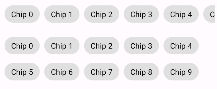
Chip默认是没有选中状态的,不过可以通过点击的时候改变背景色来实现,例如:
1
2
3
4
5
6
7
8
9
10
11
12
13
14
15
16
17
18
19
20
21
22
23
24
25
26
27
28
29
30
31
32
33
34
35
36
37
38
39
40
41
42
43
44
45
46
47
48
49
50
51
52
53
54
55
56
57
58
59
60
61
62
63
@OptIn(ExperimentalMaterialApi::class) @Composable fun SelectableChip ( modifier: Modifier = Modifier, chipText: String , isSelected: Boolean , onSelectChanged: (Boolean ) -> Unit ) Chip( modifier = modifier, onClick = { onSelectChanged(!isSelected) }, border = if (isSelected) ChipDefaults.outlinedBorder else null , colors = ChipDefaults.chipColors( backgroundColor = when { isSelected -> MaterialTheme.colors.primary.copy(alpha = 0.75f ) else -> MaterialTheme.colors.onSurface.copy(alpha = 0.12f ) .compositeOver(MaterialTheme.colors.surface) } ), ) { Text(chipText, color = if (isSelected) Color.White else Color.Black) } } @Composable fun ChipGroupSingleLineSample () Column(horizontalAlignment = Alignment.CenterHorizontally) { Row(modifier = Modifier.horizontalScroll(rememberScrollState())) { repeat(9 ) { index -> var selected by remember { mutableStateOf(false ) } SelectableChip( modifier = Modifier.padding(horizontal = 4. dp), chipText = "Chip $index " , isSelected = selected, onSelectChanged = { selected = it} ) } } } } @OptIn(ExperimentalLayoutApi::class) @Composable fun ChipGroupReflowSample () Column { FlowRow( Modifier.fillMaxWidth(1f ) .wrapContentHeight(align = Alignment.Top), horizontalArrangement = Arrangement.Start, ) { repeat(10 ) { index -> var selected by remember { mutableStateOf(false ) } SelectableChip( modifier = Modifier.padding(horizontal = 4. dp) .align(alignment = Alignment.CenterVertically), chipText = "Chip $index " , isSelected = selected, onSelectChanged = { selected = it} ) } } } }
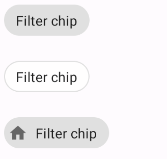
FilterChip FilterChip 就是具有选中状态的 Chip,可以配置选中状态下的背景颜色、内容颜色以及选中的图标。
1
2
3
4
5
6
7
8
9
10
11
12
13
14
15
16
17
18
19
20
21
22
23
24
25
26
27
28
29
30
31
32
33
34
35
36
37
38
39
40
41
42
43
44
45
46
47
48
49
50
51
52
53
54
55
56
57
58
59
60
61
62
63
64
65
66
67
68
69
70
71
72
73
74
75
76
77
78
79
80
@OptIn(ExperimentalMaterialApi::class) @Composable fun FilterChipSample () var selected by remember { mutableStateOf(false ) } FilterChip( selected = selected, onClick = { selected = !selected }, colors = ChipDefaults.filterChipColors( selectedBackgroundColor = MaterialTheme.colors.primary.copy(alpha = 0.75f ), selectedContentColor = Color.White, selectedLeadingIconColor = Color.White ), selectedIcon = { Icon( imageVector = Icons.Filled.Done, contentDescription = "Localized Description" , modifier = Modifier.requiredSize(ChipDefaults.SelectedIconSize) ) } ) { Text("Filter chip" ) } } @OptIn(ExperimentalMaterialApi::class) @Composable fun OutlinedFilterChipSample () var selected by remember { mutableStateOf(false ) } FilterChip( selected = selected, onClick = { selected = !selected }, border = if (!selected) ChipDefaults.outlinedBorder else BorderStroke(ChipDefaults.OutlinedBorderSize, MaterialTheme.colors.primary), colors = ChipDefaults.outlinedFilterChipColors( selectedBackgroundColor = Color.White, selectedContentColor = MaterialTheme.colors.primary, selectedLeadingIconColor = MaterialTheme.colors.primary ), selectedIcon = { Icon( imageVector = Icons.Filled.Done, contentDescription = "Localized Description" , modifier = Modifier.requiredSize(ChipDefaults.SelectedIconSize) ) } ) { Text("Filter chip" ) } } @OptIn(ExperimentalMaterialApi::class) @Composable fun FilterChipWithLeadingIconSample () var selected by remember { mutableStateOf(false ) } FilterChip( selected = selected, onClick = { selected = !selected }, colors = ChipDefaults.filterChipColors( selectedBackgroundColor = MaterialTheme.colors.primary.copy(alpha = 0.75f ), selectedContentColor = Color.White, selectedLeadingIconColor = Color.White ), leadingIcon = { Icon( imageVector = Icons.Filled.Home, contentDescription = "Localized description" , modifier = Modifier.requiredSize(ChipDefaults.LeadingIconSize) ) }, selectedIcon = { Icon( imageVector = Icons.Filled.Done, contentDescription = "Localized Description" , modifier = Modifier.requiredSize(ChipDefaults.SelectedIconSize) ) } ) { Text("Filter chip" ) } }
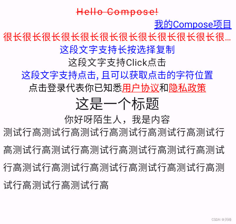
Text 1 2 3 4 5 6 7 8 9 10 11 12 13 14 15 16 17 18 19 20 21 22 23 24 25 26 27 28 29 30 31 32 33 34 35 36 37 38 39 40 41 42 43 44 45 46 47 48 49 50 51 52 53 54 55 56 57 58 59 60 61 62 63 64 65 66 67 68 69 70 71 72 73 74 75 76 77 78 79 80 81 82 83 84 85 86 87 88 89 90 91 92 93 @Composable fun TextExample () Column( horizontalAlignment = Alignment.CenterHorizontally, modifier = Modifier.padding(10. dp) ) { Text( text = "Hello Compose!" , color = Color.Red, fontSize = 16. sp, textDecoration = TextDecoration.LineThrough, letterSpacing = 2. sp, ) Text( text = stringResource(id = R.string.app_name), color = Color.Blue, fontSize = 16. sp, textDecoration = TextDecoration.Underline, modifier = Modifier.fillMaxWidth(), textAlign = TextAlign.Right, style = TextStyle(color = Color.White) ) Text( text = "很长很长很长很长很长很长很长很长很长很长很长很长很长很长" , color = Color.Red, fontSize = 16. sp, maxLines = 1 , overflow = TextOverflow.Ellipsis ) SelectionContainer { Text( text = "这段文字支持长按选择复制" , color = Color.Blue, fontSize = 16. sp, ) } Text(text = "这段文字支持Click点击" , modifier = Modifier.clickable( onClick = { println("点击了" ) } ), fontSize = 16. sp ) ClickableText( text = buildAnnotatedString { append("这段文字支持点击, 且可以获取点击的字符位置" ) }, style = TextStyle(color = Color.Blue, fontSize = 16. sp), onClick = { println("点击的字符位置是$it " ) } ) val annotatedString = buildAnnotatedString { append("点击登录代表你已知悉" ) pushStringAnnotation("protocol" , "https://jetpackcompose.cn/docs/elements/text" ) withStyle(style = SpanStyle(Color.Red, textDecoration = TextDecoration.Underline)){ append("用户协议" ) } pop() append("和" ) pushStringAnnotation("privacy" , "https://docs.bughub.icu/compose/" ) withStyle(style = SpanStyle(Color.Red, textDecoration = TextDecoration.Underline)){ append("隐私政策" ) } pop() } ClickableText( text = annotatedString, style = TextStyle(fontSize = 16. sp), onClick = { offset -> annotatedString.getStringAnnotations("protocol" , offset, offset) .firstOrNull()?.let { annotation -> println("点击到了${annotation.item} " ) } annotatedString.getStringAnnotations("privacy" , offset, offset) .firstOrNull()?.let { annotation -> println("点击到了${annotation.item} " ) } }) Text( text = "这是一个标题" , style = MaterialTheme.typography.headlineSmall ) Text( text ="你好呀陌生人,我是内容" , style = MaterialTheme.typography.bodyLarge ) Text( text = "测试行高" .repeat(20 ), lineHeight = 30. sp, fontSize = 16. sp ) } }
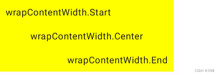
textAlign 设置 Text 在父组件中的对齐位置,还可以通过来设置文字在Text组件内部的对齐位置
1
2
3
4
5
6
7
8
9
10
11
12
13
14
15
16
17
18
19
20
21
22
23
24
25
26
27
28
29
30
31
32
33
@Composable fun TextExample2 () Column { Text( text = "wrapContentWidth.Start" .repeat(1 ), modifier = Modifier .width(300. dp) .background(Color.Yellow) .padding(10. dp) .wrapContentWidth(Alignment.Start), fontSize = 16. sp, ) Text( text = "wrapContentWidth.Center" .repeat(1 ), modifier = Modifier .width(300. dp) .background(Color.Yellow) .padding(10. dp) .wrapContentWidth(Alignment.CenterHorizontally), fontSize = 16. sp, ) Text( text = "wrapContentWidth.End" .repeat(1 ), modifier = Modifier .width(300. dp) .background(Color.Yellow) .padding(10. dp) .wrapContentWidth(Alignment.End), fontSize = 16. sp, ) } }
高斯模糊(仅支持Android 12+)
1 2 3 4 5 6 7 8 9 10 11 12 13 14 15 16 17 18 19 20 21 22 23 24 @Preview(showBackground = true, widthDp = 300) @Composable fun PreviewTextExample4 () Box(Modifier.height(50. dp)) { var checked by remember { mutableStateOf(true ) } val radius by animateDpAsState(targetValue = if (checked) 10. dp else 0. dp) Text( text = "高斯模糊效果" , Modifier.blur( radius = radius, edgeTreatment = BlurredEdgeTreatment.Unbounded ), fontSize = 20. sp ) Switch( checked = checked, onCheckedChange = { checked = it }, modifier = Modifier.align(Alignment.TopEnd) ) } }
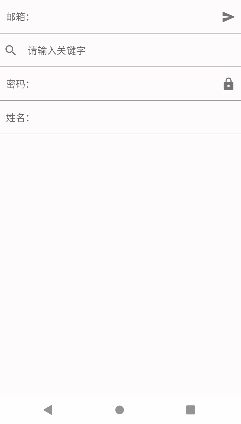
TextField 1 2 3 4 5 6 7 8 9 10 11 12 13 14 15 16 17 18 19 20 21 22 23 24 25 26 27 28 29 30 31 32 33 34 35 36 37 38 39 40 41 42 43 44 45 46 47 48 49 50 51 52 53 54 55 56 57 58 59 60 61 62 63 64 65 @Composable fun TextFieldExample () val textFieldColors = TextFieldDefaults.textFieldColors( textColor = Color(0xFF0079D3 ), backgroundColor = Color.Transparent ) Column { var text by remember { mutableStateOf("" )} TextField( value = text, onValueChange = { text = it }, singleLine = true , label = { Text("邮箱:" ) }, placeholder = { Text("请输入邮箱" ) }, trailingIcon = { IconButton(onClick = { println("你输入的邮箱是:$text " ) } ) { Icon(Icons.Filled.Send, null ) } }, colors = textFieldColors, modifier = Modifier.fillMaxWidth() ) var text2 by remember { mutableStateOf("" )} TextField( value = text2, onValueChange = { text2 = it }, singleLine = true , placeholder = { Text("请输入关键字" ) }, leadingIcon = { Icon(Icons.Filled.Search, null ) }, colors = textFieldColors, modifier = Modifier.fillMaxWidth() ) var text3 by remember { mutableStateOf("" ) } var passwordHidden by remember{ mutableStateOf(false )} TextField( value = text3, onValueChange = { text3 = it }, singleLine = true , trailingIcon = { IconButton(onClick = { passwordHidden = !passwordHidden } ) { Icon(Icons.Filled.Lock, null ) } }, visualTransformation = if (passwordHidden) PasswordVisualTransformation() else VisualTransformation.None, label = { Text("密码:" ) }, colors = textFieldColors, modifier = Modifier.fillMaxWidth() ) var text4 by remember { mutableStateOf("" ) } TextField( value = text4, onValueChange = { text4 = it }, singleLine = true , label = { Text("姓名:" ) }, colors = textFieldColors, modifier = Modifier.fillMaxWidth() ) } }
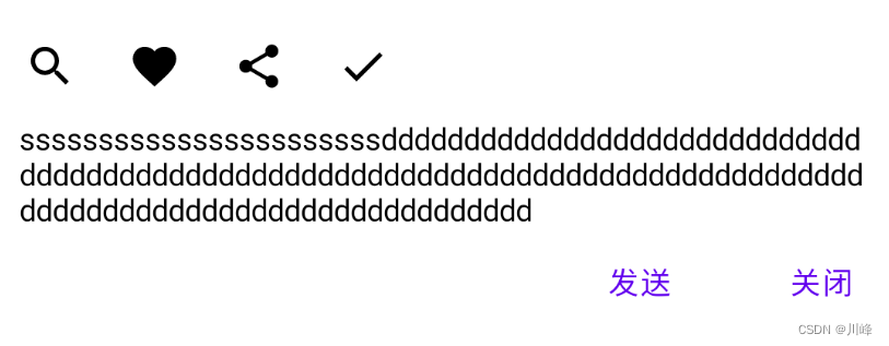
BasicTextField TextField 都是按照 Material Design 来设计的,所以里面的一些间距是固定的, 如果你想自定义一个 TextField 的高度,以及其他的自定义效果,你应该使用 BasicTextField
1 2 3 4 5 6 7 8 9 10 11 12 13 14 15 16 17 18 19 20 21 22 23 24 25 26 27 28 29 30 31 32 33 34 35 36 37 38 @Composable fun BasicTextFieldExample () var text by remember { mutableStateOf("" ) } Box(modifier = Modifier .background(Color(0xFFD3D3D3 )), contentAlignment = Alignment.Center) { BasicTextField( value = text, onValueChange = { text = it }, modifier = Modifier .background(Color.White) .fillMaxWidth(), decorationBox = { innerTextField -> Column(modifier = Modifier.padding(vertical = 10. dp)) { Row(verticalAlignment = Alignment.CenterVertically) { IconButton(onClick = {}) { Icon(Icons.Filled.Search, contentDescription = null ) } IconButton(onClick = {}) { Icon(Icons.Filled.Favorite, contentDescription = null ) } IconButton(onClick = {}) { Icon(Icons.Filled.Share, contentDescription = null ) } IconButton(onClick = {}) { Icon(Icons.Filled.Done, contentDescription = null ) } } Box(modifier = Modifier.padding(horizontal = 10. dp)) { innerTextField() } Row( modifier = Modifier.fillMaxWidth(), verticalAlignment = Alignment.CenterVertically, horizontalArrangement = Arrangement.End ) { TextButton(onClick = { }) { Text("发送" ) } Spacer(Modifier.padding(horizontal = 10. dp)) TextButton(onClick = { }) { Text("关闭" ) } } } } ) } }
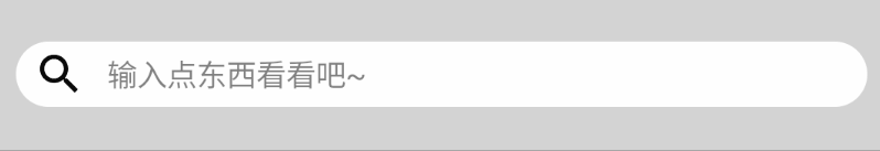
一个类似哔哩哔哩App的搜索框:
1 2 3 4 5 6 7 8 9 10 11 12 13 14 15 16 17 18 19 20 21 22 23 24 25 26 27 28 29 30 31 32 33 34 35 36 37 38 39 40 41 42 43 44 45 46 47 48 49 50 51 52 53 54 55 56 57 58 59 @Composable fun SearchBar () var text by remember { mutableStateOf("" ) } var showPlaceHolder by remember { mutableStateOf(true ) } Box( modifier = Modifier .height(50. dp) .background(Color(0xFFD3D3D3 )), contentAlignment = Alignment.Center ) { BasicTextField( value = text, onValueChange = { text = it showPlaceHolder = it.isEmpty() }, decorationBox = { innerTextField -> Row( verticalAlignment = Alignment.CenterVertically, modifier = Modifier.padding(horizontal = 8. dp, vertical = 2. dp) ) { Icon( imageVector = Icons.Filled.Search, contentDescription = "搜索" , ) Box( modifier = Modifier .padding(horizontal = 10. dp) .weight(1f ), contentAlignment = Alignment.CenterStart ) { if (showPlaceHolder) { Text( text = "输入点东西看看吧~" , color = Color(0x7F000000 ), modifier = Modifier.clickable { showPlaceHolder = false } ) } innerTextField() } if (text.isNotEmpty()) { IconButton( onClick = { text = "" }, modifier = Modifier.size(16. dp) ) { Icon(imageVector = Icons.Filled.Close, contentDescription = "清除" ) } } } }, modifier = Modifier .padding(horizontal = 10. dp) .background(Color.White, CircleShape) .height(30. dp) .fillMaxWidth() ) } }
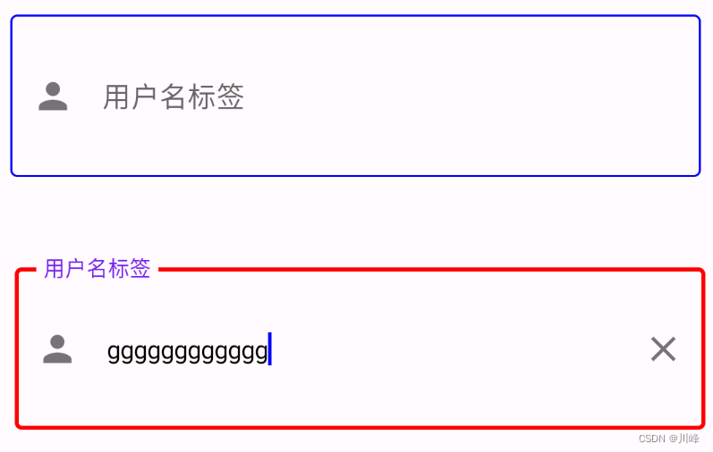
OutlinedTextField 带边框的输入框
1 2 3 4 5 6 7 8 9 10 11 12 13 14 15 16 17 18 19 20 21 22 23 24 25 26 27 28 29 30 31 32 33 34 35 36 37 38 39 40 41 42 43 44 45 46 47 48 49 @Composable fun OutlinedTextFieldExample () val textValue = remember { mutableStateOf("" ) } val context = LocalContext.current Box(contentAlignment = Alignment.Center, modifier = Modifier.padding(10. dp)) { OutlinedTextField( value = textValue.value, onValueChange = { textValue.value = it }, placeholder = { Text(text = "用户名" ) }, label = { Text(text = "用户名标签" ) }, singleLine = true , leadingIcon = { Icon(Icons.Filled.Person, contentDescription = "" ) }, trailingIcon = { if (textValue.value.isNotEmpty()) { IconButton(onClick = { textValue.value = "" }) { Icon(imageVector = Icons.Filled.Clear, contentDescription = "清除" ) } } }, keyboardOptions = KeyboardOptions( keyboardType = KeyboardType.Text, imeAction = ImeAction.Send, ), keyboardActions = KeyboardActions( onSend = { context.showToast("输入的内容为${textValue.value} " ) } ), colors = TextFieldDefaults.outlinedTextFieldColors( focusedBorderColor = Color.Red, unfocusedBorderColor = Color.Blue, disabledBorderColor = Color.Gray, cursorColor = Color.Blue, errorLabelColor = Color.Red, errorLeadingIconColor = Color.Red, errorTrailingIconColor = Color.Red, errorBorderColor = Color.Red, errorCursorColor = Color.Red, ), isError = false , enabled = true , modifier = Modifier.height(100. dp).fillMaxWidth() ) } }
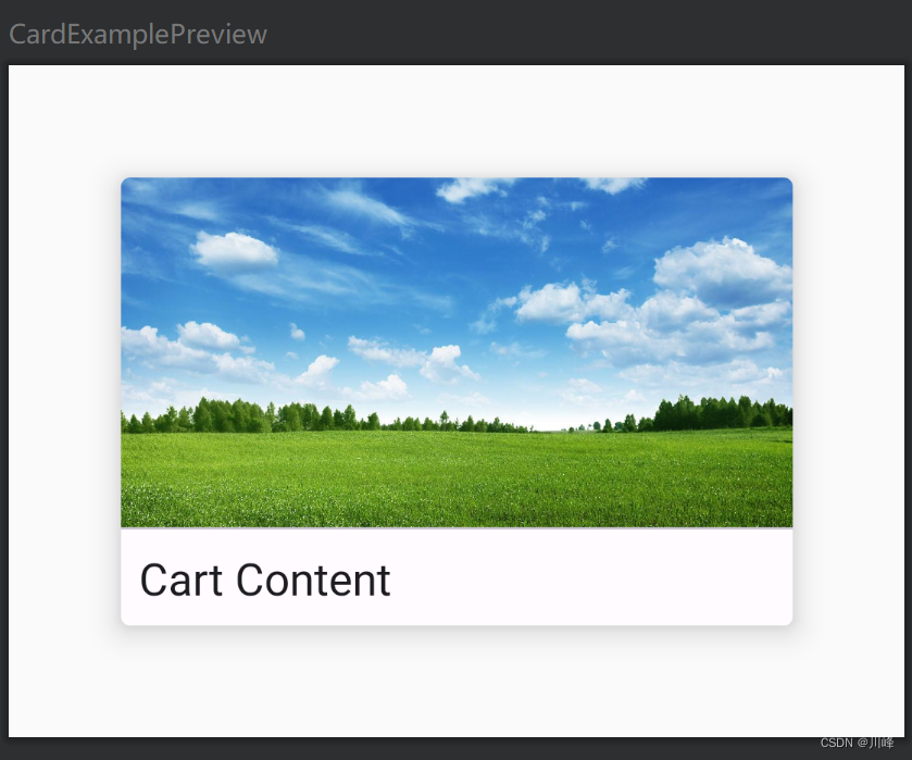
Card 一个卡片组件
1 2 3 4 5 6 7 8 9 10 11 12 13 14 15 16 17 18 19 20 21 22 23 24 25 26 27 28 29 30 31 32 33 34 35 36 37 38 @Composable fun MyCard (width: Dp , height: Dp , title: String , imgId: Int = R.drawable.ic_sky) Box { Card( modifier = Modifier.size(width, height), backgroundColor = MaterialTheme.colorScheme.background, contentColor = MaterialTheme.colorScheme.background, elevation = 10. dp ) { Column { Image( painter = painterResource(id = imgId), contentDescription = null , modifier = Modifier .fillMaxWidth() .weight(1f ), contentScale = ContentScale.Crop ) Divider(Modifier.fillMaxWidth()) Text( title, Modifier.padding(8. dp), color = MaterialTheme.colorScheme.onBackground, fontSize = 20. sp ) } } } } @Preview(showBackground = true, widthDp = 400, heightDp = 300) @Composable fun CardExamplePreview () Box(contentAlignment = Alignment.Center) { MyCard(300. dp, 200. dp, "Cart Content" ) } }
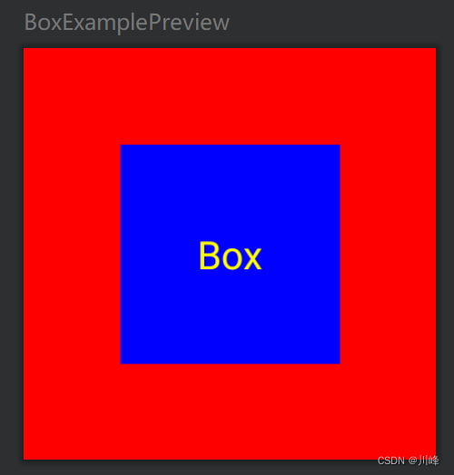
Box 按顺序堆叠,类似FrameLayout
1 2 3 4 5 6 7 8 9 10 @Composable fun BoxExample () Box( contentAlignment = Alignment.Center ) { Box(modifier = Modifier.size(150. dp).background(Color.Red)) Box(modifier = Modifier.size(80. dp).background(Color.Blue)) Text("Box" , color = Color.Yellow) } }
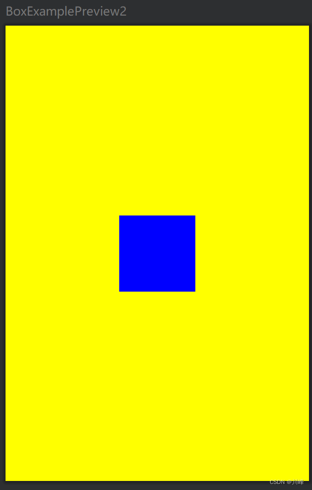
BoxScope中有两个Box子元素专有的Modifier属性:align 和 matchParentSize
1 2 3 4 5 6 7 8 9 10 11 12 13 14 @Composable fun ModifierSample2 () Box(modifier = Modifier .width(200. dp) .height(300. dp) .background(Color.Yellow)){ Box(modifier = Modifier .align(Alignment.Center) .size(50. dp) .background(Color.Blue)) } }
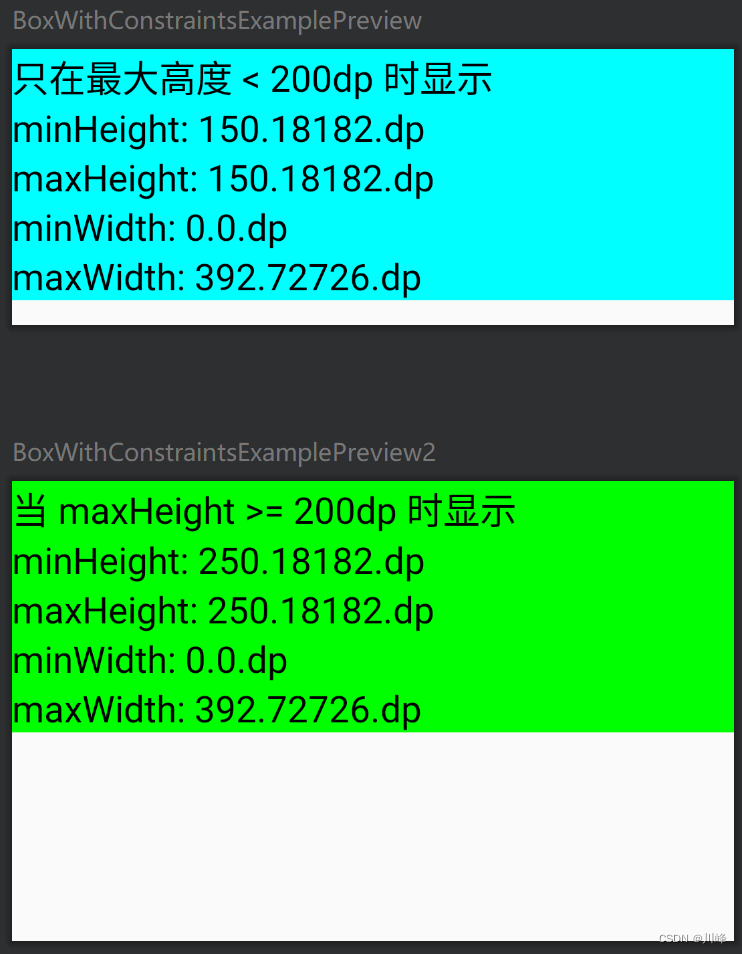
BoxWithConstraints 示例代码1:
1 2 3 4 5 6 7 8 9 10 11 12 13 14 15 16 17 18 19 20 21 22 23 24 25 26 27 28 29 30 31 32 33 34 35 36 37 38 39 40 41 42 43 @Composable fun BoxWithConstraintsExample () BoxWithConstraints { val boxWithConstraintsScope = this if (maxHeight < 200. dp) { Column(Modifier .fillMaxWidth() .background(Color.Cyan)) { Text("只在最大高度 < 200dp 时显示" , fontSize = 20. sp) with(boxWithConstraintsScope) { Text("minHeight: $minHeight " , fontSize = 20. sp) Text("maxHeight: $maxHeight " , fontSize = 20. sp) Text("minWidth: $minWidth " , fontSize = 20. sp) Text("maxWidth: $maxWidth " , fontSize = 20. sp) } } } else { Column(Modifier .fillMaxWidth() .background(Color.Green)) { Text("当 maxHeight >= 200dp 时显示" , fontSize = 20. sp) with(boxWithConstraintsScope) { Text("minHeight: $minHeight " , fontSize = 20. sp) Text("maxHeight: $maxHeight " , fontSize = 20. sp) Text("minWidth: $minWidth " , fontSize = 20. sp) Text("maxWidth: $maxWidth " , fontSize = 20. sp) } } } } } @Preview(heightDp = 150, showBackground = true) @Composable fun BoxWithConstraintsExamplePreview () BoxWithConstraintsExample() } @Preview(heightDp = 250, showBackground = true) @Composable fun BoxWithConstraintsExamplePreview2 () BoxWithConstraintsExample() }
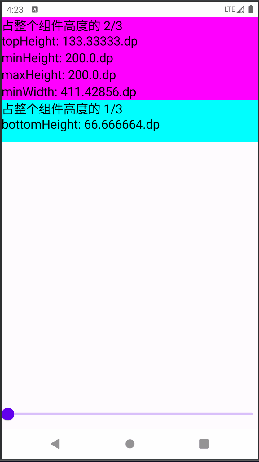
示例代码2:
1 2 3 4 5 6 7 8 9 10 11 12 13 14 15 16 17 18 19 20 21 22 23 24 25 26 27 28 29 30 31 32 33 34 35 36 37 @Composable private fun BoxWithConstraintsExample2 (modifier: Modifier = Modifier) BoxWithConstraints(modifier.background(Color.LightGray)) { val boxWithConstraintsScope = this val topHeight = maxHeight * 2 / 3f Column(Modifier.fillMaxWidth()) { Column(Modifier.background(Color.Magenta).fillMaxWidth().height(topHeight)) { Text("占整个组件高度的 2/3 \ntopHeight: $topHeight " , fontSize = 20. sp) with(boxWithConstraintsScope) { Text("minHeight: $minHeight " , fontSize = 20. sp) Text("maxHeight: $maxHeight " , fontSize = 20. sp) Text("minWidth: $minWidth " , fontSize = 20. sp) Text("maxWidth: $maxWidth " , fontSize = 20. sp) } } val bottomHeight = boxWithConstraintsScope.maxHeight * 1 / 3f Box(Modifier.background(Color.Cyan).fillMaxWidth().height(bottomHeight)) { Text("占整个组件高度的 1/3 \nbottomHeight: $bottomHeight " , fontSize = 20. sp) } } } } @Preview(showBackground = true) @Composable fun BoxWithConstraintsExample2Preview () Column(verticalArrangement = Arrangement.SpaceBetween) { var height by remember { mutableStateOf(200f ) } BoxWithConstraintsExample2( Modifier.fillMaxWidth() .height(height.dp) ) Slider(value = height, onValueChange = { height = it}, valueRange = 200f ..600f ) } }
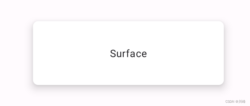
Surface可以快速设置界面的形状、阴影、边框、颜色等,可减少Modifier的使用量
1 2 3 4 5 6 7 8 9 10 11 12 13 14 15 16 17 18 19 20 21 22 23 @Composable fun SurfaceExample () Box( Modifier.fillMaxSize(), contentAlignment = Alignment.Center ) { Surface( shape = RoundedCornerShape(8. dp), elevation = 10. dp, modifier = Modifier .width(300. dp) .height(100. dp) ) { Box( modifier = Modifier.fillMaxSize(), contentAlignment = Alignment.Center ) { Text(text = "Surface" ) } } } }
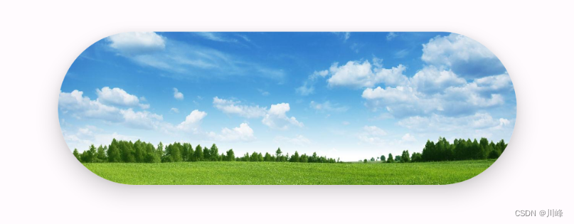
1 2 3 4 5 6 7 8 9 10 11 12 13 14 15 16 17 18 19 20 21 22 23 24 25 26 27 28 @Composable fun SurfaceExample2 () Box( Modifier.fillMaxSize(), contentAlignment = Alignment.Center ) { Surface( shape = CircleShape, elevation = 10. dp, modifier = Modifier .width(300. dp) .height(100. dp) ) { Box( modifier = Modifier.fillMaxSize(), contentAlignment = Alignment.Center ) { Image( painter = painterResource(id = R.drawable.ic_sky), contentDescription = null , contentScale = ContentScale.Crop, modifier = Modifier.fillMaxSize(), ) } } } }
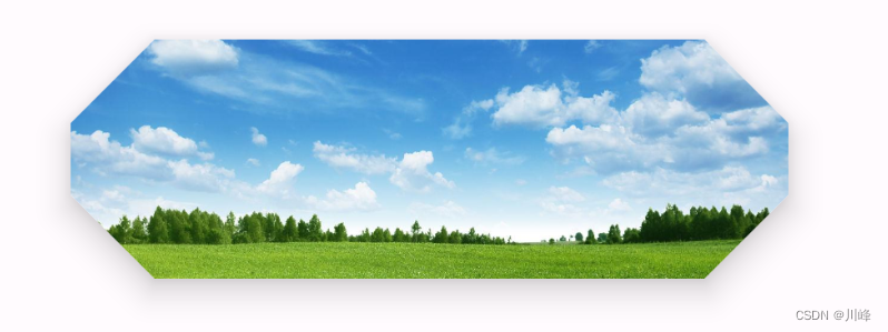
1 2 3 4 5 6 7 8 9 10 11 12 13 14 15 16 17 18 19 20 21 22 23 24 25 26 27 28 @Composable fun SurfaceExample3 () Box( Modifier.fillMaxSize(), contentAlignment = Alignment.Center ) { Surface( shape = CutCornerShape(35 ), elevation = 10. dp, modifier = Modifier .width(300. dp) .height(100. dp) ) { Box( modifier = Modifier.fillMaxSize(), contentAlignment = Alignment.Center ) { Image( painter = painterResource(id = R.drawable.ic_sky), contentDescription = null , contentScale = ContentScale.Crop, modifier = Modifier.fillMaxSize(), ) } } } }
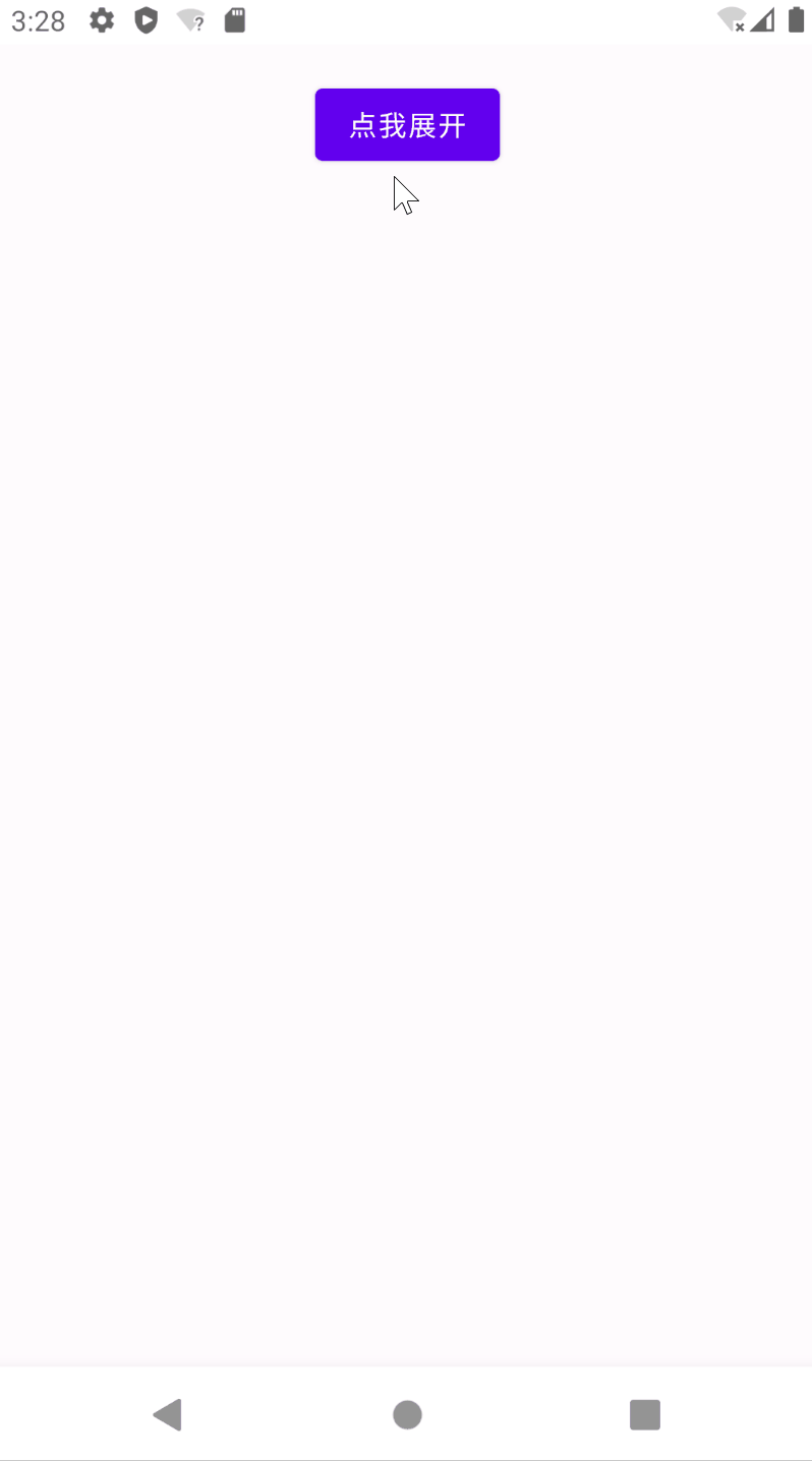
ModalBottomSheetLayout 一般用于底部弹出式菜单
1 2 3 4 5 6 7 8 9 10 11 12 13 14 15 16 17 18 19 20 21 22 23 24 25 26 27 28 29 30 31 32 33 34 35 36 37 38 39 40 41 42 43 44 45 46 47 48 49 50 51 52 53 54 55 56 57 58 59 60 61 62 63 64 65 66 67 68 69 70 71 72 73 74 75 76 77 78 79 80 81 82 83 84 85 86 87 @OptIn(ExperimentalMaterialApi::class) @Composable fun ModalBottomSheetExample () val state = rememberModalBottomSheetState(ModalBottomSheetValue.Hidden) val scope = rememberCoroutineScope() ModalBottomSheetLayout( sheetState = state, sheetContent = { Column{ ListItem( text = { Text("选择分享到哪里吧~" ) } ) ListItem( text = { Text("github" ) }, icon = { Surface( shape = CircleShape, color = Color(0xFF181717 ) ) { Icon( Icons.Default.Share, null , tint = Color.White, modifier = Modifier.padding(4. dp) ) } }, modifier = Modifier.clickable { scope.launch { state.hide() } } ) ListItem( text = { Text("微信" ) }, icon = { Surface( shape = CircleShape, color = Color(0xFF07C160 ) ) { Icon(Icons.Default.Person, null , tint = Color.White, modifier = Modifier.padding(4. dp) ) } }, modifier = Modifier.clickable { scope.launch { state.hide() } } ) ListItem( text = { Text("更多" ) }, icon = { Surface( shape = CircleShape, color = Color(0xFF07C160 ) ) { Icon(Icons.Default.MoreVert, null , tint = Color.White, modifier = Modifier.padding(4. dp) ) } }, modifier = Modifier.clickable { scope.launch { state.hide() } } ) } } ) { Column( modifier = Modifier.fillMaxSize().padding(16. dp), horizontalAlignment = Alignment.CenterHorizontally ) { Button( onClick = { scope.launch { state.show() } } ) { Text("点我展开" ) } } } BackHandler( enabled = (state.currentValue == ModalBottomSheetValue.HalfExpanded || state.currentValue == ModalBottomSheetValue.Expanded), onBack = { scope.launch { state.hide() } } ) }
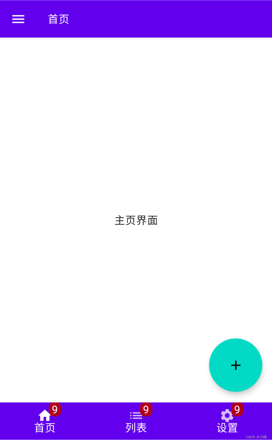
Scaffold Scaffold是一个用于配置Material Design布局结构的脚手架,提供了一些默认坑位可供配置
1 2 3 4 5 6 7 8 9 10 11 12 13 14 15 16 17 18 19 20 21 22 23 24 25 26 27 28 29 30 31 32 33 34 35 36 37 38 39 40 41 42 43 44 45 46 47 48 49 50 51 52 53 54 55 56 57 58 59 60 61 62 63 64 65 66 67 68 69 70 71 72 73 74 75 76 77 78 79 80 81 82 83 84 85 86 87 data class Item (val name : String, val icon : ImageVector)val items = listOf( Item("首页" , Icons.Default.Home), Item("列表" , Icons.Filled.List), Item("设置" , Icons.Filled.Settings) ) @Composable fun ScaffoldExample () var selectedItem by remember { mutableStateOf(0 ) } val scaffoldState = rememberScaffoldState() val scope = rememberCoroutineScope() Scaffold( topBar = { TopAppBar( title = { Text("首页" , color = MaterialTheme.colors.onPrimary) }, navigationIcon = { IconButton(onClick = { scope.launch { scaffoldState.drawerState.open () } }) { Icon(Icons.Filled.Menu, null ) } } ) }, bottomBar = { BottomNavigation { items.forEachIndexed { index, item -> BottomNavigationItem( selected = selectedItem == index, onClick = { selectedItem = index }, icon = { BadgedBox( badge = { Badge(modifier = Modifier.padding(top = 5. dp)) { val badgeNumber = "9" Text(badgeNumber, color = Color.White) } }, ) { Icon(item.icon, null , ) } }, label = { Text(text = item.name, color = MaterialTheme.colors.onPrimary)} ) } } }, drawerContent = { Text("Hello" ) }, scaffoldState = scaffoldState, floatingActionButton = { ExtendedFloatingActionButton( text = { Icon(Icons.Default.Add, null )}, onClick = { println("floatingActionButton" ) }, shape = CircleShape, modifier = Modifier.size(80. dp) ) }, floatingActionButtonPosition = FabPosition.End, isFloatingActionButtonDocked = false ) { padding -> Box( modifier = Modifier .fillMaxSize() .padding(padding), contentAlignment = Alignment.Center ) { Text("主页界面" ) } } BackHandler(enabled = scaffoldState.drawerState.isOpen) { scope.launch { scaffoldState.drawerState.close() } } }
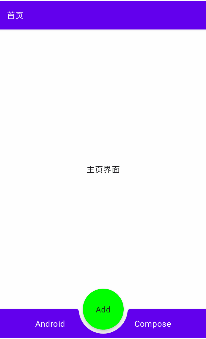
让 floatingActionButton 以 Docked 形式嵌入到底部 bottomBar 的中间:
1 2 3 4 5 6 7 8 9 10 11 12 13 14 15 16 17 18 19 20 21 22 23 24 25 26 27 28 29 30 31 32 33 34 35 36 37 38 39 40 41 42 43 44 45 46 47 48 49 50 51 52 53 @Composable fun ScaffoldExample3 () val scaffoldState = rememberScaffoldState() val scope = rememberCoroutineScope() Scaffold( topBar = { TopAppBar( title = { Text("首页" , color = MaterialTheme.colors.onPrimary) }, ) }, bottomBar = { BottomAppBar(cutoutShape = CircleShape) { Row( horizontalArrangement = Arrangement.SpaceAround, modifier = Modifier.fillMaxWidth() ) { Text("Android" , color = MaterialTheme.colors.onPrimary) Text("Compose" , color = MaterialTheme.colors.onPrimary) } } }, drawerContent = { Text("Hello" ) }, scaffoldState = scaffoldState, floatingActionButton = { ExtendedFloatingActionButton( text = { Text("Add" ) }, onClick = { scope.launch { scaffoldState.snackbarHostState.showSnackbar("添加成功" , actionLabel = "Done" ) } }, shape = CircleShape, modifier = Modifier.size(80. dp), backgroundColor = Color.Green ) }, floatingActionButtonPosition = FabPosition.Center, isFloatingActionButtonDocked = true ) { padding -> Box( modifier = Modifier .fillMaxSize() .padding(padding), contentAlignment = Alignment.Center ) { Text("主页界面" ) } } }
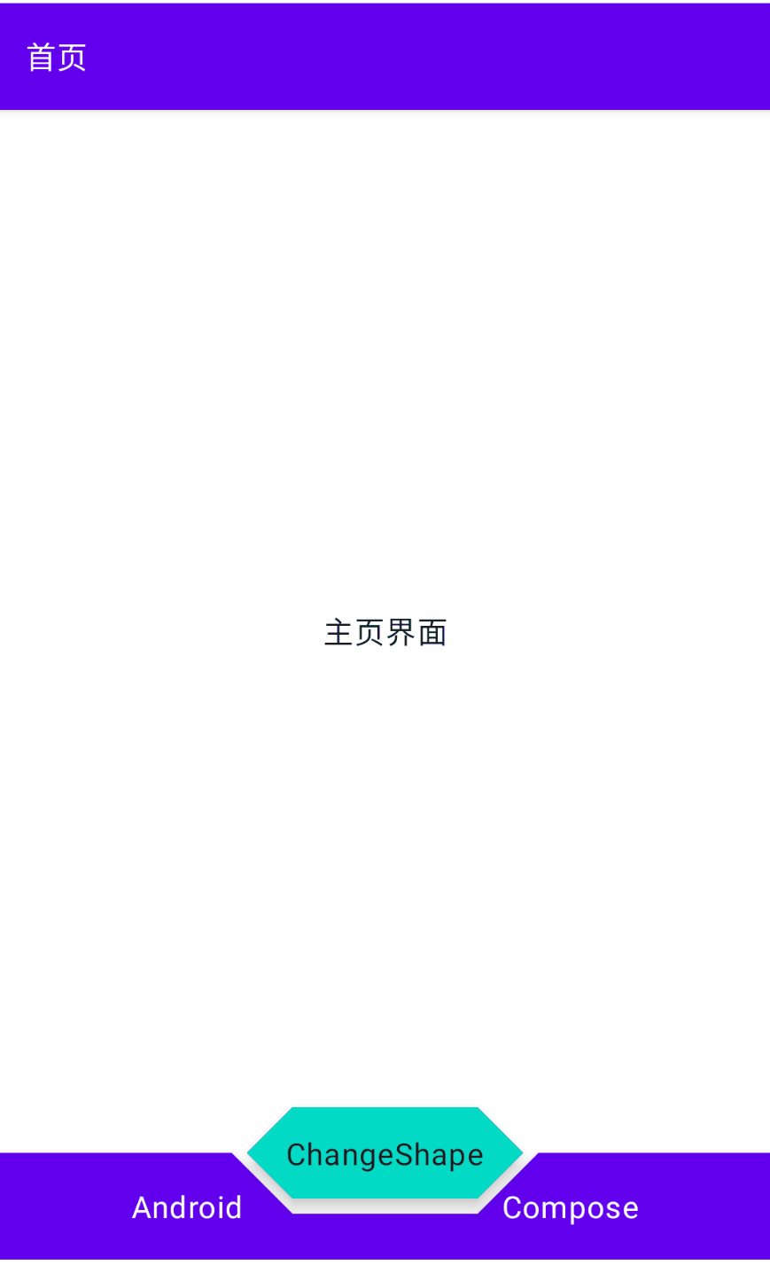
改变 floatingActionButton 嵌入底部bottomBar的形状:
1 2 3 4 5 6 7 8 9 10 11 12 13 14 15 16 17 18 19 20 21 22 23 24 25 26 27 28 29 30 31 32 33 34 35 36 37 38 39 40 41 42 43 44 45 46 47 48 49 50 51 52 53 54 55 56 57 58 59 60 61 62 63 64 65 66 67 68 69 70 71 72 73 74 75 76 77 @Composable fun ScaffoldExample2 () val scaffoldState = rememberScaffoldState() val sharpEdgePercent = -50f val roundEdgePercent = 45f val animatedProgress = remember { Animatable(sharpEdgePercent) } val coroutineScope = rememberCoroutineScope() val progress = animatedProgress.value.roundToInt() val fabShape = if (progress < 0 ) { CutCornerShape(abs(progress)) } else if (progress == roundEdgePercent.toInt()) { CircleShape } else { RoundedCornerShape(progress) } val changeShape: () -> Unit = { val target = animatedProgress.targetValue val nextTarget = if (target == roundEdgePercent) sharpEdgePercent else roundEdgePercent coroutineScope.launch { animatedProgress.animateTo( targetValue = nextTarget, animationSpec = TweenSpec(durationMillis = 600 ) ) } } Scaffold( topBar = { TopAppBar( title = { Text("首页" , color = MaterialTheme.colors.onPrimary) }, ) }, bottomBar = { BottomAppBar(cutoutShape = fabShape) { Row( horizontalArrangement = Arrangement.SpaceAround, modifier = Modifier.fillMaxWidth() ) { Text("Android" , color = MaterialTheme.colors.onPrimary) Text("Compose" , color = MaterialTheme.colors.onPrimary) } } }, drawerContent = { Text("Hello" ) }, scaffoldState = scaffoldState, floatingActionButton = { ExtendedFloatingActionButton( text = { Text("ChangeShape" ) }, onClick = changeShape, shape = fabShape, ) }, floatingActionButtonPosition = FabPosition.Center, isFloatingActionButtonDocked = true ) { padding -> Box( modifier = Modifier .fillMaxSize() .padding(padding), contentAlignment = Alignment.Center ) { Text("主页界面" ) } } }
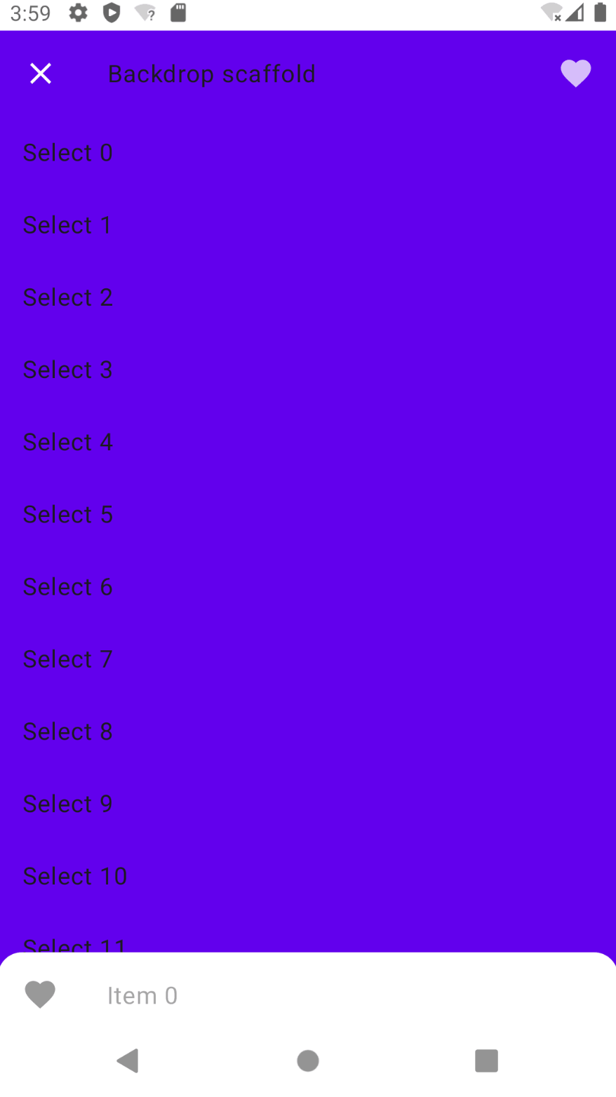
BackdropScaffold 1 2 3 4 5 6 7 8 9 10 11 12 13 14 15 16 17 18 19 20 21 22 23 24 25 26 27 28 29 30 31 32 33 34 35 36 37 38 39 40 41 42 43 44 45 46 47 48 49 50 51 52 53 54 55 56 57 58 59 60 61 62 63 64 65 66 67 @OptIn(ExperimentalMaterialApi::class) @Composable fun BackdropScaffoldExample () val scope = rememberCoroutineScope() val scaffoldState = rememberBackdropScaffoldState(BackdropValue.Concealed) LaunchedEffect(scaffoldState) { scaffoldState.reveal() } BackdropScaffold( scaffoldState = scaffoldState, appBar = { TopAppBar( title = { Text("Backdrop scaffold" ) }, navigationIcon = { if (scaffoldState.isConcealed) { IconButton(onClick = { scope.launch { scaffoldState.reveal() } }) { Icon(Icons.Default.Menu, contentDescription = "Localized description" ) } } else { IconButton(onClick = { scope.launch { scaffoldState.conceal() } }) { Icon(Icons.Default.Close, contentDescription = "Localized description" ) } } }, actions = { var clickCount by remember { mutableStateOf(0 ) } IconButton( onClick = { scope.launch { scaffoldState.snackbarHostState .showSnackbar("Snackbar #${++clickCount} " ) } } ) { Icon(Icons.Default.Favorite, contentDescription = "Localized description" ) } }, elevation = 0. dp, backgroundColor = Color.Transparent ) }, backLayerContent = { LazyColumn { items(15 ) { ListItem( Modifier.clickable { scope.launch { scaffoldState.conceal() } }, text = { Text("Select $it " ) } ) } } }, frontLayerContent = { LazyColumn { items(50 ) { ListItem( text = { Text("Item $it " ) }, icon = { Icon(Icons.Default.Favorite, "Localized description" ) } ) } } } ) }
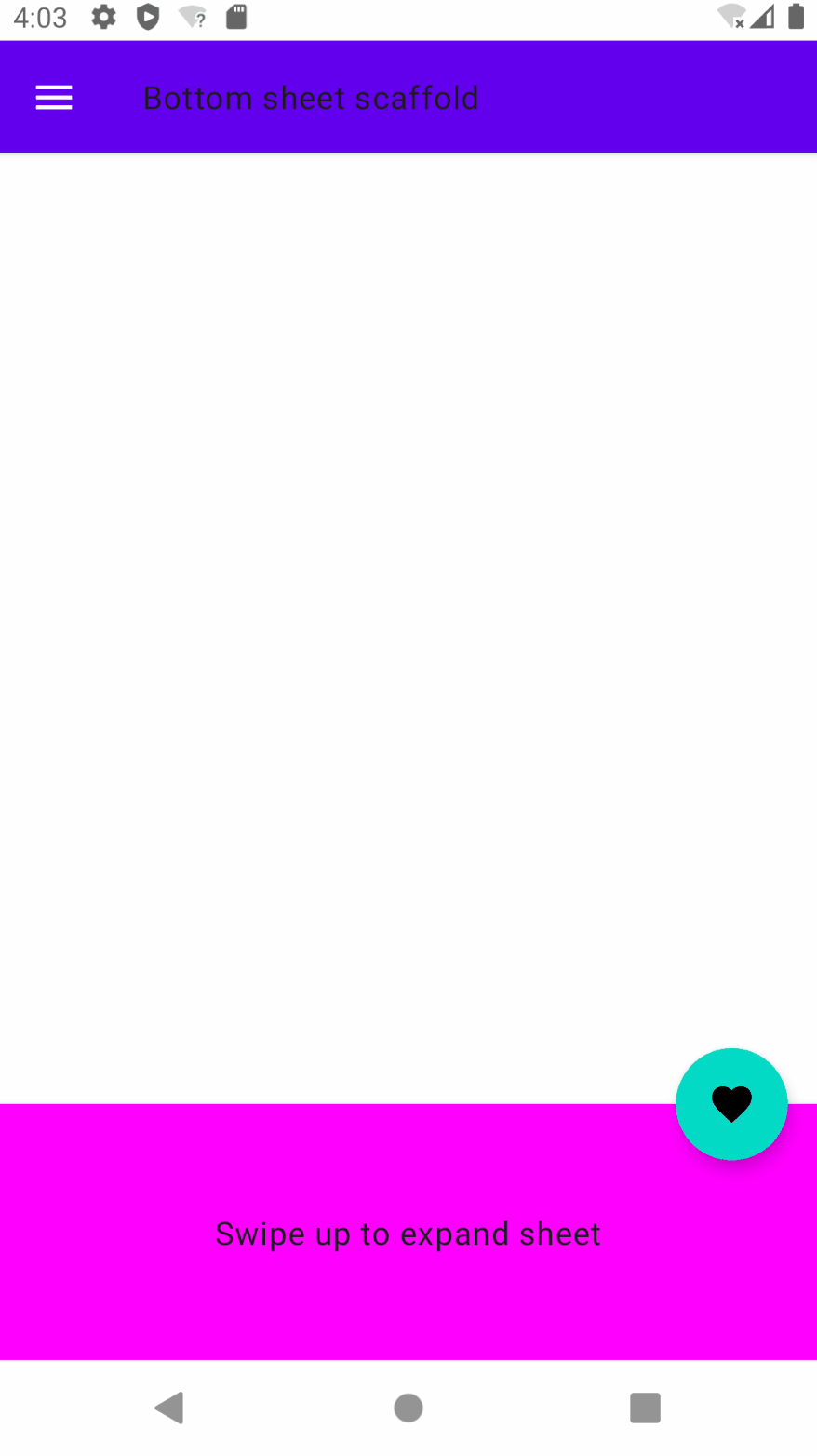
BottomSheetScaffold 1 2 3 4 5 6 7 8 9 10 11 12 13 14 15 16 17 18 19 20 21 22 23 24 25 26 27 28 29 30 31 32 33 34 35 36 37 38 39 40 41 42 43 44 45 46 47 48 49 50 51 52 53 54 55 56 57 58 59 60 61 62 63 64 65 66 67 68 69 70 71 72 73 74 75 76 77 78 79 80 81 82 83 84 85 86 @OptIn(ExperimentalMaterialApi::class) @Composable fun BottomSheetScaffoldExample () val scope = rememberCoroutineScope() val scaffoldState = rememberBottomSheetScaffoldState() BottomSheetScaffold( sheetContent = { Column(Modifier.background(Color.Magenta)) { Box( Modifier .fillMaxWidth() .height(128. dp), contentAlignment = Alignment.Center ) { Text("Swipe up to expand sheet" ) } Column( Modifier .fillMaxWidth() .padding(64. dp), horizontalAlignment = Alignment.CenterHorizontally ) { Text("Sheet content" ) Spacer(Modifier.height(20. dp)) Button( onClick = { scope.launch { scaffoldState.bottomSheetState.collapse() } } ) { Text("Click to collapse sheet" ) } } } }, scaffoldState = scaffoldState, topBar = { TopAppBar( title = { Text("Bottom sheet scaffold" ) }, navigationIcon = { IconButton(onClick = { scope.launch { scaffoldState.drawerState.open () } }) { Icon(Icons.Default.Menu, contentDescription = "Localized description" ) } } ) }, floatingActionButton = { var clickCount by remember { mutableStateOf(0 ) } FloatingActionButton( onClick = { scope.launch { scaffoldState.snackbarHostState.showSnackbar("Snackbar #${++clickCount} " ) } } ) { Icon(Icons.Default.Favorite, contentDescription = "Localized description" ) } }, floatingActionButtonPosition = FabPosition.End, sheetPeekHeight = 128. dp, drawerContent = { Column( Modifier .fillMaxWidth() .padding(16. dp), horizontalAlignment = Alignment.CenterHorizontally ) { Text("Drawer content" ) Spacer(Modifier.height(20. dp)) Button(onClick = { scope.launch { scaffoldState.drawerState.close() } }) { Text("Click to close drawer" ) } } } ) { innerPadding -> LazyColumn(contentPadding = innerPadding) { items(100 ) { Box( Modifier .fillMaxWidth() .height(50. dp) ) } } } }
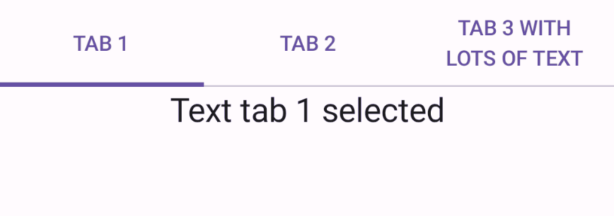
TabRow 1 2 3 4 5 6 7 8 9 10 11 12 13 14 15 16 17 18 19 20 21 @Composable fun TabRowExample () var state by remember { mutableStateOf(0 ) } val titles = listOf("TAB 1" , "TAB 2" , "TAB 3 WITH LOTS OF TEXT" ) Column { TabRow(selectedTabIndex = state) { titles.forEachIndexed { index, title -> Tab( text = { Text(title) }, selected = state == index, onClick = { state = index } ) } } Text( modifier = Modifier.align(Alignment.CenterHorizontally), text = "Text tab ${state + 1 } selected" , style = MaterialTheme.typography.titleLarge ) } }
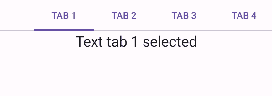
1 2 3 4 5 6 7 8 9 10 11 12 13 14 15 16 17 18 19 20 21 @Composable fun ScrollableTabRowExample () var state by remember { mutableStateOf(0 ) } val titles = listOf("TAB 1" , "TAB 2" , "TAB 3" , "TAB 4" , "TAB 5" , "TAB 6" , "TAB 7" , "TAB 8" , "TAB 9" ) Column { ScrollableTabRow(selectedTabIndex = state) { titles.forEachIndexed { index, title -> Tab( text = { Text(title) }, selected = state == index, onClick = { state = index } ) } } Text( modifier = Modifier.align(Alignment.CenterHorizontally), text = "Text tab ${state + 1 } selected" , style = MaterialTheme.typography.titleLarge ) } }
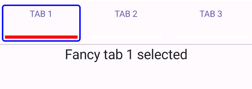
自定义 TabRow 的 Tab 和 Indicator 1 2 3 4 5 6 7 8 9 10 11 12 13 14 15 16 17 18 19 20 21 22 23 24 fun CustomTabRowExample (withAnimatedIndicator : Boolean = false ) var state by remember { mutableStateOf(0 ) } val titles = listOf("TAB 1" , "TAB 2" , "TAB 3" ) val indicator = @Composable { tabPositions: List<TabPosition> -> if (withAnimatedIndicator) { FancyAnimatedIndicator(tabPositions = tabPositions, selectedTabIndex = state) } else { FancyIndicator(Color.Blue, Modifier.tabIndicatorOffset(tabPositions[state])) } } Column { TabRow(selectedTabIndex = state, indicator = indicator) { titles.forEachIndexed { index, title -> FancyTab(title = title, onClick = { state = index }, selected = (index == state)) } } Text( modifier = Modifier.align(Alignment.CenterHorizontally), text = "Fancy tab ${state + 1 } selected" , style = MaterialTheme.typography.titleLarge ) } }
其中 FancyAnimatedIndicator 和 FancyIndicator 定义如下:
1
2
3
4
5
6
7
8
9
10
11
12
13
14
15
16
17
18
19
20
21
22
23
24
25
26
27
28
29
30
31
32
33
34
35
36
37
38
39
40
41
42
43
44
45
46
47
48
49
@Composable fun FancyAnimatedIndicator (tabPositions: List <TabPosition >, selectedTabIndex: Int ) val colors = listOf(Color.Blue, Color.Red, Color.Magenta) val transition = updateTransition(selectedTabIndex, label = "" ) val indicatorStart by transition.animateDp( transitionSpec = { if (initialState < targetState) { spring(dampingRatio = 1f , stiffness = 50f ) } else { spring(dampingRatio = 1f , stiffness = 1000f ) } }, label = "" ) { tabPositions[it].left } val indicatorEnd by transition.animateDp( transitionSpec = { if (initialState < targetState) { spring(dampingRatio = 1f , stiffness = 1000f ) } else { spring(dampingRatio = 1f , stiffness = 50f ) } }, label = "" ) { tabPositions[it].right } val indicatorColor by transition.animateColor(label = "" ) { colors[it % colors.size] } FancyIndicator( indicatorColor, modifier = Modifier .fillMaxSize() .wrapContentSize(align = Alignment.BottomStart) .offset(x = indicatorStart) .width(indicatorEnd - indicatorStart) ) } @Composable fun FancyIndicator (color : Color , modifier : Modifier ) Box(modifier.padding(5. dp).fillMaxSize() .border(BorderStroke(2. dp, color), RoundedCornerShape(5. dp))) }
FancyTab定义如下:
1 2 3 4 5 6 7 8 9 10 11 12 13 14 15 16 17 18 19 @Composable fun FancyTab (selected: Boolean , onClick: () -> Unit , title: String , ) Tab(selected, onClick) { Column( Modifier.padding(10. dp).height(50. dp).fillMaxWidth(), verticalArrangement = Arrangement.SpaceBetween ) { Text( text = title, style = MaterialTheme.typography.bodyMedium, modifier = Modifier.align(Alignment.CenterHorizontally) ) Box( Modifier.height(5. dp).fillMaxWidth().align(Alignment.CenterHorizontally) .background(color = if (selected) Color.Red else Color.White) ) } } }
带动画效果:
不带动画效果:
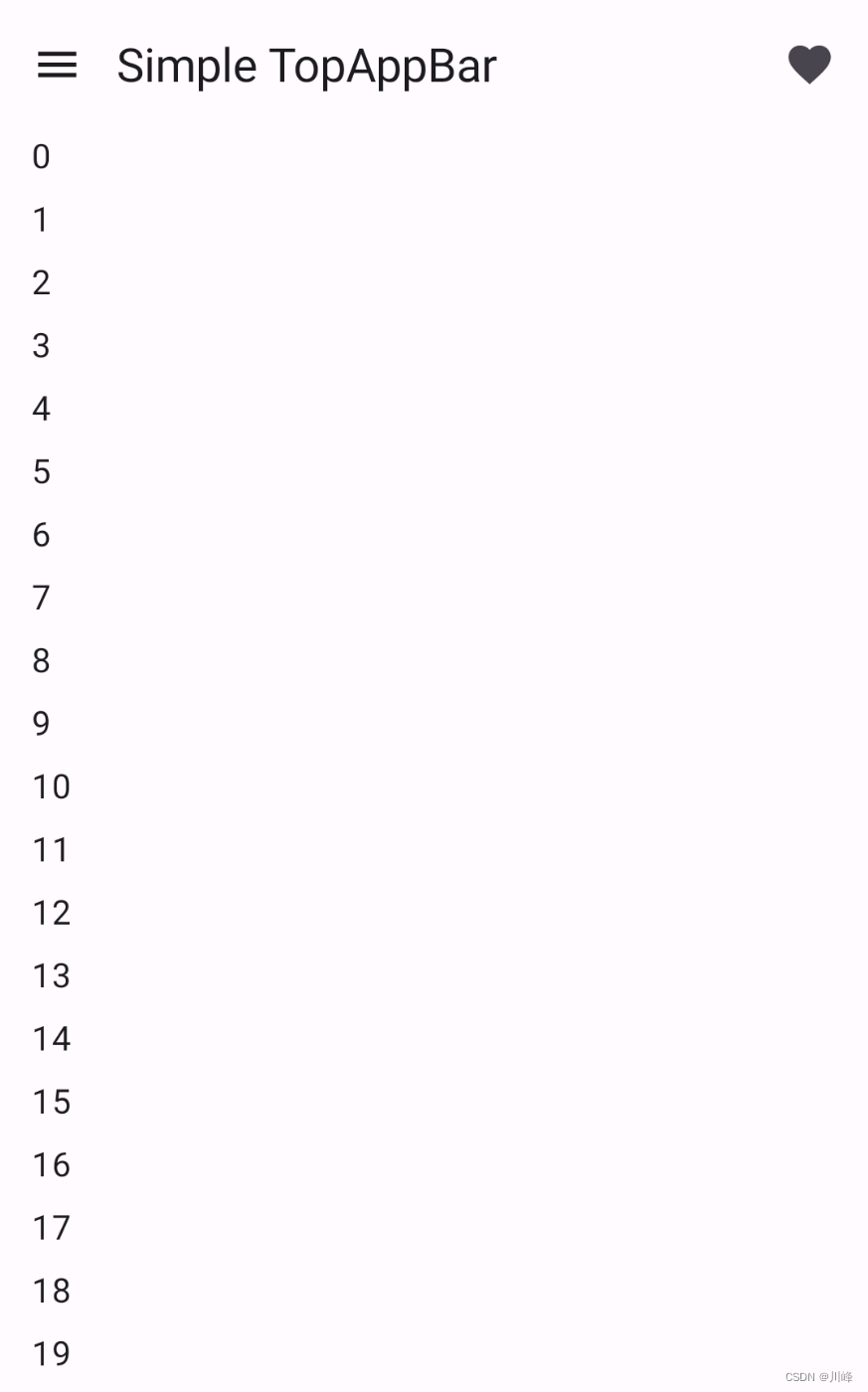
TopAppBar TopAppBar 是Material3包中的,一般搭配Scaffold脚手架使用
1 2 3 4 5 6 7 8 9 10 11 12 13 14 15 16 17 18 19 20 21 22 23 24 25 26 27 28 29 30 31 32 33 34 35 36 37 38 39 40 41 42 43 44 45 46 47 48 49 50 51 @OptIn(ExperimentalMaterial3Api::class) @Preview @Composable fun SimpleTopAppBar () Scaffold( topBar = { TopAppBar( title = { Text( "Simple TopAppBar" , maxLines = 1 , overflow = TextOverflow.Ellipsis ) }, navigationIcon = { IconButton(onClick = { }) { Icon( imageVector = Icons.Filled.Menu, contentDescription = "Localized description" ) } }, actions = { IconButton(onClick = { }) { Icon( imageVector = Icons.Filled.Favorite, contentDescription = "Localized description" ) } } ) }, content = { innerPadding -> LazyColumn( contentPadding = innerPadding, verticalArrangement = Arrangement.spacedBy(8. dp) ) { val list = (0. .75 ).map { it.toString() } items(count = list.size) { Text( text = list[it], style = MaterialTheme.typography.bodyLarge, modifier = Modifier .fillMaxWidth() .padding(horizontal = 16. dp) ) } } } ) }
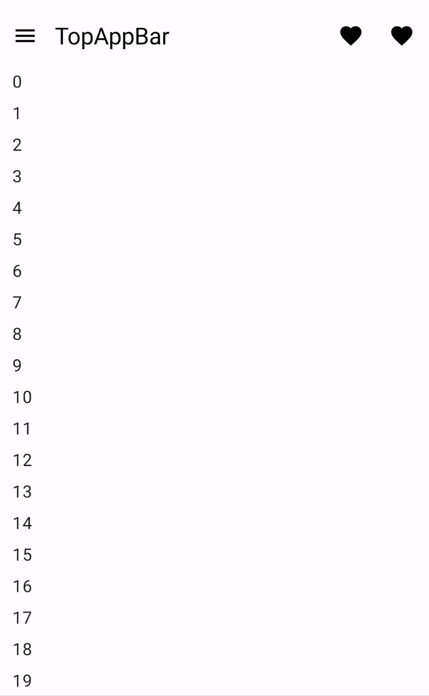
固定顶部栏
通过指定TopAppBar的scrollBehavior 参数为TopAppBarDefaults.pinnedScrollBehavior()实现固定顶部栏效果。滚动内容时,可以动态改变TopAppBar的颜色。
1 2 3 4 5 6 7 8 9 10 11 12 13 14 15 16 17 18 19 20 21 22 23 24 25 26 27 28 29 30 31 32 33 34 35 36 37 38 39 40 41 42 43 44 45 46 47 48 49 50 51 52 53 54 55 56 57 58 59 60 61 62 63 64 65 66 67 68 69 70 @OptIn(ExperimentalMaterial3Api::class) @Preview @Composable fun PinnedTopAppBar () val scrollBehavior = TopAppBarDefaults.pinnedScrollBehavior() val topAppBarState = remember{ scrollBehavior.state } val isAppBarCoveredContent = topAppBarState.overlappedFraction > 0f val titleAndIconColor = if (isAppBarCoveredContent) Color.White else Color.Black Scaffold( modifier = Modifier.nestedScroll(scrollBehavior.nestedScrollConnection), topBar = { TopAppBar( scrollBehavior = scrollBehavior, colors = TopAppBarDefaults.topAppBarColors( scrolledContainerColor = MaterialTheme.colorScheme.primary, navigationIconContentColor = titleAndIconColor, titleContentColor = titleAndIconColor, actionIconContentColor = titleAndIconColor, ), title = { Text( "TopAppBar" , maxLines = 1 , overflow = TextOverflow.Ellipsis ) }, navigationIcon = { IconButton(onClick = { }) { Icon( imageVector = Icons.Filled.Menu, contentDescription = "Localized description" ) } }, actions = { IconButton(onClick = { }) { Icon( imageVector = Icons.Filled.Favorite, contentDescription = "Localized description" ) } IconButton(onClick = { }) { Icon( imageVector = Icons.Filled.Favorite, contentDescription = "Localized description" ) } }, ) }, content = { innerPadding -> LazyColumn( contentPadding = innerPadding, verticalArrangement = Arrangement.spacedBy(8. dp) ) { val list = (0. .75 ).map { it.toString() } items(count = list.size) { Text( text = list[it], style = MaterialTheme.typography.bodyLarge, modifier = Modifier .fillMaxWidth() .padding(horizontal = 16. dp) ) } } } ) }
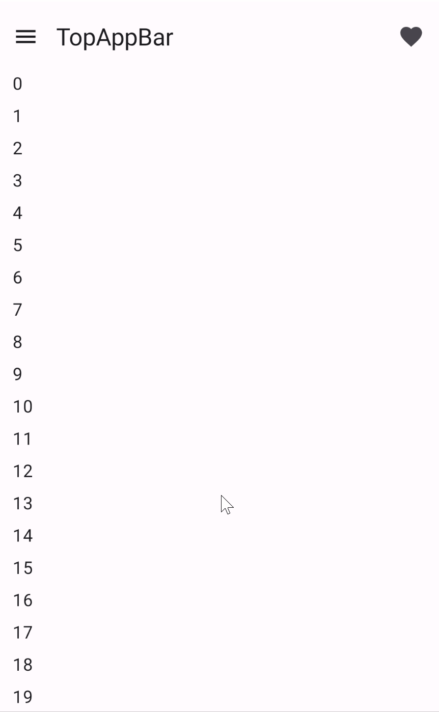
折叠顶部栏
通过指定TopAppBar的scrollBehavior 参数为TopAppBarDefaults.enterAlwaysScrollBehavior()实现折叠顶部栏效果
1 2 3 4 5 6 7 8 9 10 11 12 13 14 15 16 17 18 19 20 21 22 23 24 25 26 27 28 29 30 31 32 33 34 35 36 37 38 39 40 41 42 43 44 45 46 47 48 49 50 51 52 53 54 @OptIn(ExperimentalMaterial3Api::class) @Preview @Composable fun EnterAlwaysTopAppBar () val scrollBehavior = TopAppBarDefaults.enterAlwaysScrollBehavior() Scaffold( modifier = Modifier.nestedScroll(scrollBehavior.nestedScrollConnection), topBar = { TopAppBar( scrollBehavior = scrollBehavior, title = { Text( "TopAppBar" , maxLines = 1 , overflow = TextOverflow.Ellipsis ) }, navigationIcon = { IconButton(onClick = { }) { Icon( imageVector = Icons.Filled.Menu, contentDescription = "Localized description" ) } }, actions = { IconButton(onClick = { }) { Icon( imageVector = Icons.Filled.Favorite, contentDescription = "Localized description" ) } }, ) }, content = { innerPadding -> LazyColumn( contentPadding = innerPadding, verticalArrangement = Arrangement.spacedBy(8. dp) ) { val list = (0. .75 ).map { it.toString() } items(count = list.size) { Text( text = list[it], style = MaterialTheme.typography.bodyLarge, modifier = Modifier .fillMaxWidth() .padding(horizontal = 16. dp) ) } } } ) }
TopAppBarDefaults中还有其他的scrollBehavior 如 exitUntilCollapsedScrollBehavior(),效果类似,可根据需要选择。
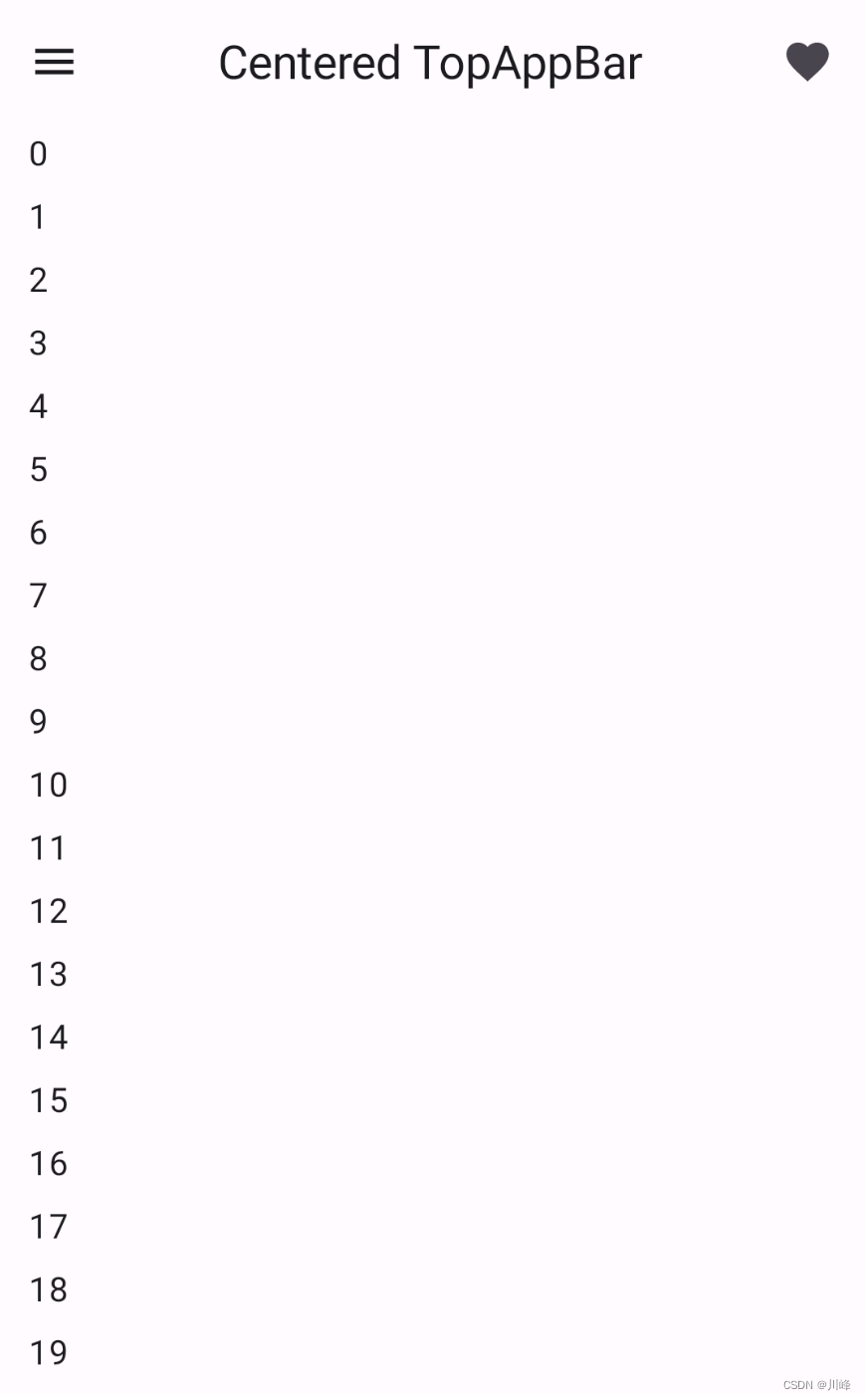
CenterAlignedTopAppBar 这个与TopAppBar 没太大区别,就是标题居中,但是它不会响应任何滚动事件。
1 2 3 4 5 6 7 8 9 10 11 12 13 14 15 16 17 18 19 20 21 22 23 24 25 26 27 28 29 30 31 32 33 34 35 36 37 38 39 40 41 42 43 44 45 46 47 48 49 50 51 @OptIn(ExperimentalMaterial3Api::class) @Preview @Composable fun SimpleCenterAlignedTopAppBar () Scaffold( topBar = { CenterAlignedTopAppBar( title = { Text( "Centered TopAppBar" , maxLines = 1 , overflow = TextOverflow.Ellipsis ) }, navigationIcon = { IconButton(onClick = { }) { Icon( imageVector = Icons.Filled.Menu, contentDescription = "Localized description" ) } }, actions = { IconButton(onClick = { }) { Icon( imageVector = Icons.Filled.Favorite, contentDescription = "Localized description" ) } } ) }, content = { innerPadding -> LazyColumn( contentPadding = innerPadding, verticalArrangement = Arrangement.spacedBy(8. dp) ) { val list = (0. .75 ).map { it.toString() } items(count = list.size) { Text( text = list[it], style = MaterialTheme.typography.bodyLarge, modifier = Modifier .fillMaxWidth() .padding(horizontal = 16. dp) ) } } } ) }
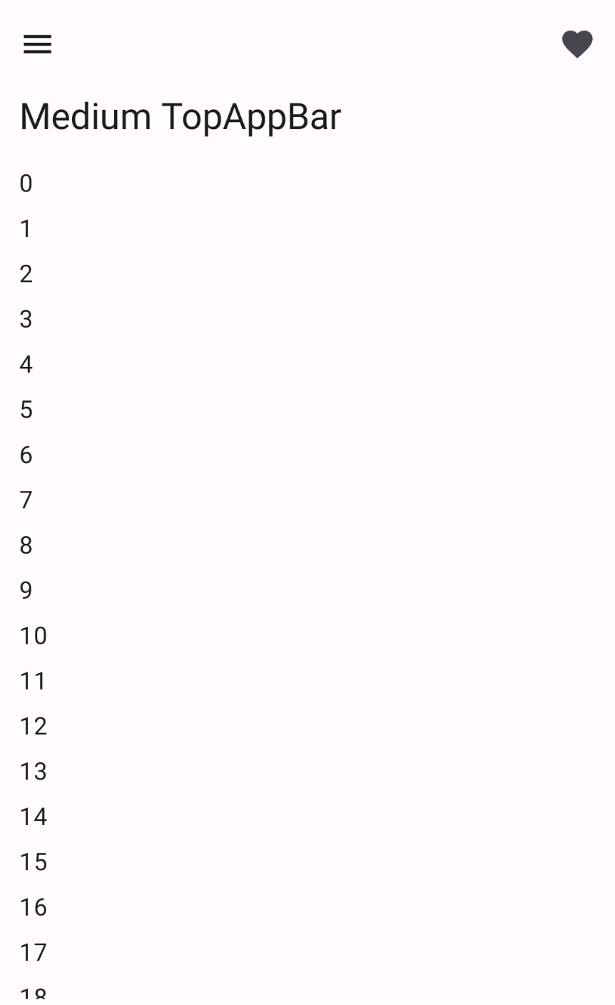
MediumTopAppBar 大一号的TopAppBar,MediumTopAppBar带有一个title槽位,并且默认是展开的状态,可以实现折叠顶部栏时标题收起展开效果。
1 2 3 4 5 6 7 8 9 10 11 12 13 14 15 16 17 18 19 20 21 22 23 24 25 26 27 28 29 30 31 32 33 34 35 36 37 38 39 40 41 42 43 44 45 46 47 48 49 50 51 52 53 54 @OptIn(ExperimentalMaterial3Api::class) @Preview @Composable fun ExitUntilCollapsedMediumTopAppBar () val scrollBehavior = TopAppBarDefaults.exitUntilCollapsedScrollBehavior() Scaffold( modifier = Modifier.nestedScroll(scrollBehavior.nestedScrollConnection), topBar = { MediumTopAppBar( scrollBehavior = scrollBehavior, title = { Text( "Medium TopAppBar" , maxLines = 1 , overflow = TextOverflow.Ellipsis ) }, navigationIcon = { IconButton(onClick = { }) { Icon( imageVector = Icons.Filled.Menu, contentDescription = "Localized description" ) } }, actions = { IconButton(onClick = { }) { Icon( imageVector = Icons.Filled.Favorite, contentDescription = "Localized description" ) } }, ) }, content = { innerPadding -> LazyColumn( contentPadding = innerPadding, verticalArrangement = Arrangement.spacedBy(8. dp) ) { val list = (0. .75 ).map { it.toString() } items(count = list.size) { Text( text = list[it], style = MaterialTheme.typography.bodyLarge, modifier = Modifier .fillMaxWidth() .padding(horizontal = 16. dp) ) } } } ) }
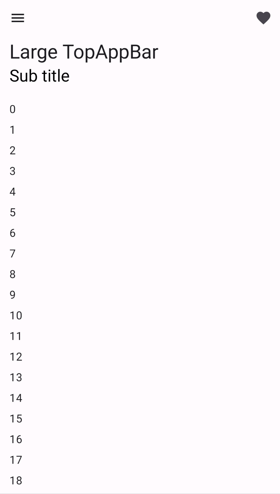
LargeTopAppBar 更大一号的TopAppBar,但是LargeTopAppBar的title区域高度是固定的,不能修改,比较适合放两行标题。
1 2 3 4 5 6 7 8 9 10 11 12 13 14 15 16 17 18 19 20 21 22 23 24 25 26 27 28 29 30 31 32 33 34 35 36 37 38 39 40 41 42 43 44 45 46 47 48 49 50 51 52 53 54 55 56 57 58 59 60 61 62 63 64 65 66 67 @OptIn(ExperimentalMaterial3Api::class) @Preview @Composable fun ExitUntilCollapsedLargeTopAppBar () val scrollBehavior = TopAppBarDefaults.exitUntilCollapsedScrollBehavior() val isCollapsed = scrollBehavior.state.collapsedFraction == 1.0f val alpha = 1.0f - scrollBehavior.state.collapsedFraction Scaffold( modifier = Modifier.nestedScroll(scrollBehavior.nestedScrollConnection), topBar = { LargeTopAppBar( scrollBehavior = scrollBehavior, title = { Column { Text( "Large TopAppBar" , maxLines = 1 , overflow = TextOverflow.Ellipsis, ) if (!isCollapsed) { Text( "Sub title" , maxLines = 1 , overflow = TextOverflow.Ellipsis, color = Color.Black.copy(alpha = alpha), fontSize = MaterialTheme.typography.headlineSmall.fontSize * alpha, ) } } }, navigationIcon = { IconButton(onClick = { }) { Icon( imageVector = Icons.Filled.Menu, contentDescription = "Localized description" ) } }, actions = { IconButton(onClick = { }) { Icon( imageVector = Icons.Filled.Favorite, contentDescription = "Localized description" ) } }, ) }, content = { innerPadding -> LazyColumn( contentPadding = innerPadding, verticalArrangement = Arrangement.spacedBy(8. dp) ) { val list = (0. .75 ).map { it.toString() } items(count = list.size) { Text( text = list[it], style = MaterialTheme.typography.bodyLarge, modifier = Modifier .fillMaxWidth() .padding(horizontal = 16. dp) ) } } } ) }
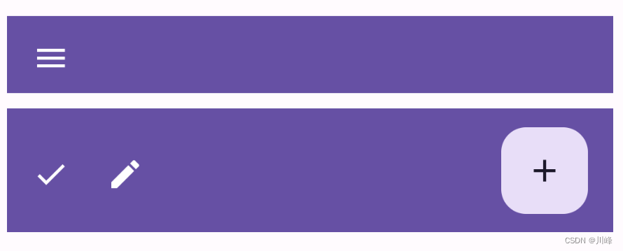
BottomAppBar BottomAppBar 一般结合 Scaffold 脚手架一起使用,放在 Scaffold 的 bottomBar 槽位上,但是也可以独立使用。
1 2 3 4 5 6 7 8 9 10 11 12 13 14 15 16 17 18 19 20 21 22 23 24 25 26 27 28 29 30 31 32 33 34 35 36 37 38 39 40 41 42 43 44 45 46 47 @Preview @Composable fun SimpleBottomAppBar () Column( verticalArrangement = Arrangement.Center, modifier = Modifier.padding(10. dp) ) { BottomAppBar( containerColor = MaterialTheme.colorScheme.primary, modifier = Modifier.height(50. dp) ) { IconButton(onClick = { }) { Icon(Icons.Filled.Menu, contentDescription = "Localized description" ) } } Spacer(modifier = Modifier.height(10. dp)) BottomAppBarWithFAB() } } @Preview @Composable fun BottomAppBarWithFAB () BottomAppBar( actions = { IconButton(onClick = { }) { Icon(Icons.Filled.Check, contentDescription = "Localized description" ) } IconButton(onClick = { }) { Icon( Icons.Filled.Edit, contentDescription = "Localized description" , ) } }, floatingActionButton = { FloatingActionButton( onClick = { }, containerColor = BottomAppBarDefaults.bottomAppBarFabColor, elevation = FloatingActionButtonDefaults.bottomAppBarFabElevation() ) { Icon(Icons.Filled.Add, "Localized description" ) } }, containerColor = MaterialTheme.colorScheme.primary, ) }
AlertDialog 注意下面代码是material1中的AlertDialog,Material1中有两个AlertDialog构造函数,而material3包中只有一个AlertDialog构造函数。
1 2 3 4 5 6 7 8 9 10 11 12 13 14 15 16 17 18 19 20 21 22 23 24 25 26 27 28 29 30 31 32 33 34 35 36 37 38 39 40 41 42 @Composable fun DialogExample () var openDialog by remember { mutableStateOf(false ) } Column(verticalArrangement = Arrangement.Center, horizontalAlignment = Alignment.CenterHorizontally) { Button(onClick = { openDialog = true }) { Text(text = "show AlertDialog" ) } } if (openDialog) { AlertDialog( onDismissRequest = { openDialog = false }, title = { Text( text = "开启位置服务" , style = MaterialTheme.typography.h5 ) }, text = { Text( text = "这将意味着,我们会给您提供精准的位置服务,并且您将接受关于您订阅的位置信息" , fontSize = 16. sp ) }, buttons = { Row( modifier = Modifier.padding(all = 8. dp), horizontalArrangement = Arrangement.Center ) { Button( modifier = Modifier.fillMaxWidth(), onClick = { openDialog = false } ) { Text("必须接受!" ) } } } ) } }
下面的代码是使用固定2个按钮槽位的AlertDialog构造函数
1
2
3
4
5
6
7
8
9
10
11
12
13
14
15
16
17
18
19
20
21
22
23
24
25
26
27
28
29
30
31
32
33
34
35
36
37
38
39
40
41
42
43
44
45
46
47
48
49
50
51
52
53
@Composable fun DialogExample () var openDialog by remember { mutableStateOf(false ) } Column(verticalArrangement = Arrangement.Center, horizontalAlignment = Alignment.CenterHorizontally) { Button(onClick = { openDialog = true }) { Text(text = "show AlertDialog" ) } } if (openDialog) { AlertDialog( onDismissRequest = { openDialog = false }, title = { Text( text = "开启位置服务" , style = MaterialTheme.typography.h5 ) }, text = { Text( text = "这将意味着,我们会给您提供精准的位置服务,并且您将接受关于您订阅的位置信息" , fontSize = 16. sp ) }, confirmButton = { TextButton( onClick = { openDialog = false println("点击了确认" ) }, ) { Text( "确认" , style = MaterialTheme.typography.body1 ) } }, dismissButton = { TextButton( onClick = { openDialog = false println("点击了取消" ) } ) { Text( "取消" , style = MaterialTheme.typography.body1 ) } }, shape = RoundedCornerShape(15. dp) ) } }
material3包中的AlertDialog效果跟上面类似,只是颜色略微不一样。(个人感觉material3的颜色设计没有material好)
Dialog Dialog的参数比较少,相比AlertDialog简单一些,content内容可以自由填充
1 2 3 4 5 6 7 8 9 10 11 12 13 14 15 16 17 18 19 20 21 22 23 24 25 26 27 @Composable fun DialogExample3 () var flag by remember{ mutableStateOf(false ) } Box( modifier = Modifier.fillMaxSize(), contentAlignment = Alignment.Center ) { Button(onClick = { flag = true }) { Text("show Dialog" ) } } if (flag) { Dialog(onDismissRequest = { flag = false }) { Box( modifier = Modifier .height(150. dp).width(300. dp) .background(Color.White), contentAlignment = Alignment.Center ) { Column { LinearProgressIndicator() Text("加载中 ing..." ) } } } } }
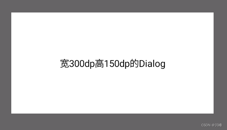
如果要修改Dialog的宽高只需使用Modifier修改内容区的宽高即可:
1 2 3 4 5 6 7 8 9 10 11 12 13 14 15 16 17 18 @Composable fun DialogExample5 () var flag by remember{ mutableStateOf(true ) } val width = 300. dp val height = 150. dp if (flag) { Dialog(onDismissRequest = { flag = false }) { Box( modifier = Modifier .size(width, height) .background(Color.White), contentAlignment = Alignment.Center ) { Text("宽300dp高150dp的Dialog" ) } } } }
Dialog 的一些行为控制可以通过 properties 参数来指定:
1 2 3 4 5 6 7 8 9 10 11 12 13 14 15 16 17 18 19 20 21 22 23 24 @Composable fun DialogExample4 () var flag by remember{ mutableStateOf(true ) } if (flag) { Dialog( onDismissRequest = { flag = false }, properties = DialogProperties( dismissOnBackPress = true , dismissOnClickOutside = true , securePolicy = SecureFlagPolicy.Inherit, usePlatformDefaultWidth = false ) ) { Box( modifier = Modifier .fillMaxSize() .background(Color.Blue), contentAlignment = Alignment.Center ) { Text("Dialog全屏的效果" ) } } } }
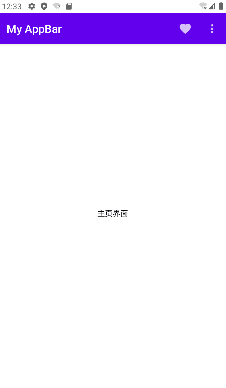
DropdownMenu 一般是结合 TopAppBar 一起使用,放在Scaffold脚手架中。
1 2 3 4 5 6 7 8 9 10 11 12 13 14 15 16 17 18 19 20 21 22 23 24 25 26 27 28 29 30 31 32 33 34 35 36 37 38 39 40 41 42 43 44 45 46 47 48 49 50 @Composable fun ScaffoldWithDropDownMenu () Scaffold(topBar = { OptionMenu() }) { padding -> Box(modifier = Modifier.fillMaxSize().padding(padding), contentAlignment = Alignment.Center ) { Text("主页界面" ) } } } @Composable fun OptionMenu () var showMenu by remember { mutableStateOf(false ) } val context = LocalContext.current TopAppBar( title = { Text("My AppBar" ) }, actions = { IconButton(onClick = { context.showToast("Favorite" ) }) { Icon(Icons.Default.Favorite, "" ) } IconButton(onClick = { showMenu = !showMenu }) { Icon(Icons.Default.MoreVert, "" ) } DropdownMenu( expanded = showMenu, onDismissRequest = { showMenu = false }, properties = PopupProperties( focusable = true , dismissOnBackPress = true , dismissOnClickOutside = true , securePolicy = SecureFlagPolicy.SecureOn, ) ) { DropdownMenuItem(onClick = { showMenu = false context.showToast("Settings" ) }) { Text(text = "Settings" ) } DropdownMenuItem(onClick = { showMenu = false context.showToast("Logout" ) }) { Text(text = "Logout" ) } } } ) }
如果单独使用DropdownMenu,可能无法得到预期的效果,例如放一个按钮点击时想在按钮下面弹出DropdownMenu:
1 2 3 4 5 6 7 8 9 10 11 12 13 14 15 16 17 18 19 20 21 @Composable fun DropDownMenuExample () var expanded by remember { mutableStateOf(false ) } Box( modifier = Modifier.size(300. dp), contentAlignment = Alignment.Center ) { IconButton(onClick = { expanded = !expanded }) { Icon(imageVector = Icons.Default.Add, contentDescription = null ) } DropdownMenu( expanded = expanded, onDismissRequest = {expanded = false }, offset = DpOffset(x = 10. dp, y = 10. dp), ) { DropdownMenuItem(onClick = { expanded = false }) { Text(text = "Menu 0" ) } DropdownMenuItem(onClick = { expanded = false }) { Text(text = "Menu 1" ) } DropdownMenuItem(onClick = { expanded = false }) { Text(text = "Menu 2" ) } } } }
可以看到DropdownMenu没有显示在正确的位置,跟原生的弹出菜单PopupWindow不同,原生PopupWindow控件show的时候有个anchor参数可以指定锚点,而 Compose 中的DropdownMenu没有办法这样做。
这意味着我们要手动修改DropdownMenu的offset参数,获取点击的位置坐标作为偏移量传入DropdownMenu的offset即可。要获取点击的位置信息,可以通过pointerInput修饰符的detectTapGestures API来实现:
1 2 3 4 5 6 7 8 9 10 11 12 13 14 15 16 17 18 19 20 21 22 23 24 25 26 27 28 29 30 31 32 33 34 35 36 37 38 39 40 41 42 43 44 45 46 47 48 49 50 51 52 53 54 55 56 57 58 59 @Composable fun PersonItem ( personName: String , dropdownItems: List <DropDownItem >, modifier: Modifier = Modifier, onItemClick: (DropDownItem ) -> Unit ) var isMenuVisible by rememberSaveable { mutableStateOf(false ) } var pressOffset by remember { mutableStateOf(DpOffset.Zero) } var itemHeight by remember { mutableStateOf(0. dp) } val interactionSource = remember { MutableInteractionSource() } val density = LocalDensity.current Card( elevation = 4. dp, modifier = modifier.onSizeChanged { itemHeight = with(density) { it.height.toDp() } } ) { Box( modifier = Modifier .fillMaxWidth() .indication(interactionSource, LocalIndication.current) .pointerInput(true ) { detectTapGestures( onLongPress = { isMenuVisible = true pressOffset = DpOffset(it.x.toDp(), it.y.toDp()) }, onPress = { val press = PressInteraction.Press(it) interactionSource.emit(press) tryAwaitRelease() interactionSource.emit(PressInteraction.Release(press)) } ) } .padding(16. dp) ) { Text(text = personName) } DropdownMenu( expanded = isMenuVisible, onDismissRequest = { isMenuVisible = false }, offset = pressOffset.copy(y = pressOffset.y - itemHeight) ) { dropdownItems.forEach { DropdownMenuItem(onClick = { onItemClick(it) isMenuVisible = false }) { Text(text = it.text) } } } } } data class DropDownItem (val text: String)
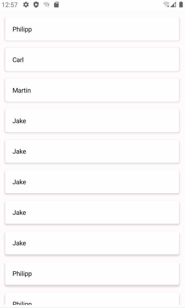
1 2 3 4 5 6 7 8 9 10 11 12 13 14 15 16 17 18 19 20 21 22 23 @Composable fun CustomDropdownMenuExample () val context = LocalContext.current LazyColumn( modifier = Modifier.fillMaxSize().padding(16. dp), verticalArrangement = Arrangement.spacedBy(16. dp) ) { items( listOf("Philipp" , "Carl" , "Martin" , "Jake" , "Jake" , "Jake" , "Jake" , "Jake" , "Philipp" , "Philipp" ) ) { PersonItem( personName = it, dropdownItems = listOf( DropDownItem("Item 1" ), DropDownItem("Item 2" ), DropDownItem("Item 3" ), ), onItemClick = {context.showToast(it.text) }, modifier = Modifier.fillMaxWidth() ) } } }
这个在 Jetpack Compose Android 库中没有对应的组件,如果要做就是使用上面的 DropdownMenu 来实现。但是如果是使用 JetBrains 的 Compose-Multiplatform 进行多平台开发的话,在桌面端是有对应的 ContextMenu API 支持的,毕竟在桌面端上下文菜单是比较常见的,可以参考官网教程:Context Menu in Compose for Desktop 。